|
|
Post by Deleted on Jun 19, 2022 13:06:25 GMT -5
Every once in a while I run into a comic book cover that really strikes me as very different from the era it was created in. I don't mean so much the clearly "groundbreaking" ones that signaled the beginning of a new era of style (e.g. Neal Adams), but rather just one-off covers that seem a bit "out of period". For instance, this Showcase cover from 1968 looks to me almost like it could be made today. The typography, and just the overall layout:  This cover also makes me think more late 60's, but it was just 1963, and feels so different from the issues that preceded and followed it. Somewhat it is the more "serious" theme, but even just all the detail of the background:  Anybody else have examples that sort of just jump out at you like that? |
|
|
|
Post by dbutler69 on Jun 19, 2022 14:10:31 GMT -5
Probably a lot of Neal Adams covers. Also, some of the Flash covers. This one from 1968 has a much much serious looking theme than its DC predecessor, keeping with what you said about that Action Comics cover. 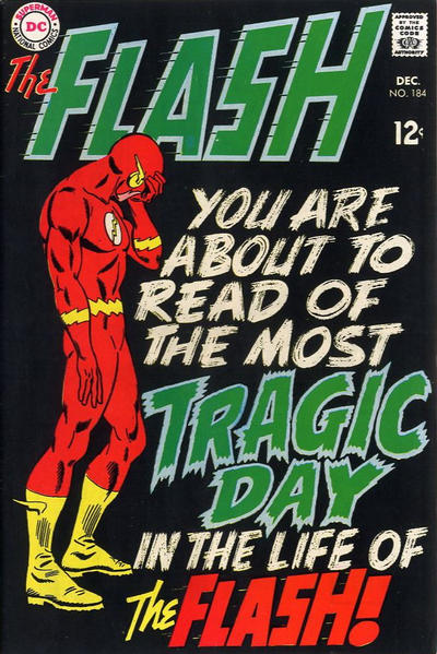 |
|
|
|
Post by Ish Kabbible on Jun 19, 2022 14:17:33 GMT -5
Flash Comics # 52 (1944)- Supposedly the first appearence of a computer in comic books  |
|
|
|
Post by james on Jun 19, 2022 16:49:25 GMT -5
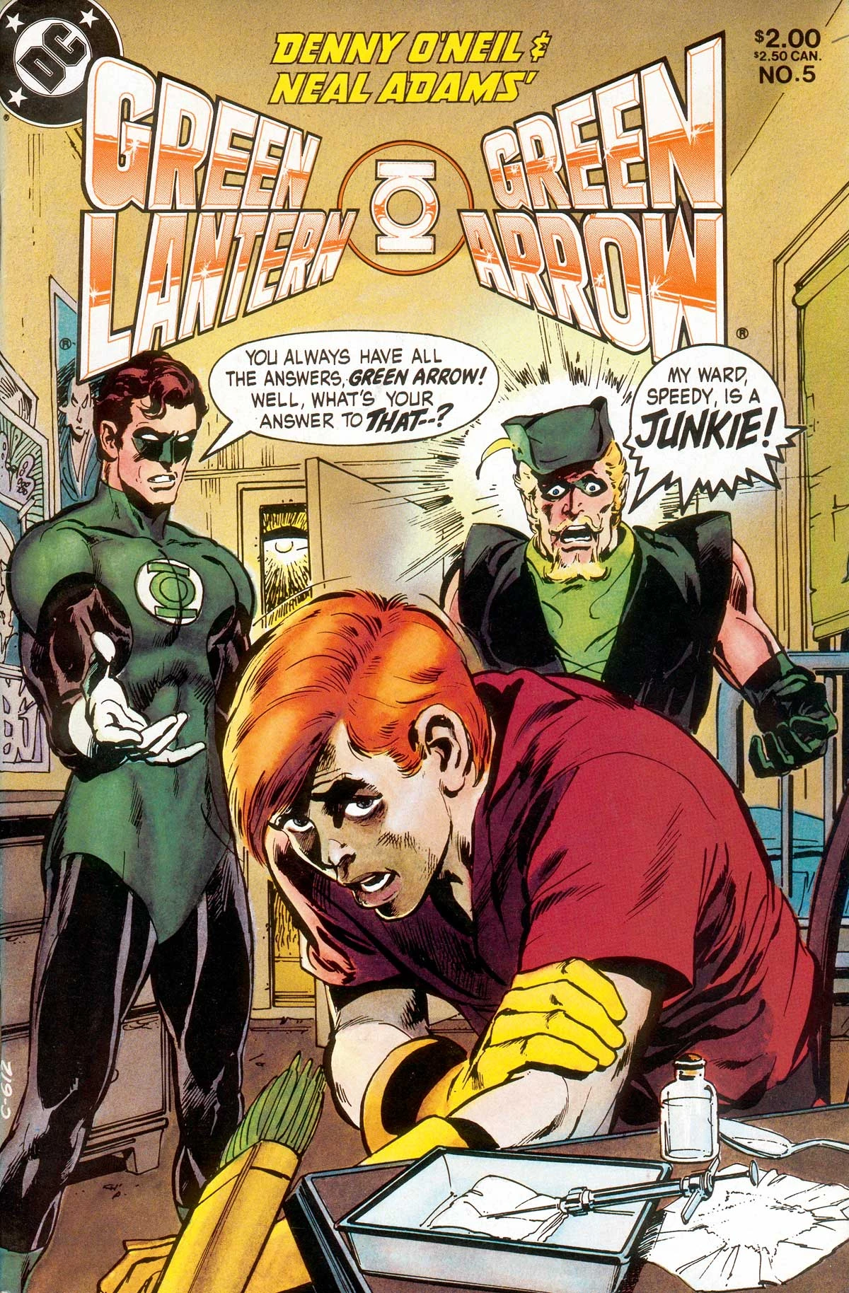 Cliche I know but couldn’t this be considered the most “before it’s time cover”? |
|
|
|
Post by Deleted on Jun 19, 2022 16:58:41 GMT -5
 Cliche I know but couldn’t this be considered the most “before it’s time cover”? Absolutely, great example for sure! I also rehosted your picture as a jpeg if that's ok, the original wasn't showing for me though I could see the link in the code. |
|
|
|
Post by Deleted on Jun 19, 2022 17:17:08 GMT -5
If not for the text box in the middle, this presaged the era of blank variant covers...  -M |
|
|
|
Post by Deleted on Jun 19, 2022 17:22:31 GMT -5
If not for the text box in the middle, this presaged the era of blank variant covers... -M I learn something everyday here, never had seen that before! What was the story behind it? Pure one-off "parody" of sorts? |
|
|
|
Post by Deleted on Jun 19, 2022 17:24:29 GMT -5
If not for the text box in the middle, this presaged the era of blank variant covers... -M I learn something everyday here, never had seen that before! What was the story behind it? Pure one-off "parody" of sorts? I'm not sure, I've never seen the insides of a copy. -M |
|
|
|
Post by Deleted on Jun 19, 2022 17:35:26 GMT -5
I'm not sure, I've never seen the insides of a copy. -M It also reminds me of a series from 2001/2002 from a publisher called "Comics Conspiracy" that was just titled "Comic Book", and every month the cover looked exactly like this except the background color was different. It was likewise a "generic" branded book. I have one issue I got just as a novelty of sorts when it came out.  |
|
|
|
Post by Deleted on Jun 19, 2022 17:39:57 GMT -5
There was a Vertigo Quarterly anthology, 4 one-shots actually named after the four colors in the four-color process (Cyan, Magenta, Yellow, Black) that had simple color covers with text as well... Here's the Cyan issue  and this was the trade collecting all 4 issues...  -M |
|
|
|
Post by tarkintino on Jun 19, 2022 17:54:33 GMT -5
MAD was never short on innovative covers breaking ground, such as the covers for: #20 (February, 1955) 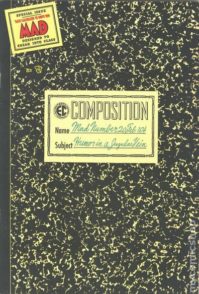 #21 #21 (March, 1955; incorporating EC/ MAD branding into a parody of the Johnson C. Smith & Co. novelty item ads very familiar to comic readers).  #41 #41 (September, 1958). Cover by Kelly Freas.  #57 #57 (September, 1960). Cover by Kelly Freas--the first of two with "usable" hand implements on the cover.  And-- #75 (December, 1962). Cover by Norman Mingo. 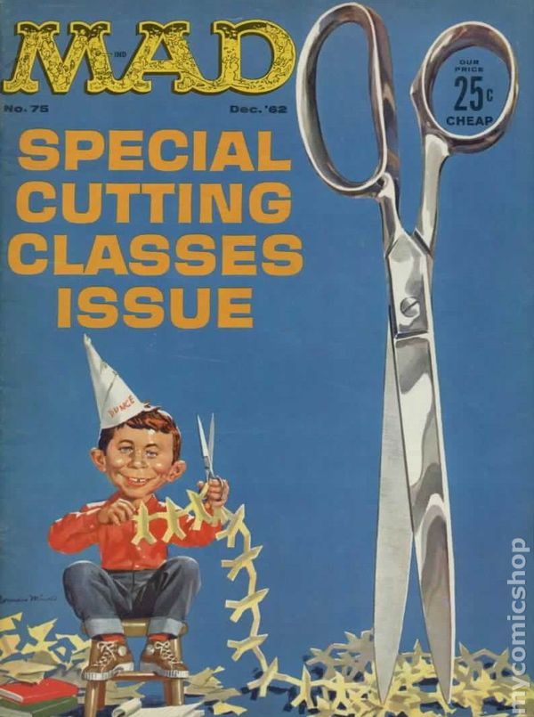
|
|
|
|
Post by codystarbuck on Jun 19, 2022 19:40:12 GMT -5
I learn something everyday here, never had seen that before! What was the story behind it? Pure one-off "parody" of sorts? I'm not sure, I've never seen the insides of a copy. -M One-shot parody.... 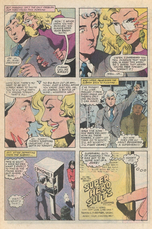 Not quite as effective as Scott McCloud's Destroy.....  This book pretty much prefigured the 90s, perfectly..... 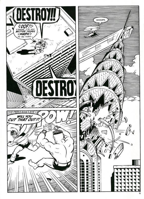 |
|
|
|
Post by Calidore on Jun 19, 2022 19:40:58 GMT -5
If not for the text box in the middle, this presaged the era of blank variant covers... -M I learn something everyday here, never had seen that before! What was the story behind it? Pure one-off "parody" of sorts? According to CBR, the writer was Stephen Skeates, working under Larry Hama. No art credit is given. The article also has a few interior pages that may explain why no artist has claimed the work. www.cbr.com/marvel-comics-generic-comic/This reminded me of a generic greeting card my sister gave me once for my birthday. Plain white cover with just the text "Greeting Card", and on the inside it just said, "Whatever." |
|
Crimebuster
CCF Podcast Guru
Making comics!
Posts: 3,944 
|
Post by Crimebuster on Jun 19, 2022 22:56:48 GMT -5
I've read it, and it's just as generic as advertised. It's a parody of all the most generic superhero cliches, but played so straight none of it is funny. So it's just boring.
|
|
|
|
Post by Deleted on Jun 20, 2022 5:55:58 GMT -5
Here's another one that always hit my eyes kind of funny...the coloring on the Thing from this issue in 1963. Not sure if this is a washed color approach here like DC used on full covers a number of times during this era? But with only the Thing (and I think the grass, tree, and maybe the flame?) having that coloring and the rest looking traditional, I don't know, it almost seems like some kind of digital coloring thing they might have tried in say the late 90's or early 2000's. Almost like he was "Photoshopped" in.  |
|