|
|
Post by Professor Echo on Jun 20, 2022 6:27:50 GMT -5
These might be examples....Minimalist covers of early Golden Age:  Early example of a meta cover:  Shock value:  Experimental color/tint for effect: 
|
|
|
|
Post by tarkintino on Jun 20, 2022 6:56:50 GMT -5
Here's another one that always hit my eyes kind of funny...the coloring on the Thing from this issue in 1963. Not sure if this is a washed color approach here like DC used on full covers a number of times during this era? But with only the Thing (and I think the grass, tree, and maybe the flame?) having that coloring and the rest looking traditional, I don't know, it almost seems like some kind of digital coloring thing they might have tried in say the late 90's or early 2000's. Almost like he was "Photoshopped" in.  I've always loved this cover; the approach to the Thing seemed to be a "how he would look in real life" experiment. |
|
|
|
Post by MDG on Jun 20, 2022 8:50:33 GMT -5
This is kind've a "high concept" cover, with no real clue about the story: 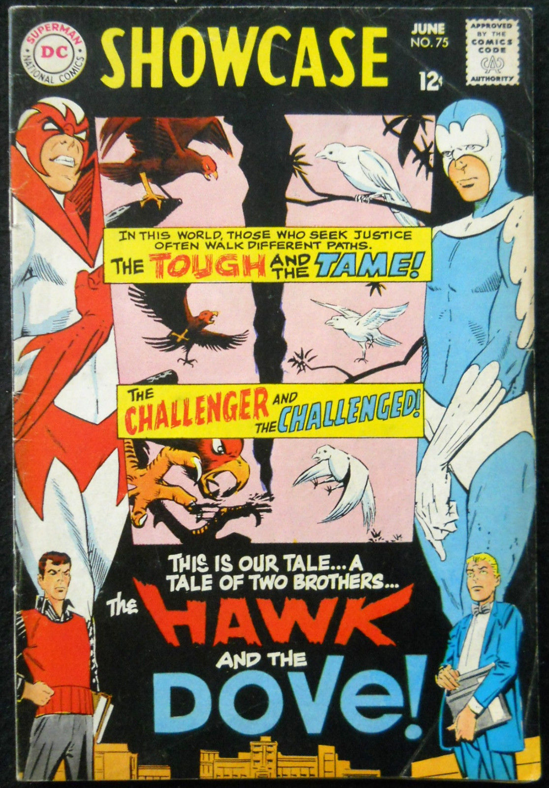 On the other hand, this dives right into the story... 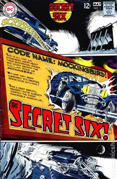 |
|
|
|
Post by EdoBosnar on Jun 20, 2022 10:11:05 GMT -5
I always thought the cover to Spider-man #28 was really ahead of its time...  It looked nothing like any of the other covers Ditko did for Spider-man at the time, nor anything else produced by Marvel, or DC, during the 1960s. |
|
|
|
Post by Deleted on Jun 20, 2022 10:42:46 GMT -5
I always thought the cover to Spider-man #28 was really ahead of its time... It looked nothing like any of the other covers Ditko did for Spider-man at the time, nor anything else produced by Marvel, or DC, during the 1960s. Always loved that one, and thought ASM #188's cover must have been an homage many years later:  |
|
|
|
Post by Farrar on Jun 20, 2022 13:57:26 GMT -5
Every once in a while I run into a comic book cover that really strikes me as very different from the era it was created in. I don't mean so much the clearly "groundbreaking" ones that signaled the beginning of a new era of style (e.g. Neal Adams), but rather just one-off covers that seem a bit "out of period". For instance, this Showcase cover from 1968 looks to me almost like it could be made today. The typography, and just the overall layout: Always loved this cover. And I'm sure many here already know this, but Jay Scott Pike based the main figure on the famous Marilyn Monroe calendar pic from 1952.
ETA: Oh, I guess I should add an NSFW note. Done. |
|
|
|
Post by Deleted on Jun 20, 2022 14:05:24 GMT -5
Every once in a while I run into a comic book cover that really strikes me as very different from the era it was created in. I don't mean so much the clearly "groundbreaking" ones that signaled the beginning of a new era of style (e.g. Neal Adams), but rather just one-off covers that seem a bit "out of period". For instance, this Showcase cover from 1968 looks to me almost like it could be made today. The typography, and just the overall layout:Always loved this cover. And I'm sure many here already know this, but Jay Scott Pike based the main figure on the famous Marilyn Monroe calendar pic from 1952.
ETA: Oh, I guess I should add an NSFW note. Done. I kick myself every time I see that cover. I passed on a copy at $15 about 2013 when I was helping out in a shop thinking I could always find another copy later and maybe at a better price because it was a throwaway issue that would never be in demand. I was dead wrong. Now, you can't touch a low grade copy for under $100 and high grade copies are through the roof. -M |
|
|
|
Post by MDG on Jun 20, 2022 14:13:16 GMT -5
I kick myself every time I see that cover. I passed on a copy at $15 about 2013 when I was helping out in a shop thinking I could always find another copy later and maybe at a better price because it was a throwaway issue that would never be in demand. I was dead wrong. Now, you can't touch a low grade copy for under $100 and high grade copies are through the roof. -M What's oddest about the Dolphin cover for the time was the lack of balloons, blurbs, and come-ons, especially with so much open space on the cover. |
|
|
|
Post by Ish Kabbible on Jun 20, 2022 14:37:12 GMT -5
I kick myself every time I see that cover. I passed on a copy at $15 about 2013 when I was helping out in a shop thinking I could always find another copy later and maybe at a better price because it was a throwaway issue that would never be in demand. I was dead wrong. Now, you can't touch a low grade copy for under $100 and high grade copies are through the roof. -M What's oddest about the Dolphin cover for the time was the lack of balloons, blurbs, and come-ons, especially with so much open space on the cover. Exactly. Looks like a cover from Dell |
|
|
|
Post by Graphic Autist on Jun 20, 2022 15:06:46 GMT -5
Whoa...it's sideways. And...TATTOOZ! 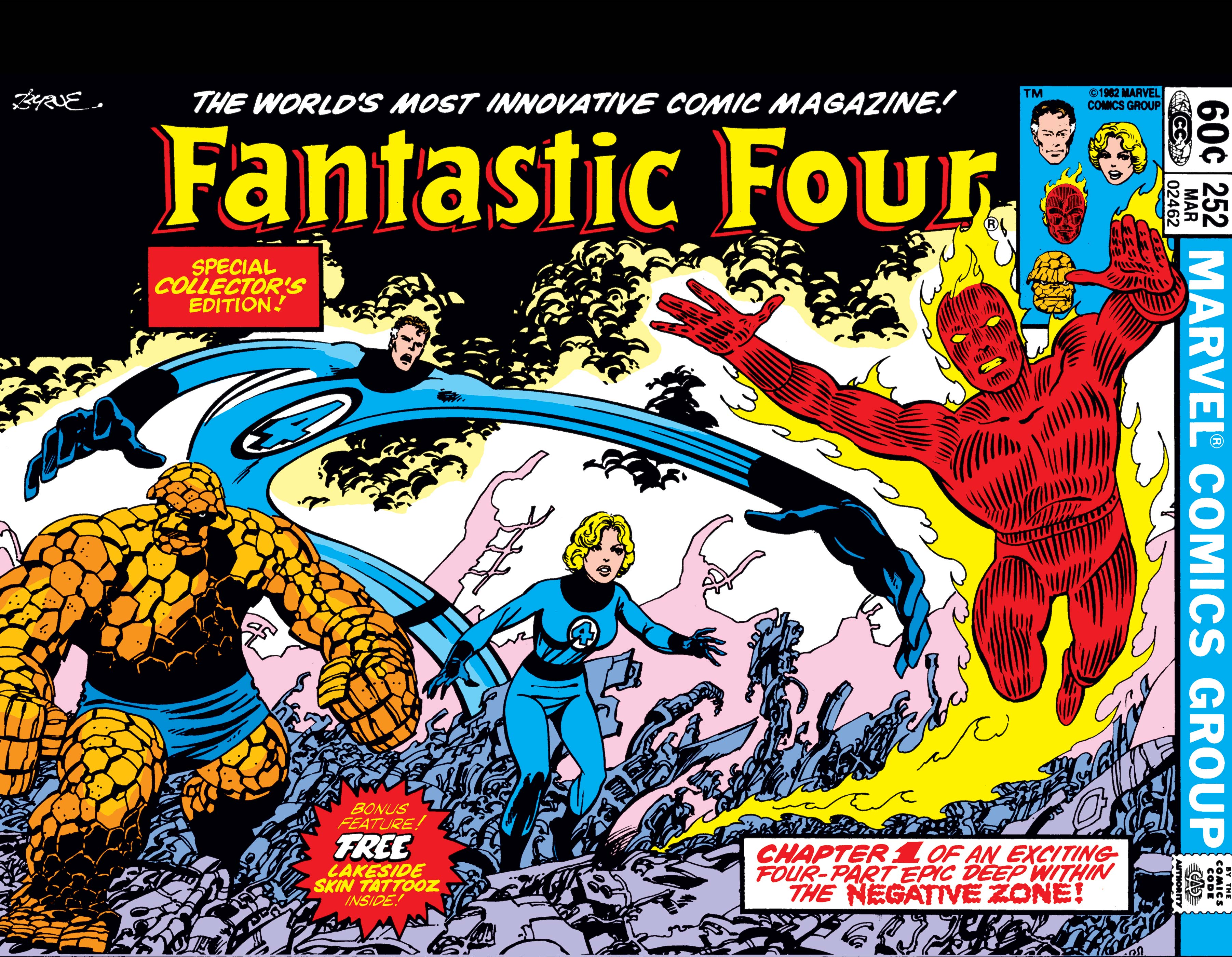 |
|
|
|
Post by MDG on Jun 20, 2022 15:52:36 GMT -5
Whoa...it's sideways. And...TATTOOZ! No tatoos, but... 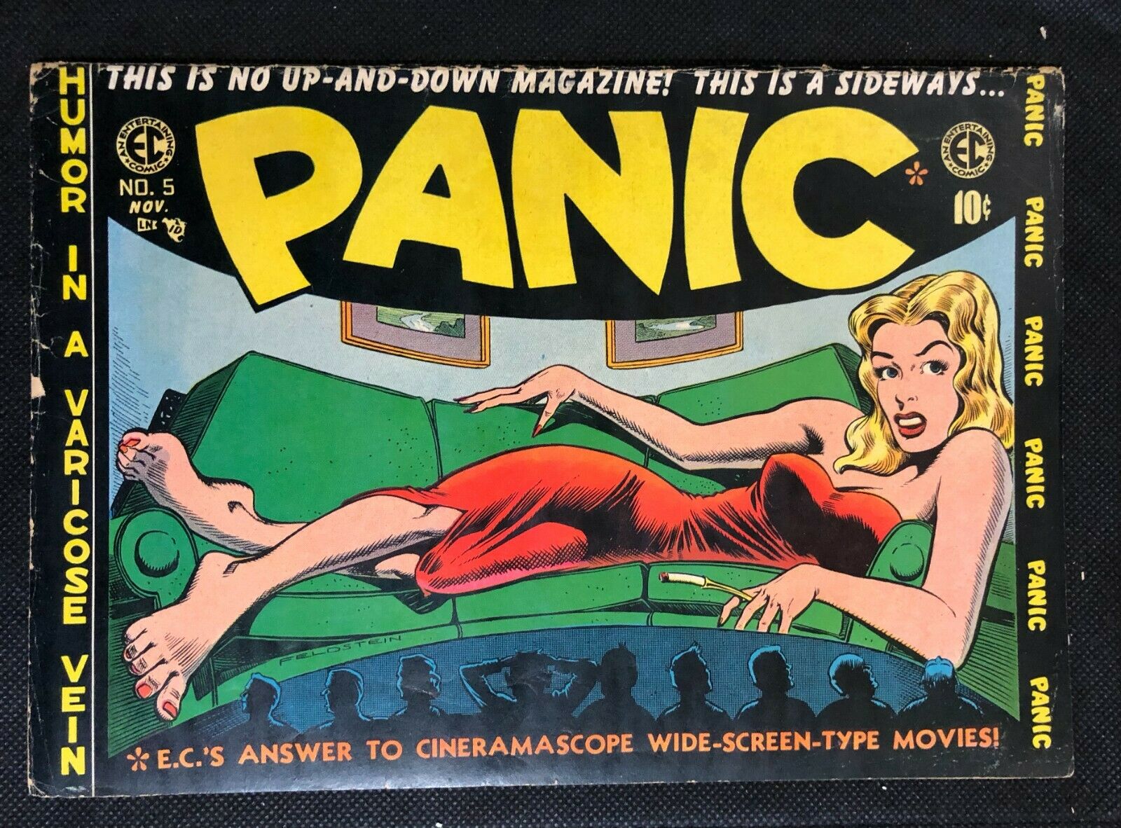 |
|
|
|
Post by Calidore on Jun 20, 2022 19:00:47 GMT -5
In the '80s, had the likes of Moonshadow's gorgeous watercolor covers ever been seen before?
|
|
|
|
Post by Prince Hal on Jun 20, 2022 23:15:15 GMT -5
This Batman comic from August 1967 has to be one of the earliest "broken/crumbling/logo" covers.  It was followed by a few other examples, like Flash 174 in November of '67; Hulk Annual 1 in 1968; Blackhawk 243, November 1968; Aquaman 42 from December 1968.  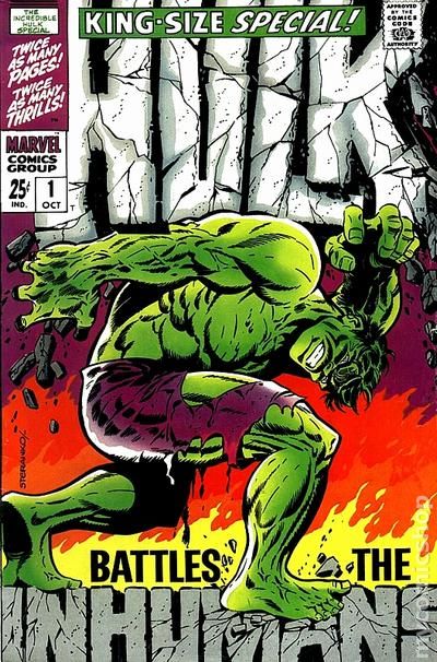   |
|
|
|
Post by Ish Kabbible on Jun 20, 2022 23:26:48 GMT -5
Here's A Mad Magazine cover from 1960, predicting the outcome of the 1968 and 1972 elections  |
|
|
|
Post by Prince Hal on Jun 21, 2022 6:14:15 GMT -5
Here's A Mad Magazine cover from 1960, predicting the outcome of the 1968 and 1972 elections That issue was printed with a double cover with the other congratulating JFK. |
|