|
|
Post by EdoBosnar on Jun 21, 2022 7:05:42 GMT -5
Best part about that Mad cover? "I like Dick" *snerk*
|
|
|
|
Post by Slam_Bradley on Jun 21, 2022 8:44:27 GMT -5
This Batman comic from August 1967 has to be one of the earliest "broken/crumbling/logo" covers.  It was followed by a few other examples, like Flash 174 in November of '67; Hulk Annual 1 in 1968; Blackhawk 243, November 1968; Aquaman 42 from December 1968.  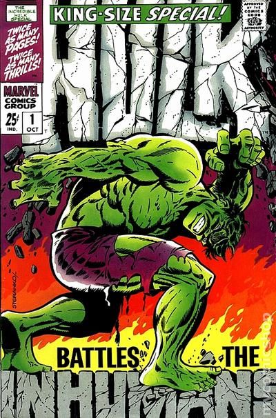   But really these were all kind of riffing on things that Will Eisner did in the Spirit supplement. |
|
|
|
Post by Prince Hal on Jun 21, 2022 9:18:09 GMT -5
Slam_Bradley, you're right. I should have thought of those! One of many f'rinstances... 
|
|
|
|
Post by badwolf on Jun 21, 2022 14:52:26 GMT -5
Best part about that Mad cover? "I like Dick" *snerk* I was trying to find a funny image for this... whatever you do, don't Google "kirsten dunst dick gif". |
|
|
|
Post by tonebone on Jun 21, 2022 15:14:28 GMT -5
I learn something everyday here, never had seen that before! What was the story behind it? Pure one-off "parody" of sorts? According to CBR, the writer was Stephen Skeates, working under Larry Hama. No art credit is given. The article also has a few interior pages that may explain why no artist has claimed the work. www.cbr.com/marvel-comics-generic-comic/This reminded me of a generic greeting card my sister gave me once for my birthday. Plain white cover with just the text "Greeting Card", and on the inside it just said, "Whatever." I believe from the interior pages, the artist is Tony Salmons, a frequent contributor to Crazy magazine. |
|
|
|
Post by tonebone on Jun 21, 2022 15:18:04 GMT -5
In the '80s, had the likes of Moonshadow's gorgeous watercolor covers ever been seen before?
That is a beautiful cover, but painted covers had been around for a LONG time. Just look at the previous 30 years of output from Gold Key. Maybe not a lot of watercolor, but lots of paint. |
|
|
|
Post by chadwilliam on Jun 21, 2022 18:42:25 GMT -5
 Though commonplace today given how well versed collectors are expected to be when it comes to recognizing an homage cover, it's strange to see DC referencing an image ( Adventure 247) which would likely have been considered "old" (three years in 1961 when Superman 147 was published) by the standards of the time. The average kid was expected to stick with comics for five years and then move on to other pursuits. They were assumed to have such little familiarity with the history of their favorite characters that the publisher could reveal that Luthor and Superman were once boyhood chums without their batting an eye; that any character who hadn't been seen in five years could be re-introduced with a fancy new civilian identity, outfit, and backstory without most readers being any the wiser; that Captain America vanished in 1944 without ever making it into the 1950s and with Bucky in tow. Of course, by 1961, DC figured out that there were fans with longer memories than they'd previously credited them with, but still, during a period when to recognize that 1958 image being paid tribute to you would have had to have seen it or purchased it and held onto/remembered it since there were no books, magazines, internet to point it out to you, it's interesting that DC decided to go in that direction. In fact, at that time, a better word than 'homage' for something like this might have been 'in-joke'. 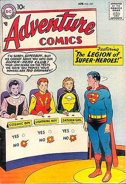 |
|
|
|
Post by Farrar on Jun 21, 2022 21:15:34 GMT -5
.... Experimental color/tint for effect:  .... ^^^^ Always loved this type of cover. Marvel back then had some other really striking covers that had used a similarly "limited palette" (one or two main colors) -- a few that come to mind are X-Men #17, Sgt. Fury #16 , and Tales to Astonish #98. And a mere month after Avengers #57, we get this!  Courtesy of Steranko (pencils/inks/colors). Today "pin-up" type covers, complete with dramatic/symbolic/nontraditional coloring, are commonplace, but back in 1968 Avengers #57's and X-Men #50's covers really stood out. |
|
|
|
Post by Farrar on Jun 21, 2022 21:27:17 GMT -5
Three covers that strike me as being definitely "ahead" of their time--ahead of any time, actually  -- are these 3 covers by artist William Ekgren. These are from late 1952/early 1953 and they seem to me to be atypical of what would have been on the stands back then, at least when it comes to comic books. Strange Terrors #4 cover date Nov. 1952  Weird Horrors #6 Weird Horrors #6 Feb. 1953  Weird Horrors #7 Weird Horrors #7 April 1953  As has been chronicled online and in print: in 1952 Ekgren was displaying his paintings in a Greenwich Village (NYC) open market when he was approached by the St. John publisher who bought three of Ekgren's paintings. The paintings were reproduced (and returned to Ekgren) and used as the basis for covers for three St. John horror comic books, the three shown above. Ekgren did no other known work for comic books, at least not for American comics. He passed away at age 98 in 2016. |
|
|
|
Post by berkley on Jun 22, 2022 0:15:41 GMT -5
Three covers that strike me as being definitely "ahead" of their time--ahead of any time, actually -- are these 3 covers by artist William Ekgren. These are from late 1952/early 1953 and they seem to me to be atypical of what would have been on the stands back then, at least when it comes to comic books. Strange Terrors #4 cover date Nov. 1952 Weird Horrors #6 Feb. 1953 Weird Horrors #7 April 1953 As has been chronicled online and in print: in 1952 Ekgren was displaying his paintings in a Greenwich Village (NYC) open market when he was approached by the St. John publisher who bought three of Ekgren's paintings. The paintings were reproduced (and returned to Ekgren) and used as the basis for covers for three St. John horror comic books, the three shown above. Ekgren did no other known work for comic books, at least not for American comics. He passed away at age 98 in 2016.
I'd say that they'd be just as ahead of their time if they appeared today in 2022.
|
|
|
|
Post by tonebone on Jun 22, 2022 7:27:29 GMT -5
Sergio Toppi's scratchboard covers for Marvel's 1602 limited series were quite striking and classy.   |
|
|
|
Post by james on Jun 22, 2022 15:20:49 GMT -5
I can’t find it and it certainly wasn’t a good time for comics in the 90’s but does anyone the first gimmicky cover that was so prevalent in the 90’s? Take your pick foil cover, die-cut, hologram etc etc etc🤦🏻♂️
|
|
|
|
Post by Calidore on Jun 24, 2022 8:08:26 GMT -5
In the '80s, had the likes of Moonshadow's gorgeous watercolor covers ever been seen before?
That is a beautiful cover, but painted covers had been around for a LONG time. Just look at the previous 30 years of output from Gold Key. Maybe not a lot of watercolor, but lots of paint. Jeez, forgot all about Gold Key somehow. |
|
|
|
Post by berkley on Jun 26, 2022 2:14:17 GMT -5
I've tried and I've tried and I've tried - and I still haven't been able to come up with a good Modok joke in response to the title of this thread.
|
|
|
|
Post by Prince Hal on Jun 26, 2022 7:47:11 GMT -5
Who's ahead, Modok... or this guy? (Reprint and original)  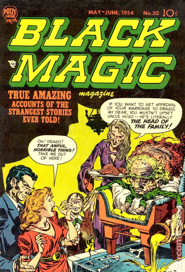 |
|


 -- are these 3 covers by artist William Ekgren. These are from late 1952/early 1953 and they seem to me to be atypical of what would have been on the stands back then, at least when it comes to comic books.