|
|
Post by pinkfloydsound17 on May 27, 2016 18:11:23 GMT -5
Never mind...duh...SS #3
|
|
|
|
Post by Warmonger on May 27, 2016 18:40:40 GMT -5
Probably my favorite rendering of Mephisto 
Where is this from??? Any issue in particular?
I think it's from Thor Annual 13, though I could be mistaken. |
|
|
|
Post by berkley on May 28, 2016 9:43:52 GMT -5
John is famous for hating the work of most of his inkers. I had assumed that he disliked inkers whose own style was different from his own because they overwhelmed his clean and classic pencils : certainly, the lush work of Chan and Alcala makes the final result look like Chan and Alcala more than Buscema. But then John liked the work of Tom Palmer, Steve Gan and Tony DeZuniga, whose respective styles don't look like John's either... So I'm puzzled as to why he liked certain inkers and not others. For my money, the Buscema-Alcala team was a beautiful case of synergy. The two men brought something different to the art, and it looked better in the end than the sum of its parts. I agree, but I can kind of see why he might have liked deZuniga and Gan (though I personally don't) - their styles don't really look like his or like each other but there is a certain rough edge to all three that he might have appreciated, or perhaps thought appropriate to Conan. |
|
|
|
Post by earl on May 28, 2016 9:54:35 GMT -5
I'd put 'The Tower of the Elephant' in the list of the best Marvel comics artwork. That hybrid with Buscema and Alcala on that story is amazing.
Last night I read a Big John comic that was new to me. It was 'The Punisher: A Man Called Frank' graphic novel written by Chuck Dixon. It has to be a pretty rare comic for Buscema doing a western. Story is pretty rote, but it was enjoyable enough.
|
|
|
|
Post by Roquefort Raider on May 30, 2016 8:44:07 GMT -5
|
|
|
|
Post by Batflunkie on May 30, 2016 9:14:47 GMT -5
Buscema is, in my mind, part of the all-mighty collective god head of Marvel artists. His work has always reminded me of Kirby, but with more modern sensibilities applied like that of Neal Adams. Most of that comes from the sheer thickness of the linework I think
|
|
|
|
Post by Batflunkie on May 30, 2016 9:17:03 GMT -5
I'd get that Galactus and Silver Surfer as a tattoo, no joke |
|
|
|
Post by Action Ace on May 30, 2016 13:50:38 GMT -5
from Dial B For Blogthere's some of his work on the "other side of the street" |
|
|
|
Post by Warmonger on Jun 10, 2016 12:44:44 GMT -5
Conan Annual #7  |
|
|
|
Post by berkley on Jun 10, 2016 16:43:16 GMT -5
From Savage sword of Conan #19 : 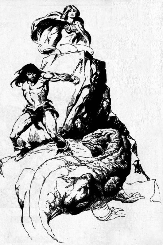 I like this one especially, for its partial reversal of the usual Conan/damsel positioning. The Kull and Solomon Kane are pretty good too. The Red Sonja was a little weak, I thought. |
|
|
|
Post by Icctrombone on Jun 10, 2016 22:38:08 GMT -5
A great moment in Comic history when Big John drew Superman.  |
|
|
|
Post by Icctrombone on Jun 10, 2016 22:40:33 GMT -5
From Epic Illustrated Buscema with Nebres  |
|
|
|
Post by Batflunkie on Jun 11, 2016 6:37:24 GMT -5
From Epic Illustrated Buscema with Nebres There's just something about late 70's/early 80's sci-fi and fantasy artwork that just "speaks" to me. Kind of makes me wonder why sci-fi went from being "pulp fantasy with rayguns" to being "deeply entrenched social commentary hiding behind technological metaphors". It seems like the former just died out went the first Star Wars film hit |
|
|
|
Post by Nowhere Man on Jun 11, 2016 6:41:34 GMT -5
Huge John Buscema fan. Next to Kirby, he's the quintessential Marvel artist in my book. His best work is in Conan and Savage Sword of Conan, but one of his lesser known gems is Thor Annual #13. The whole book is gorgeous, but this might be my favorite image:  |
|
|
|
Post by Nowhere Man on Jun 11, 2016 6:43:17 GMT -5
Where is this from??? Any issue in particular?
I think it's from Thor Annual 13, though I could be mistaken. Ha, Thor Annual #13 is correct. |
|