|
|
Post by batlaw on Sept 30, 2015 3:43:14 GMT -5
Couldn't find the image online, but the worst cover I can think of is "Image Plus #1" from image comics. Just a big black image "i" logo making up the cover. Not even a bad drawing or ugly picture. Just a logo. And a dull one. Not even holographic or silver foil or anything.
|
|
|
|
Post by Deleted on Sept 30, 2015 3:47:02 GMT -5
Couldn't find the image online, but the worst cover I can think of is "Image Plus #1" from image comics. Just a big black image "i" logo making up the cover. Not even a bad drawing or ugly picture. Just a logo. And a dull one. Not even holographic or silver foil or anything. Here you go....  seems to be along the lines of this classic...  -M |
|
|
|
Post by Icctrombone on Sept 30, 2015 5:43:02 GMT -5
I don't care what anyone says, that's gotta hurt the spine.  Unfortunately, there was more of the same inside the book.  |
|
|
|
Post by tingramretro on Sept 30, 2015 6:07:01 GMT -5
I don't care what anyone says, that's gotta hurt the spine.  I consider your complaint intolerant and distasteful. What exactly do you have against conjoined twins? I think the fact that these two ladies have managed to forge a successful career as Avengers despite being joined at the arse speaks very highly of their spirit and determination! |
|
|
|
Post by Deleted on Sept 30, 2015 8:24:22 GMT -5
oh.. so, so close. but I see YOUR Liefeld Cap, and raise you this: 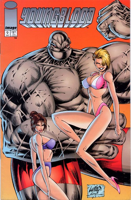 Hmm. So, the girl in pink appears to be hovering in front of the big bloke, who is clearly either standing in a hole, or else the really tiny girl in blue is actually standing on a stepladder. Well, that all seems fine to me... and nevermind pink girl has no right foot (and Purple girl has teeny tiny doll hand for a right hand (and apparently no left hand). . but the "big bloke" ?. .has no wrist on the arm pinky is sitting on! |
|
|
|
Post by tingramretro on Sept 30, 2015 9:47:37 GMT -5
Hmm. So, the girl in pink appears to be hovering in front of the big bloke, who is clearly either standing in a hole, or else the really tiny girl in blue is actually standing on a stepladder. Well, that all seems fine to me... and nevermind pink girl has no right foot (and Purple girl has teeny tiny doll hand for a right hand (and apparently no left hand). . but the "big bloke" ?. .has no wrist on the arm pinky is sitting on! Wait-she's supposed to be sitting on it? But she doesn't appear to be touching it at all, I assumed she was just hanging in mid air about a foot in front of him! |
|
|
|
Post by MWGallaher on Sept 30, 2015 13:58:06 GMT -5
Those are all some gloriously bad covers, but nothing, in my opinion, beats this one for sheer, repulsive awfulness:  I've never been a big fan of Jon Bogdanove's work, but I found most of it at least tolerable, but this...this...is just...*choke*... |
|
|
|
Post by MWGallaher on Sept 30, 2015 14:07:27 GMT -5
And first runner up in my rankings is this atrocity:  At least Liefeld's worst covers are amusingly bad. This thing is amateurish work, poorly designed, unimaginatively colored, with pathetic "special effects" (in the water), lazy details, a total failure at conveying any dynamicism in whatever the heck is supposed to be happening with that pink energy blast (which is conveniently curving?! to fit in the cover space)...ugh...and I've usually enjoyed everything I've seen from artists June Brigman and Terry Austin, but not this! I'm not much of an artist, but I'm utterly confident that I could produce a far better cover than this thing. And to think that Marvel Fanfare was originally promoted as a "high end" artistic showcase (even though it was actually a dumping ground for unused inventory stories)... |
|
Confessor
CCF Mod Squad
Not Bucky O'Hare!
Posts: 10,232 
|
Post by Confessor on Sept 30, 2015 14:29:03 GMT -5
Some of the covers in this thread are making me feel very angry. Stop doing comics wrong!!  |
|
|
|
Post by MDG on Sept 30, 2015 15:16:12 GMT -5
This one always bugged me: it's the back cover of a Marvel "prestige format" one-shot, "The Draft." 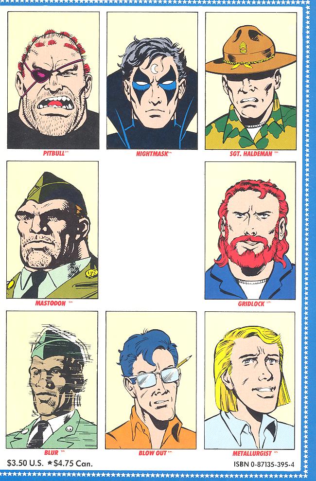 "For the back cover, we'll just use some mediocre portraits of the cast surrounding...." "How about a blank space?" "Great!" One thing about DC in the late 80s, their sense of design was excellent. Well, most of the time, anyway...  Yeesh! |
|
|
|
Post by pinkfloydsound17 on Sept 30, 2015 15:44:53 GMT -5
I will agree that while the story is really good, that above cover is awkward as hell. That being said, there is something about it that still makes it work for me personally.
|
|
|
|
Post by Reptisaurus! on Sept 30, 2015 15:50:47 GMT -5
I will agree that while the story is really good, that above cover is awkward as hell. That being said, there is something about it that still makes it work for me personally. Yeah. Batman is almost too damn ripped to fit on the cover of his comic! I think it's an original idea, very well executed. (I will defend Frank Miller's stuff all day.) |
|
|
|
Post by Prince Hal on Sept 30, 2015 16:08:10 GMT -5
What's sad is that it's so easy to come up with awful covers. How about this monstrosity? 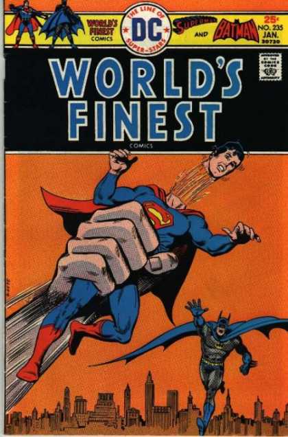 What the hell is going on here? Love Superman's generic expression that captures so vividly how one would look when thinking, "I'm upset that my head just popped off." Horrible "trade dress," which is comic book-ese for graphic nightmare; the ugliest possible shade of orange as a background color; those lines between the segments of Superman's neck: what are they? Blood? Sparklers? Some kind of magical after-effect of disembodied hand-squeezing? When you think of all the beautiful cover images ruined over the years by stupid blurbs and balloons, this ain't one of them. Though, when you realize that the story this illustrates is called -- obviously! -- "Superman's Stolen Birthday." Ah, Maybe that's not Superman, but a party favor dis guised as Superman. Now it all makes sense.. Oh, and don't you love the skyline hommage to Carmine Infantino? Yep, he's so easy to imitate, n'est-ce pas? God, I love the smell of Ernie Chua-Chan and John Calnan in the morning! I keep waiting for Superman to yell "Split!" like that ridiculous Captain Marvel knock-off. Whose horrible cover is actually light-years better than that WF mess-terpiece. 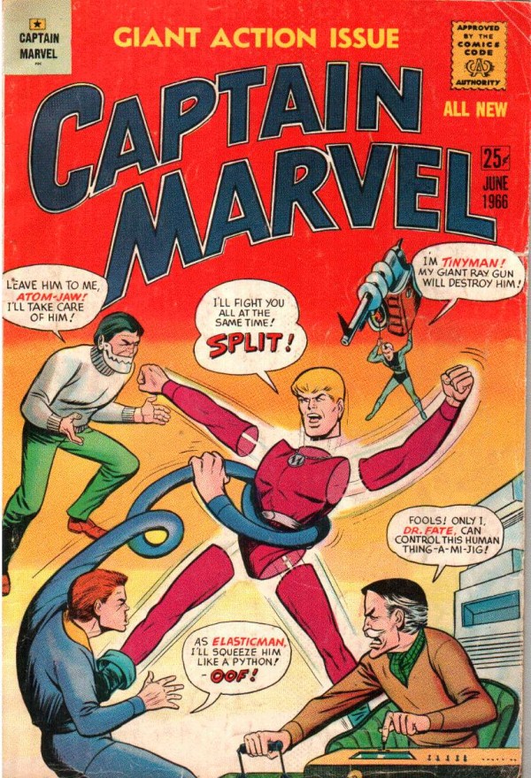 |
|
|
|
Post by Slam_Bradley on Sept 30, 2015 16:15:24 GMT -5
What's sad is that it's so easy to come up with awful covers. How about this monstrosity?  What the hell is going on here? Love Superman's generic expression that captures so vividly how one would look when thinking, "I'm upset that my head just popped off." Horrible "trade dress," which is comic book-ese for graphic nightmare; the ugliest possible shade of orange as a background color; those lines between the segments of Superman's neck: what are they? Blood? Sparklers? Some kind of magical after-effect of disembodied hand-squeezing? I love that cover so very very much!!! It made my list on the Classic Christmas covers. |
|
|
|
Post by pinkfloydsound17 on Sept 30, 2015 16:40:22 GMT -5
I will agree that while the story is really good, that above cover is awkward as hell. That being said, there is something about it that still makes it work for me personally. Yeah. Batman is almost too damn ripped to fit on the cover of his comic! I think it's an original idea, very well executed. (I will defend Frank Miller's stuff all day.) Can you defend Dark Knight Returns 2? |
|