|
|
Post by Deleted on Sept 29, 2015 17:04:12 GMT -5
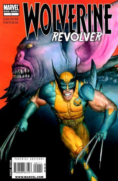
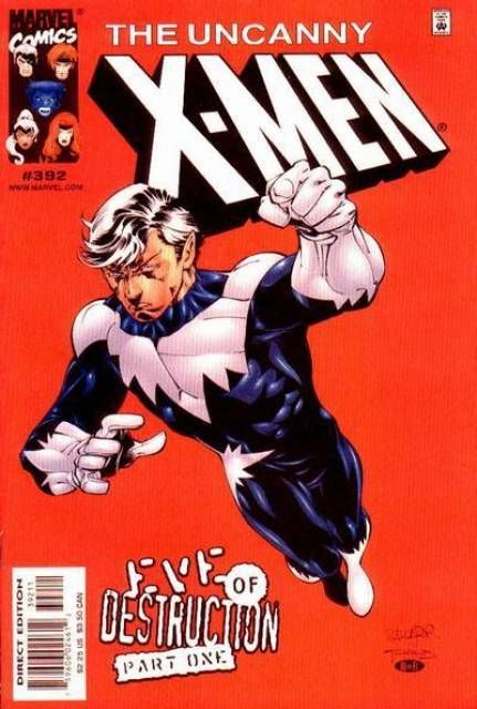
I am probably alone in this, but I actually preferred Rob Liefeld's eagle design on the forehead over the crappy looking big A...always hated the A, looked silly back in the Golden/Silver Age & even more so in the Modern age!! Ha, could you imagine Batman with a big B on his forehead/cowl?? It's actually not an "A." On his planet, it stands for "freedom." |
|
|
|
Post by Warmonger on Sept 29, 2015 17:27:13 GMT -5
 What do I win? /thread |
|
|
|
Post by Reptisaurus! on Sept 29, 2015 17:55:55 GMT -5
Spinning off of the Worst Stories You Have Ever Read thread, I thought it would be cool to see what people think is the worst cover of all-time. Maybe we can have this set up where everyone nominates a cover and then we vote on it? Nothing formal, just for fun. I want to see what people think of as being the worst cover, be it from a particular decade or overall. Of course, reasons and explanations are always enjoyable. And you can decide what makes it the worst. My vote goes to MTU #102  Now, Rhino is never going to win any beauty contests and as corny as he can be, this is absolutely terrible. Add in Doc Samson who I have never loved and always felt was a Hulk-haired, Flash costumed, Luke Cage pants disaster makes this even more unappealing. Oh and a white background...not to symbolize or add more to the cover but well just because I feel like they really couldn't be bothered. By far the worst thing Frank Miller did for the time period. Milgrom too...strange how the cover of the issue is a weird amalgamation of their names yet Miler gets credit everywhere you look. Whoever is ultimately responsible should be ashamed! My vote for the worst cover, definitely the worst from the 80's. I'm not completely sure what's going on with Doc hanging off the Rhino's arm like monkey bars, but I like the overall design of the cover (Kind of looks like a letter "P") and the white background is uncommon and makes it pop out atcha. |
|
|
|
Post by foxley on Sept 29, 2015 18:27:19 GMT -5
I am not responsible for anyone gouging their eyes out after viewing this monstrosity.  |
|
|
|
Post by Gene on Sept 29, 2015 18:37:14 GMT -5
 So. Much. Red. |
|
|
|
Post by Icctrombone on Sept 29, 2015 18:41:12 GMT -5
 Teen with implant boobs, too much going on, what the heck is Robin sitting on, the foreshortening and perspective are all over the place. This is our " Uncle Ben" moment. We wouldn't be here without this first Domino falling. |
|
|
|
Post by DubipR on Sept 29, 2015 19:39:17 GMT -5
I'll leave this one right here......  |
|
|
|
Post by Deleted on Sept 29, 2015 19:48:19 GMT -5
I'll leave this one right here......   |
|
|
|
Post by chadwilliam on Sept 29, 2015 19:59:10 GMT -5
"Of All-Time"? Perhaps not, but this has to be the worst cover Brian Bolland ever did.

|
|
|
|
Post by Prince Hal on Sept 29, 2015 20:46:45 GMT -5
I hope no comics fan stumbles onto this thread after having fallen asleep in the middle of the Kree-Skrull War or Batman visiting the House of Mystery or Kirby's FF run wondering how good comics got while he was sleeping.
When I saw the title I figured I'd search to see if Vinnie Colletta had ever inked a Tony Tallarico cover, but now? They're like Dan Adkins and Wally Wood by comparison to the insult to comics art that is Liefeld.
So glad I stopped reading comics when I did.
|
|
shaxper
CCF Site Custodian
Posts: 22,895
|
Post by shaxper on Sept 29, 2015 22:08:31 GMT -5
"Of All-Time"? Perhaps not, but this has to be the worst cover Brian Bolland ever did.

Winner. |
|
|
|
Post by Deleted on Sept 30, 2015 2:36:36 GMT -5
"Of All-Time"? Perhaps not, but this has to be the worst cover Brian Bolland ever did.

When, I first saw this cover my Jaw dropped to the floor! |
|
|
|
Post by Deleted on Sept 30, 2015 2:42:53 GMT -5
Ok not a Liefeld cover....  ok so a Liefled clone....trying to do Conan...at least the logo says Conan...I have my doubts. -M |
|
|
|
Post by tingramretro on Sept 30, 2015 2:50:24 GMT -5
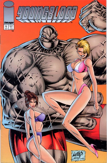
 What do I win? oh.. so, so close. but I see YOUR Liefeld Cap, and raise you this:  Hmm. So, the girl in pink appears to be hovering in front of the big bloke, who is clearly either standing in a hole, or else the really tiny girl in blue is actually standing on a stepladder. Well, that all seems fine to me... |
|
|
|
Post by tingramretro on Sept 30, 2015 2:57:51 GMT -5
What I like about this one is that the title of the magazine perfectly describes the cover image. Still, at least there's sexual equality here: realistically, neither Death's Head II nor Tuck would be able to stand up without scaffolding to support their upper bodies.  |
|