|
|
Post by Cei-U! on Dec 23, 2017 9:14:31 GMT -5
Considering how often I’ve cited Batman as my favorite comic book character, some of you may have been surprised at how few of his enemies have appeared on my list. That was deliberate on my part, since I knew there’d be plenty of others including Joker, Catwoman, et al on their countdowns. But there is one Bat-foe who simply had to be here, and so I give you 2. The Scarecrow You may recall that Gold Key’s heroic Scarecrow made my Best Hero Design list a few years back. There’s something about scarecrows in general that I find both fascinating and frightening, and never more so than with Professor Jonathan Crane’s straw-stuffed alter ego. His lean frame, the baggy brown clothes, the battered broad-brimmed hat, and especially the burlap mask that simultaneously hides his true features and grants him an eerie, unsettling expressiveness all haunt my imagination. He looks good under almost every artistic hand but never moreso than when the late great Don Newton was at the drawing board. More than any other Bat-foe, Scarecrow is the stuff of nightmares. Cei-U! I summon the big chill! By the way, the Day One thread will probably not be posted til sometime tomorrow afternoon as I’m spending the night at my sister’s. If I do post it earlier, it will of necessity not include a picture until later in the day. |
|
|
|
Post by Pharozonk on Dec 23, 2017 9:56:57 GMT -5
#2. Professor ZoomThe Silver Age flash design stands out as one of the all-time great designs to come out of the DC revitalization of its classic heroes. It's sleek and simple, emphasizing his speed through the winged tips on the mask and boots. The red and yellow color scheme is bright and vibrant, tied together by the lightning stripe around the waist. It only stands to reason that it would also look good inverted, as is the case with Professor Zoom (and to an extent Zoom). The yellow, which is usually an accenting color rather than a primary costume color, is jarring and assaults the eyes, but in a way that works. 
|
|
|
|
Post by Deleted on Dec 23, 2017 9:57:12 GMT -5
On the Eleventh Day of Christmas, Santa said to me, beware these stupid, stupid hordes.... Kingdok and the Rat Creatures designed by Jeff Smith 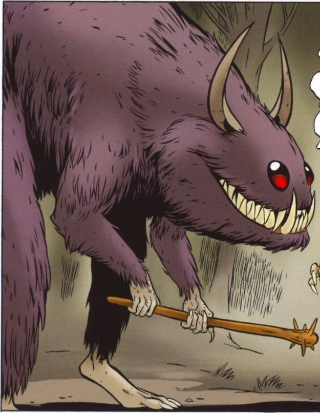 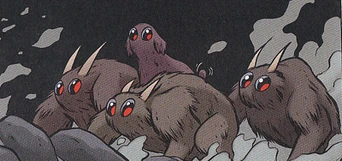 It may be my experience as a D&D player/DM, but I love me some hordes of monstrous creatures, especially when the leader is of the same design, just bigger and badder, and Kingdok and the Rat Creatures fit that bill, plus there adorable as well as frightening. A single rat creature looks harmless and adorable, but en masse as a teeming horde overrunning where you live, they;re terrifying, just likes a horde of rats would be. Big eyes, sharp teeth, horns, they've got all the trademarks of the scary monster of childhood nightmares, but they're big and fluffy. Which is all a tribute to Jeff Smith's design genius. They work on every level for a story like Bone aimed at all ages (not just kids). They hit all the right notes but do so in a way that makes being terrified a fun experience for those reading, not a disturbing one. They evoke the thrill of the scary monster without the actual soul shaking terror some monsters can, the way the best designed monsters do (especially the Universal monsters) that leave a lasting impression and fondness for that design that lasts well beyond the reading experience. And Kingdok works the same way, he is quintessentially a Rat Creature, one of the horde, but bigger and badder and carries a mean stick to beat you with (sometimes I think Kirkman drew from Kingdok when he armed Neegan with Lucille, it;s the same idea of the big bad with a beat stick). -M |
|
|
|
Post by thwhtguardian on Dec 23, 2017 10:04:38 GMT -5
I went back and fourth on this one and what will be my number one pick but on the Eleventh day I give you... The Shredder Eastman and Laird, 1984 I mentioned previously in my post about Agat that I loved the samurai look and as my first real exposure to that style I'm betting that love is in large part due to just how awesome the Shredder looked. He's got the classic samurai helmet...but with spikes, and traditional samurai shoulder pads and gauntlets...but with spikes. Yep, he's got sharp spikes just about everywhere, as Michelangelo remarked in the film, "I bet he never has to look for a can opener." which isn't very practical as far jumping around doing ninja stuff is concerned as I'd imagine you'd stab yourself by accident just moving around but hey it's a damn intimidating look so damn practicality. He may have actually been pretty much a push over for the turtles in the comics when you really get down to it but he looked cool while he was around.  |
|
Confessor
CCF Mod Squad
Not Bucky O'Hare!
Posts: 10,199 
|
Post by Confessor on Dec 23, 2017 10:22:09 GMT -5
2. Mean Machine Angel Like Judge Death, who I chose on the 6th Day of Classic Comics Christmas, Mean Machine Angel comes from the pages of the Judge Dredd strip in 2000 AD comic. One of the notorious Angel Gang of the Cursed Earth wastelands, Mean was an instant favourite of mine from the moment I first encountered him, in the "Judge Child Quest", which ran from Progs #156-181 in 1980. His design was concocted by writers John Wagner and Alan Grant, with artist Mike McMahon. Mean Machine cuts an imposing and threatening figure with that huge, deadly cybernetic claw standing in for his right arm, an armoured skull cap, robotic right eye and a stump of a left arm (having had it shot away by Judge Dredd in an early appearance). However, absolutely the best thing about the character is the dial on his forehead, which controls his temper and level of aggression. On 1 he's surly; on 2 he's mean; on 3 he's vicious, and on 4 he's brutal. Better yet, on occasion, Mean Machine's dial gets stuck on 4½, sending him into an uncontrollable berserker rage. Dangerously unhinged at the best of times, Mean Machine becomes a much, much more formidable foe as the settings on his dial go up. As soon as this years Classic Comics Christmas theme was announced, I new that without doubt Mean Machine would be in my top 3. It's just a fantastic design and concept, as far as I'm concerned. 
|
|
|
|
Post by Jesse on Dec 23, 2017 10:29:53 GMT -5
2. Green Gobin One of the scariest villain designs ever the face alone is nightmare inducing. Certain elements feel like they shouldn't work together like the pointed boots and long hat feel goofy but when added with the pointy ears and green chain mail that looks like reptilian scales it's just a very threatening design. It's scary but it's also fun like the green and purple color scheme as well as the bombs shaped like Jack-o'-lanterns. Plus he flies around and a giant metal bat. What's not to like?!  
|
|
|
|
Post by berkley on Dec 23, 2017 10:58:27 GMT -5
2. Hela
design by Jack Kirby Amazingly effective visual for this character, and I'm not sure I've seen anyone else get it quite right. John Buscema, for example, made her a bit too willowy and slender. Kirby's Hela has the stature and physical presence of a Goddess. She not only towers above the tall God of Thunder, but she looks physically powerful, in an entirely feminine way. The body-language and god-like impassivity of her expression are also key features - for example, she doesn't walk she strides (as seen on the cover to Thor #150 reproduced in earlier Hela posts).   All this and I haven't even mentioned the intricate design of her costume - the patterns on which changed at Kirby's whim, IIRC - and of course the famous headdress (the only thing they really got right in the movie, IMO).
|
|
|
|
Post by Slam_Bradley on Dec 23, 2017 11:09:15 GMT -5
In at Number 02, with a bullet, on our countdown, the lady who makes the collective heart of the Far East beat a whole lot faster (particularly that of Pat Ryan)... The Dragon Lady Caniff created the ultimate femme fatale of the dangerous Orient. Every bit of the look was designed to convey sultry mystery and danger. The Dragon Lady's look would permeate comics for decades. 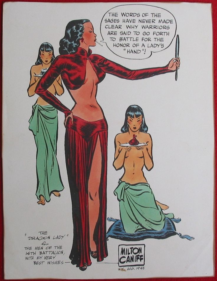 |
|
|
|
Post by Deleted on Dec 23, 2017 11:11:55 GMT -5
2, Hela  Kirby created it, John Buscema enhanced it and I felt that this character is totally a spectacle when she walks in the room and all eyes are centered on her. Her massive headpiece, cape, and the incredible design of this character make her an impressive villainess that she really is. I just in awe of this character and I've been fascinated ever since I started reading The Mighty Thor since mid-60's. I was stunned when I saw her for the first time back then. The two tone green shaded with black tones and all that makes her omnipotent and dangerous to all heroes alike including Thor of which I've believe one of his most difficult opponents ever. Her green cape is perfectly flow(s) and along with her massive headpiece is alone impressive. Add that and her amazing design of shapes of all comers that Kirby did originally is a masterpiece and when John later on made it even better than ever ... literally! I was fighting whether I've was placing either the Scarlet Witch at #2 or not and I'm glad that I put her as high as Number 2 and rightly so. One more thing, I'm so glad that she is getting the respect that she deserved on so many CCF Members lists. Thank You for supporting her! Hela deserved it! |
|
|
|
Post by Deleted on Dec 23, 2017 11:13:16 GMT -5
berkley ... We have one thing in common ... Hela! ... Thanks! 
|
|
|
|
Post by Deleted on Dec 23, 2017 11:16:59 GMT -5
Considering how often I’ve cited Batman as my favorite comic book character, some of you may have been surprised at how few of his enemies have appeared on my list. That was deliberate on my part, since I knew there’d be plenty of others including Joker, Catwoman, et al on their countdowns. But there is one Bat-foe who simply had to be here, and so I give you 2. The Scarecrow
You may recall that Gold Key’s heroic Scarecrow made my Best Hero Design list a few years back. There’s something about scarecrows in general that I find both fascinating and frightening, and never more so than with Professor Jonathan Crane’s straw-stuffed alter ego. His lean frame, the baggy brown clothes, the battered broad-brimmed hat, and especially the burlap mask that simultaneously hides his true features and grants him an eerie, unsettling expressiveness all haunt my imagination. He looks good under almost every artistic hand but never moreso than when the late great Don Newton was at the drawing board. More than any other Bat-foe, Scarecrow is the stuff of nightmares. Cei-U! I summon the big chill! By the way, the Day One thread will probably not be posted til sometime tomorrow afternoon as I’m spending the night at my sister’s. If I do post it earlier, it will of necessity not include a picture until later in the day. Scarecrow barely missed my list. . . . but yeah, he's a great design (and a great redesign in the 2000's too) |
|
shaxper
CCF Site Custodian
Posts: 22,864
Member is Online
|
Post by shaxper on Dec 23, 2017 11:17:30 GMT -5
2. Brainiac (George Perez)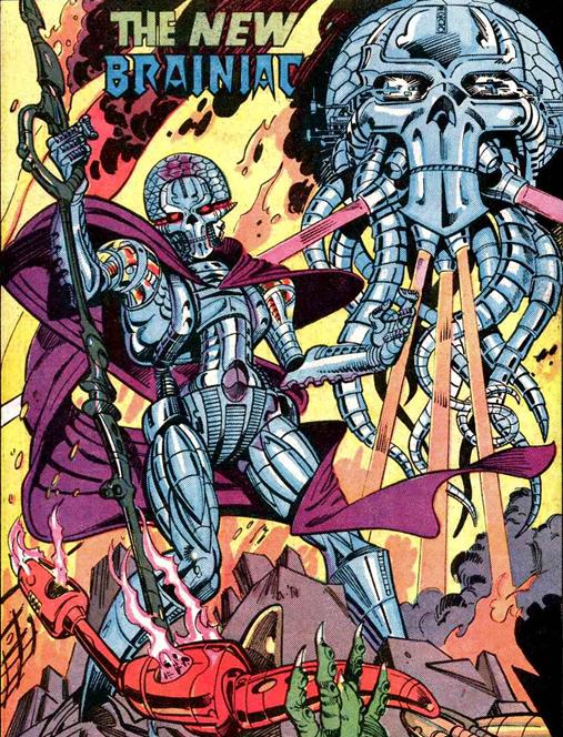 If I'd grown up on the original Brainiac, I could see how this re-imagining would have felt like a betrayal, but I was becoming aware of superheroes during those three brief years when this was Brainiac, and man did I love him. My love for the design began with the Kenner Super Powers figure, which I still consider to be the absolute best design of the series.  I remember getting excited anytime I was watching the Superfriends cartoon and someone would mention "Brainiac". I kept waiting for the silver-chromed terror to show up, but all we ever got was a green dude in underpants. At least that was better than the Milton Fine man-bun version that came with the Post-Crisis reboot. This remains my second favorite villain design of all time and, like my #3, it's a total shame DC didn't get more mileage out of it.
|
|
|
|
Post by Deleted on Dec 23, 2017 11:28:04 GMT -5
after getting all caught up yesterday, I actually get to participate on the day of  My #2 (which I spoiled in a comment yesterday anyways): Validus. as noted elsewhere in my countdown, I'm a fan of Kaiju films. . .so it's almost a given that i'd be drawn to characters that are larger than life (Giganta, Giant-Man, Black Goliath, Chemo, Apache Chief, etc. . ). . but as a Legion Fan too, I never really cared for Colossal Boy (even when they sweetened the pot by making him Jewish, just never took to him). But when the Fatal Five took center stage as the "big baddies" in the 70's Legion books, i fell in love with the look of Validus right away: Big, Hulking, Destructive, Mute, with no eyes, but frigging lightning bolts shooting out of his head!! and in a rare Ret-con that worked to absolute perfection? When the writers had a brilliant idea that Validus was Lightning Lad & Saturn Girl's child (who had been kidnapped by Darkseid at birth - so no one even knew they had HAD twins -- and brought back thru time so he aged up and mutated)? It makes perfect sense, as Valdius always showed "mental lightning". . so again a rare case of a retcon that really, really worked. This really is about the design tho, and Validus is a winner with a simple Purple/While outfit, see thru skullcap, and horned toes.   (and like Iron Man. . when he was occasionally drawn with a nose, he looked idiotic):  |
|
|
|
Post by codystarbuck on Dec 23, 2017 11:38:50 GMT -5
Number 2 is Brynocki....  Brynocki first appears as the robot assistant of the assassin Mordillo, the second great villain in the Moench/Gulacy Master of Kung Fu. Mordillo, himself, is more interesting before being seen. However, Brynocki steals the show from the moment he steps on panel. The character comes across like a demented cartoon character, speaking in simple ways yet doing evil things, like helping rope in Leiko, after Mordillo has lost control of her and is outclassed by her martial skills. One of the joys of Brynocki is his changes of clothing to match his current duty (engineer's overalls and cap for driving a train, chef's hat for bringing dinner, etc...) The character's design is based on the mascot of the Bob's Big Boy restaurant chain (it was Topp's Big Boy, in my neck of the woods), who was, himself, a star of his own comic book series (given out at the restaurant). The costume changing was a stroke of genius. Brynocki would return much later in the series, launching an attack on Shang-Chi and Leiko Wu, to gain revenge for his fallen master; but, I like to remember him at the end of the Mordillo storyline...  |
|
Crimebuster
CCF Podcast Guru
Making comics!
Posts: 3,958 
|
Post by Crimebuster on Dec 23, 2017 12:19:56 GMT -5
2. Reverse FlashI had a number of villain variations on hero costumes on my short list, but the one that always stood out for me is Reverse Flash, who I think looks cooler than the Flash himself. The all-yellow with red and black highlights just looks too cool! 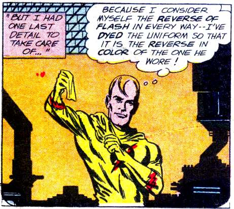 Good thinking!
|
|