|
|
Post by benday-dot on Nov 1, 2015 16:02:54 GMT -5
Oh, yes. His art was HORRIBLE on Alpha Flight, but the art on the book got worse. His wasn't even the worst. Believe me. I stopped reading volume 1 because it got into that weird, busy, over-lined art of the 90s where the panel layout was confusing to follow. I couldn't handle it. It was bad enough what they had done to my favorite superhero team. They just lost me with the art later on. Geez... I don't even like the font used in those panels! |
|
|
|
Post by Deleted on Nov 1, 2015 16:04:59 GMT -5
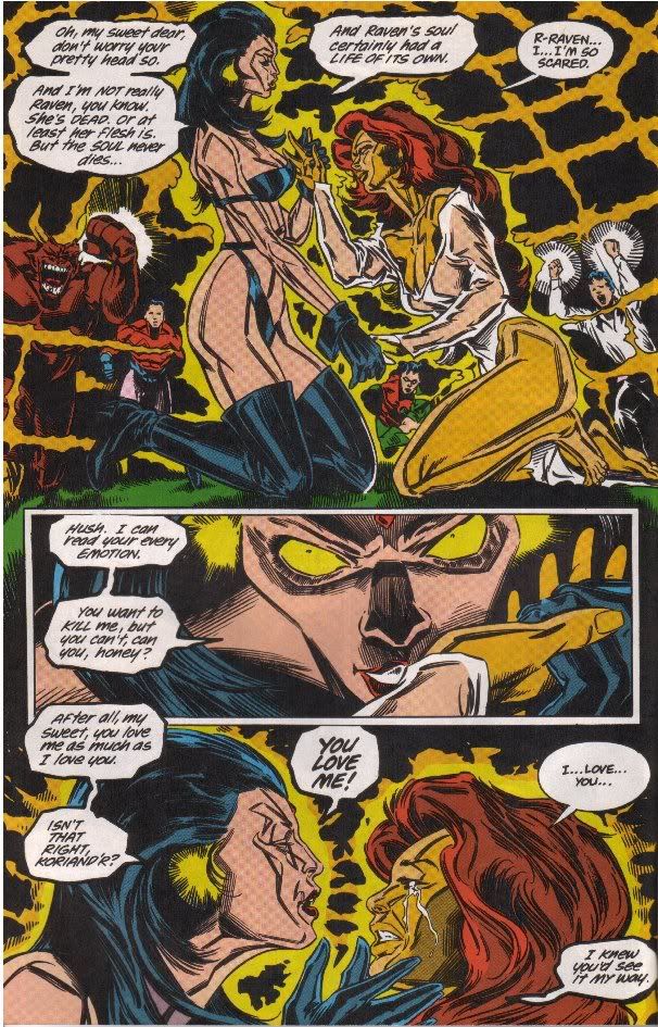
Then of course there was the late Bill Jaaska on New Titans.  D@mmit. Can we just not. . I want to read 90's stuff so badly. Because I think I could like the stories, and some of it has a feel from my time, but the art. I just cannot with the art. It is so hard to look at. A lot of it is pure eyef*&kery to look at. I get confused. |
|
shaxper
CCF Site Custodian
Posts: 22,865
|
Post by shaxper on Nov 1, 2015 17:05:01 GMT -5
Pat Broderick shows he can draw: Undoubtedly. Which, I think, makes his turning work like what I provided above even more pathetic. |
|
|
|
Post by Deleted on Nov 1, 2015 22:56:21 GMT -5
Lots of things not to like here...what stands out most to me are Robin's hands. Look at them. LOOK...AT...THEM  |
|
|
|
Post by Paste Pot Paul on Nov 2, 2015 3:46:05 GMT -5
You know, that Bill Jaaska piece is not that bad by his standard. Seen much worse.
The original piece just reminds me of the current Ms Marvel book, very stylised, and therefore very divisive. People will love or hate, which I think will massively harm sales. At least with guys like S Buscema, Don Heck, or even Ron Frenz and Tom Grummet, you got good solid storytelling, could follow the story, and a Robin hand looked like a Robin hand, and not an advert for recoloured HULK HANDS.
That piece is also way better than many of the books Marvel put out over the Secret Wars event, some of them were 90s amateur hour.
|
|
|
|
Post by Spike-X on Nov 2, 2015 3:48:44 GMT -5
Oh, yes. His art was HORRIBLE on Alpha Flight, but the art on the book got worse. His wasn't even the worst. Believe me. I stopped reading volume 1 because it got into that weird, busy, over-lined art of the 90s where the panel layout was confusing to follow. I couldn't handle it. It was bad enough what they had done to my favorite superhero team. They just lost me with the art later on. Geez... I don't even like the font used in those panels! Looks like Bob Lappan. |
|
|
|
Post by Deleted on Nov 2, 2015 6:31:49 GMT -5
Lots of things not to like here...what stands out most to me are Robin's hands. Look at them. LOOK...AT...THEM  Oh, wow. You win. I think you just found the worst ever. It's awful. Compare them to his feet (I mean, to the rest of any of him, actually). I know this art is just a style, but I don't care. It's just not what I want to see in common comic books. Just my opinion, though. |
|
|
|
Post by DE Sinclair on Nov 2, 2015 9:18:56 GMT -5
 So it is indeed Eric Canete as I thought... And the colors really made the drawing more confusing IMHO. I also think it's quite heavy on stylization, but really, it's obvious the artist has skills and can draw, it would really be stuborn to deny that, which is why starting a "worst panel ever" topic with this is fairly hypocritical and says more about the poster than the actual panel.  Do you have any examples of Eric Canete's work that is not heavily stylized? Or is that his primary thing? If he had some conventional work it would be easier to tell about his grasp of anatomy. |
|
|
|
Post by Icctrombone on Nov 2, 2015 9:28:10 GMT -5
Lots of things not to like here...what stands out most to me are Robin's hands. Look at them. LOOK...AT...THEM  Maybe this is a dream sequence with distorted perspective. I never read the book. |
|
|
|
Post by Icctrombone on Nov 2, 2015 9:33:03 GMT -5
Then of course there was the late Bill Jaaska on New Titans.  i consider this just a style. Nothing wrong with the page IMHO. |
|
|
|
Post by Prince Hal on Nov 2, 2015 9:34:54 GMT -5
Good point, icc.
|
|
|
|
Post by Icctrombone on Nov 2, 2015 9:36:19 GMT -5
No offense to anyone , but I consider this to be a nitpicky thread. To pull one panel out of a book and criticize it, is kind of harsh. Even the great artists have had a bad panel or two. A entire book that is badly drawn will eventually lose sales and the artist will be fired , but one panel ?
|
|
Confessor
CCF Mod Squad
Not Bucky O'Hare!
Posts: 10,199 
|
Post by Confessor on Nov 2, 2015 9:47:19 GMT -5
No offense to anyone , but I consider this to be a nitpicky thread. To pull one panel out of a book and criticize it, is kind of harsh. Even the great artists have had a bad panel or two. A entire book that is badly drawn will eventually lose sales and the artist will be fired , but one panel ? You know this is a comic fans' forum, right? Nitpicky is kinda what we do, isn't it?   |
|
|
|
Post by Icctrombone on Nov 2, 2015 9:48:53 GMT -5
No offense to anyone , but I consider this to be a nitpicky thread. To pull one panel out of a book and criticize it, is kind of harsh. Even the great artists have had a bad panel or two. A entire book that is badly drawn will eventually lose sales and the artist will be fired , but one panel ? You know this is a comic fans' forum, right? Nitpicky is kinda what we do, isn't it?   Damn, you're right. Carry on, everyone.  |
|
|
|
Post by Dizzy D on Nov 2, 2015 9:52:09 GMT -5
No offense to anyone , but I consider this to be a nitpicky thread. To pull one panel out of a book and criticize it, is kind of harsh. Even the great artists have had a bad panel or two. A entire book that is badly drawn will eventually lose sales and the artist will be fired , but one panel ? I'm afraid to post any of Hein de Kort's work, somebody's head might explode. (for those who want to GIS, I'd not do it at work. Some images might be NSFW) |
|