shaxper
CCF Site Custodian
Posts: 22,865
|
Post by shaxper on Nov 1, 2015 1:05:51 GMT -5
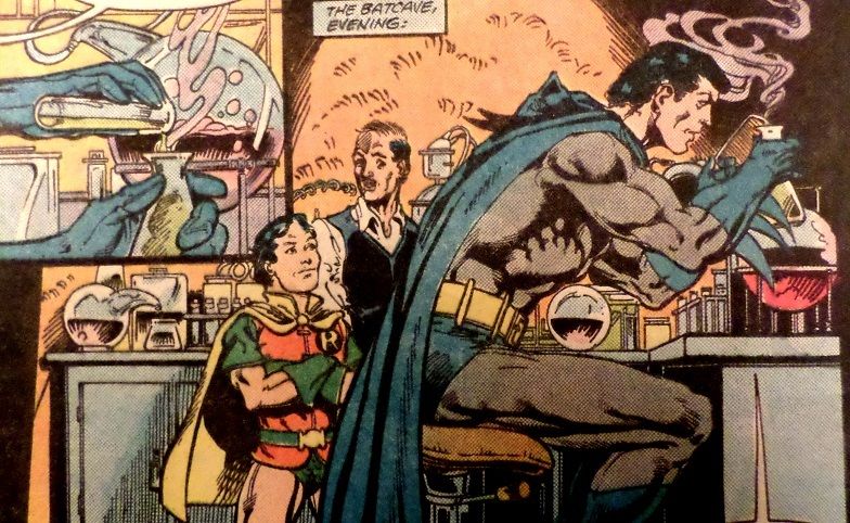
From Detective Comics #552 Sin against humanity committed by Pat Broderick This was the first comic book I ever bought, and Pat Broderick is a lot of the reason that I didn't come back for more until a long time after. I still maintain he's one of the laziest artists in comicdom, in that his artwork is generally quite good, but then he'll turn in garbage like this, whereas a better artist would burn the original page, bury the remains, and kill any potential witnesses.  Unless, of course, I missed the story where Jason Todd got replaced by a fifty year old midget. |
|
|
|
Post by the4thpip on Nov 1, 2015 4:34:34 GMT -5
|
|
|
|
Post by sunofdarkchild on Nov 1, 2015 4:39:26 GMT -5
My god. Iron Man's head...
I knew he was really a robot the whole time!
|
|
|
|
Post by the4thpip on Nov 1, 2015 4:44:24 GMT -5
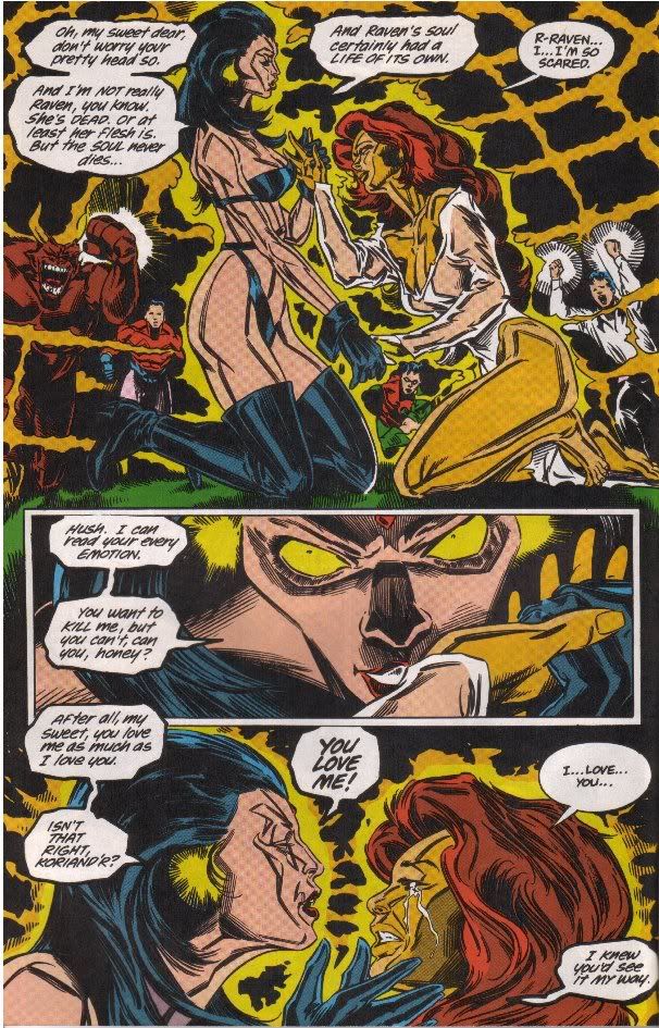
Then of course there was the late Bill Jaaska on New Titans.  |
|
|
|
Post by Arthur Gordon Scratch on Nov 1, 2015 6:17:38 GMT -5
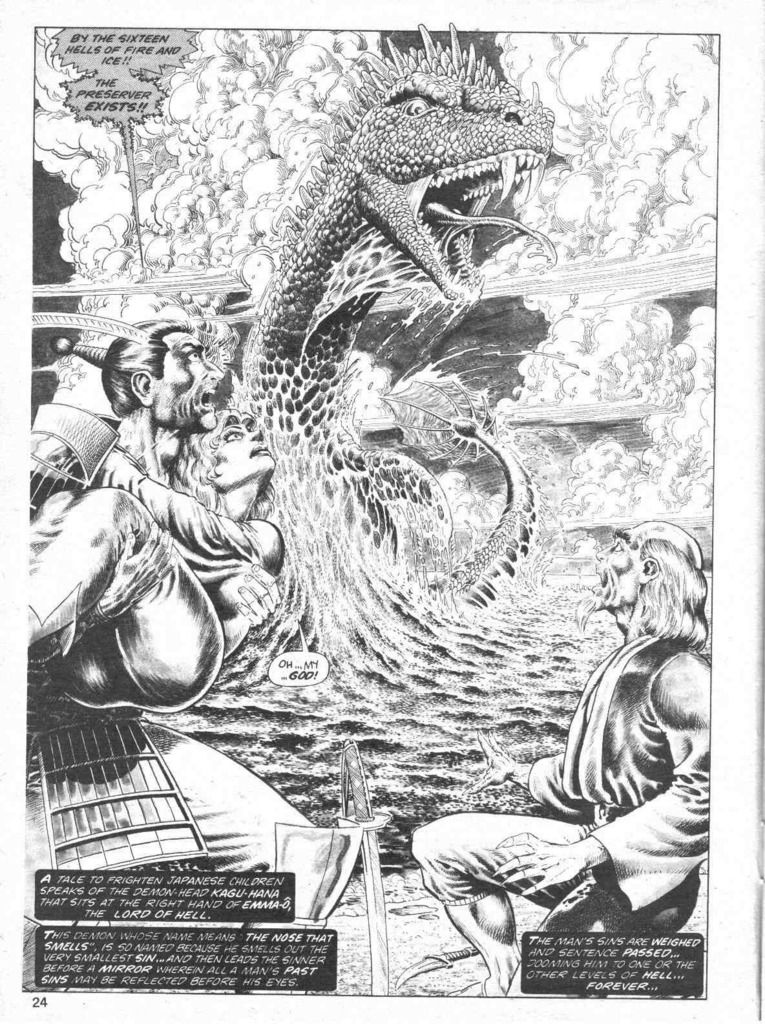
Then I guess no topic of 'worst ever' should ever include Rob Liefeld because no matter how ridiculous his drawing is, it's still obvious he has some skills and can draw. Are we now going to defend panels of women standing in a way that breaks their backs because that's a stylistic choice? If you want to see exaggeration done right, check out certain anime like One Piece. If you want to see stylization done right, check out something like Bill Sienkiewicz on New Mutants. At best this is a depiction of a skeleton that has been shattered. Except Liefield has no skill in anatomy and perspective, when Canete obviously have, ad does Sienkiewicz, so I really don't see your point there. Liefield doesn't chose to draw the way he does, he just can't do it any other way. If buy knowing how to draw you mean the guy is able to lift a pen and use it, then we have a different use of the expression "can draw"  |
|
|
|
Post by Icctrombone on Nov 1, 2015 6:50:56 GMT -5
The panels posted are all good examples of artwork churned out for the sake of a monthly schedule. The Broderick panel has perspective issues also, but I think that not everything Broderick did back in the day was for everyone. I enjoyed his run on Captain Marvel and his Micronauts stuff.
|
|
|
|
Post by Arthur Gordon Scratch on Nov 1, 2015 6:59:23 GMT -5
Exactly, fine art artist are artists, big two published artists are pros, and pros got to live and accept some mediocre pages, or so it seems. How many pages has Travis Charest published since he became obsessed with perfection? Those Jaaksa, Broderick mostly are run of the mill tight schedule pages, somewhat ugly but nothing scandaleous IMHO, they don't try to sell you something they aren't. That being said, those Calimee pages are a "calimeety". The editor must have been desperate!
|
|
|
|
Post by Icctrombone on Nov 1, 2015 7:05:15 GMT -5
There was a period in the 90's where it seemed that anyone that could hold a pencil was working. Lots of bad stuff was published. The Topps comic line hired Don Heck and other 60's artists to try to sell their comic line. It was not really that good, but at least they got a few paychecks from the 90's boom.
|
|
Confessor
CCF Mod Squad
Not Bucky O'Hare!
Posts: 10,199 
|
Post by Confessor on Nov 1, 2015 10:58:50 GMT -5
Hush your mouth! Stilt-Man is all kinds of awesome! I have been re-reading classic Daredevil comics, and I keep experiencing cognitive dissonance whenever Stilt-Man is treated as an actual menace. Stilt-Man: "Behold my deadly powers!" (legs get really long) Everybody: "Whoa! Run for your lives!"" Yeah, he's a total loser, but damn it...he's got charm and charm goes a long way. As an aside, I think the trouble with a lot of Daredevil villains, pre-Frank Miller anyway, is that they need to be pretty puny on the grand scale of things, in order that Daredevil (arguably the weakest Marvel superhero of that era) could beat them. For me, the definitive Stilt-Man story isn't a Daredevil one, it's in Amazing Spider-Man #237. In that issue, Wilbur Day faces up to the fact that as a super-villain, he's a bit of a laughing stock, and it's a very human portrayal of a washed up, wannabe menace. |
|
|
|
Post by Reptisaurus! on Nov 1, 2015 13:56:08 GMT -5
Then I guess no topic of 'worst ever' should ever include Rob Liefeld because no matter how ridiculous his drawing is, it's still obvious he has some skills and can draw. Are we now going to defend panels of women standing in a way that breaks their backs because that's a stylistic choice? If you want to see exaggeration done right, check out certain anime like One Piece. If you want to see stylization done right, check out something like Bill Sienkiewicz on New Mutants. At best this is a depiction of a skeleton that has been shattered. I agree that this is a highly abstract drawing. I just don't agree that that automatically makes it a bad drawing. I really like the background effects (the building being warped, perspective-wise towards the center of the "frame") that are obviously designed to evoke a specific tone and mood. And using techniques that other artists wouldn't even consider makes it BETTER in my book, not worse. I mean, obviously I love One Piece because I love any damn thing with pirates in it and Bill Sienkiewicz is my favorite superhero artist, full stop. But honestly this doesn't seem particularly indebted to either of 'em. I've got the TPB with that in front of me (Go Iowa City Public Library) and this story seems fairly European in flavor, where the line between "fine art" and "comics" is a little blurrier. (Actually, a little googling says his first job was the animated Aeon Flux show, which makes perfect sense.) Here's the thing - "Comic artist" is a competetive gig, and bad comic artists simply Do Not Get Work. (Except in the early '40s and the late '80s early '90s, when the market was big enough that publishing crap could be profitable.) The editors must see SOMETHING in his stuff, even if it's based in a set of influences that are unfamiliar or distasteful to people my age who were raised on Sal Buscema. |
|
|
|
Post by benday-dot on Nov 1, 2015 14:28:16 GMT -5
Pat Broderick shows he can draw:   |
|
|
|
Post by benday-dot on Nov 1, 2015 14:38:33 GMT -5
I love abstract drawing, although I am not so sure that Spidey panel is all that abstract (in the way say Toth, Bushmiller. a lot of Kirby, some Sienkiewicz is). I'm sure that the artist (have we determined who it is?) is completely capable of drawing straight art as Arthur Scratch suggests, and this is just some highly left-field stylization. I don't much like it to be honest, but I won't condemn it as bad art either. It doesn't fill me revulsion or anything, it just fails to excite if that was the artists motive.
|
|
|
|
Post by the4thpip on Nov 1, 2015 15:00:22 GMT -5
"Abstract" means paintings that do not depict anything from reality. Even cubism isn't abstract painting.
Think Pollock, Rothko etc.
So with the exception of, say, Ditko's backgrounds in Strange Tales, there is no abstract drawing in comic books.
|
|
|
|
Post by benday-dot on Nov 1, 2015 15:53:44 GMT -5
"Abstract" means paintings that do not depict anything from reality. Even cubism isn't abstract painting. Think Pollock, Rothko etc. So with the exception of, say, Ditko's backgrounds in Strange Tales, there is no abstract drawing in comic books. Well, that is a pretty strict definition to be sure. Using shapes and forms, indeed geometrical abstractions, in which to compose either figure work or constructions certainly can lend itself to an abstract type of art. This is why the 70's period of Kirby with his blocky and stylized form of expression with the squiggles and hyper use of geometric patterns in all his machinery and tech is often considered to be the King's more abstract period. Toth's simplified use of shades and tones is certainly tending toward abstraction as well. [Cubism and abstract art= www.artyfactory.com/art_appreciation/art_movements/cubism.htm] |
|
|
|
Post by Deleted on Nov 1, 2015 16:00:17 GMT -5
Oh, yes. His art was HORRIBLE on Alpha Flight, but the art on the book got worse. His wasn't even the worst. Believe me. I stopped reading volume 1 because it got into that weird, busy, over-lined art of the 90s where the panel layout was confusing to follow. I couldn't handle it. It was bad enough what they had done to my favorite superhero team. They just lost me with the art later on. |
|