|
|
Post by Prince Hal on May 24, 2023 8:14:13 GMT -5
How my beard and I dress for a meeting with the President, according to Mike Grell...  |
|
|
|
Post by DubipR on May 24, 2023 8:15:34 GMT -5
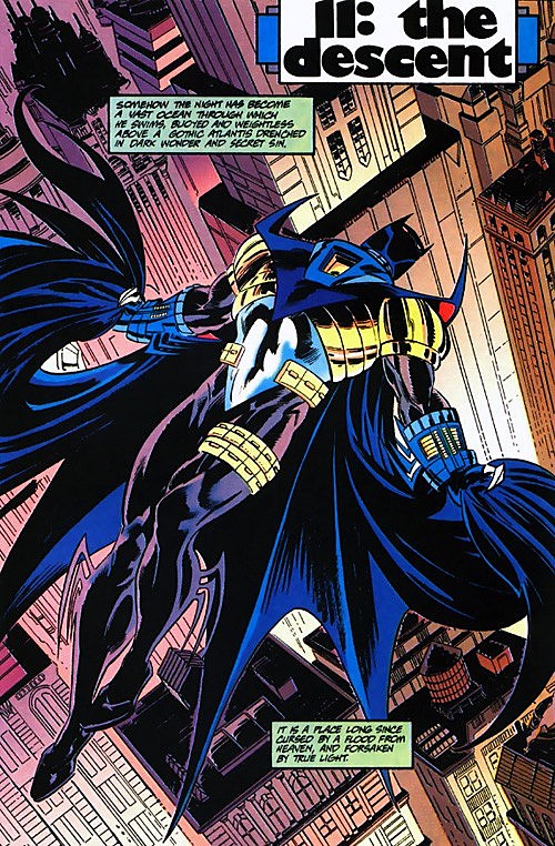 I liked this armour as a kid, and y'know what? I still kinda do. The garter pouches are stupid, but minus that, I think it's a perfectly sleek design, well-suited for a darker take on Batman. I fully concede the later evolutions of the armour are ass, though. 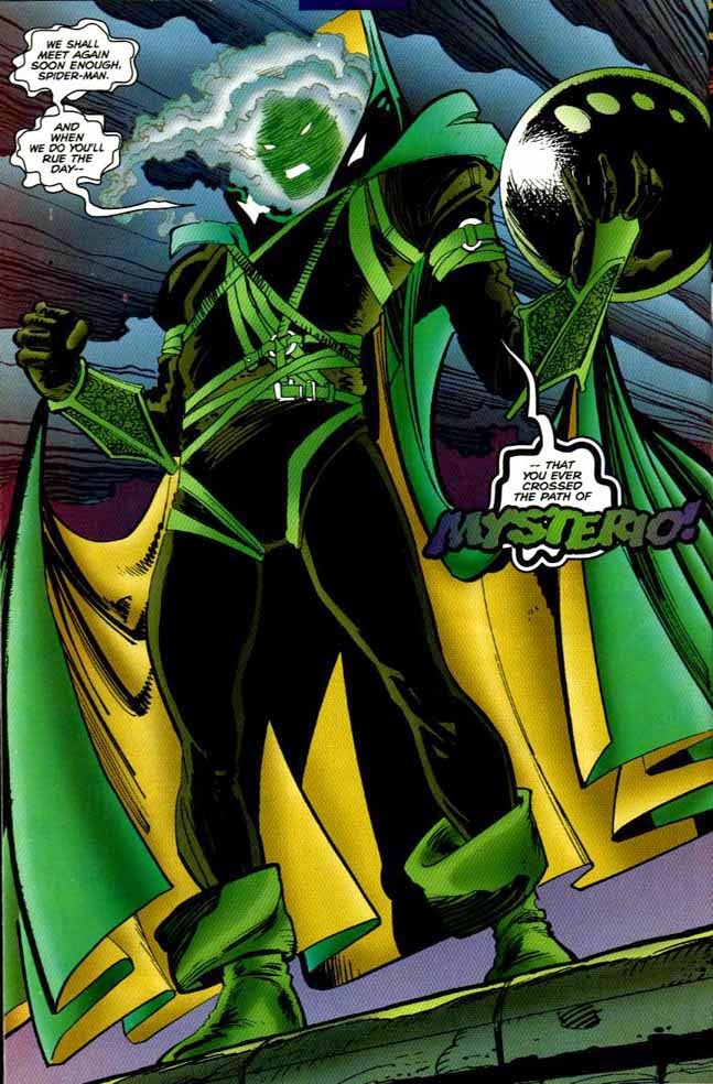 I actually don't know what the consensus opinion on Mysterio's Clone Saga redesign is, but I hated it at the time. Now, though? I don't think it's half-bad. ASM #413 restored the fishbowl, synthesizing the new and classic designs, which I thought would've been the perfect look going forward, but AFAIK, it was retired following the Clone Saga. A shame.  Even as a kid, long before my current political beliefs took shape, I disliked this costume. The wings ... the "A" on the forehead ... the scales ... the buccaneer boots ... it's just so nauseously busy. Almost every redesign has been an improvement. I have a soft spot for Az-Bats as well. It's glorious 90s schlocky but I enjoy it. As for Captain America, only person that got it right with the chainmail, was John Cassaday. His detail to the chainmail is perfect. Also the face mask is more functional than the hood originally drawn.  |
|
|
|
Post by jason on May 24, 2023 9:35:16 GMT -5
I actually don't know what the consensus opinion on Mysterio's Clone Saga redesign is, but I hated it at the time. Now, though? I don't think it's half-bad. ASM #413 restored the fishbowl, synthesizing the new and classic designs, which I thought would've been the perfect look going forward, but AFAIK, it was retired following the Clone Saga. A shame. Ugh, did JRJR draw that? He had a lot of terrible costume designs in his X-Men run...
 As white hot as they were in the 80s, it was not a good decade for X-Men costumes. Wolverine's redesign was probably the best of that whole bunch, and all they did there was change the color of his tights. |
|
|
|
Post by tonebone on May 24, 2023 9:50:06 GMT -5
Even as a kid, long before my current political beliefs took shape, I disliked this costume. The wings ... the "A" on the forehead ... the scales ... the buccaneer boots ... it's just so nauseously busy. Almost every redesign has been an improvement. Years ago, I was working on the art for a video game featuring a US Military anti-terrorist team. The marketing team specifically directed me to use American flag symbology in the loading screens. In presenting it to my Art Director, his big complaint was that it was unfortunate it was just so "rah-rah America". I just stared blankly at him. |
|
|
|
Post by tarkintino on May 24, 2023 9:56:39 GMT -5
Never cared for the Green Goblin costume. Those stupid elvish books; who the hell would wear something like into combat? You'd lose your footing and stumble. Game over. And the old fashioned sleeping cap? The tunic and face mask are okay but the green unitard? Is that shading or scales? It's a terrible look. Hobgolin's look is a bit better with the cowl, but it's a terrible costume.  Osborn was attempting to add a horrific aura to his costume, which--along with the name--would be seen as off-putting to anyone he encountered. I believe his post-Ditko evolution--illustrated to be physically imposing in and out of costume-- made the Green Goblin be the threatening megalomaniac of the Spider-Man end of Marvel. It was one thing to have him be a thin weirdo in his earliest appearances, but the necessary mix of the strange with physical power sold the man and the costume, despite the elf boots and withcy hat. |
|
|
|
Post by badwolf on May 24, 2023 11:32:13 GMT -5
Ugh, did JRJR draw that? He had a lot of terrible costume designs in his X-Men run...
As white hot as they were in the 80s, it was not a good decade for X-Men costumes. Wolverine's redesign was probably the best of that whole bunch, and all they did there was change the color of his tights. The shoulders were different and he ditched the stripes as well. But yeah the Byrne redesign was a good one. |
|
|
|
Post by berkley on May 24, 2023 15:46:26 GMT -5
And then there was this.  This is one that never struck me as weird when I read the comic as a kid. It was only many years later when I saw people talking about it on the internet that I realised how it looked to most readers. I can kind of see what they mean now but it still seems to me not too different from, say, Dr. Doom's kilt or the Marvel Hercules, or whatever. |
|
|
|
Post by Duragizer on May 25, 2023 4:20:31 GMT -5
I actually don't know what the consensus opinion on Mysterio's Clone Saga redesign is, but I hated it at the time. Now, though? I don't think it's half-bad. ASM #413 restored the fishbowl, synthesizing the new and classic designs, which I thought would've been the perfect look going forward, but AFAIK, it was retired following the Clone Saga. A shame. Ugh, did JRJR draw that? He had a lot of terrible costume designs in his X-Men run... I think it may be Dan Jurgens' art (don't own any of these comics, so I can't check). I don't know if it's his design, though. Mark Bagley, JRJR, and he all did art chores on the storyline where it made its initial appearance. I think Bagley's rendition was the most impressive, but the image above was literally the only full-body shot of the costume I could find on short notice. |
|
|
|
Post by Roquefort Raider on May 25, 2023 8:38:26 GMT -5
How my beard and I dress for a meeting with the President, according to Mike Grell... Is that Night Girl??? The Bêlit look suits her (albeit barely)! They obviously didn't solve the problem of global warming in the XXX century. |
|
|
|
Post by Prince Hal on May 25, 2023 9:22:14 GMT -5
How my beard and I dress for a meeting with the President, according to Mike Grell... Is that Night Girl??? The Bêlit look suits her (albeit barely)! They obviously didn't solve the problem of global warming in the XXX century. Is that an owl above your crotch or are you just pleased to see me? Yes, must be Night Girl. Give me 60s Night Girl with that tensile-strength bouffant. 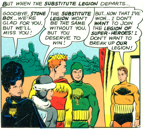 |
|
|
|
Post by Roquefort Raider on May 25, 2023 9:37:03 GMT -5
Ah, but what may that bouffant hairdo hide? That is the question... 
Night Girl should clearly have been the Leader of that team!  |
|
|
|
Post by Prince Hal on May 25, 2023 10:56:13 GMT -5
Ah, but what may that bouffant hairdo hide? That is the question...
Night Girl should clearly have been the Leader of that team! 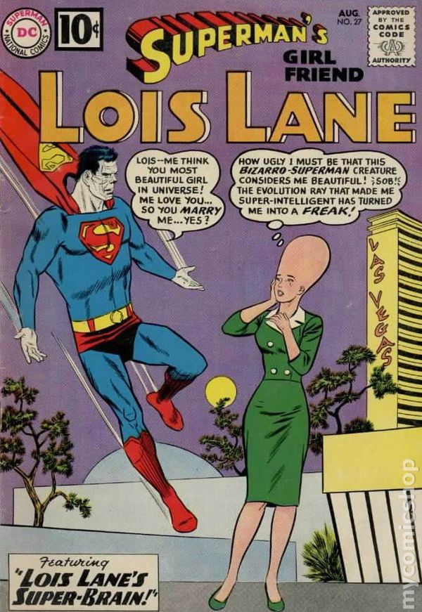 Untold Imaginary Story: “Lois Lane, Night Girl!” |
|
|
|
Post by codystarbuck on May 25, 2023 21:47:34 GMT -5
Cassaday is sill doing scale mail......  It consists of overlapping scales, with segments linked together by wire. This is chain mail.... 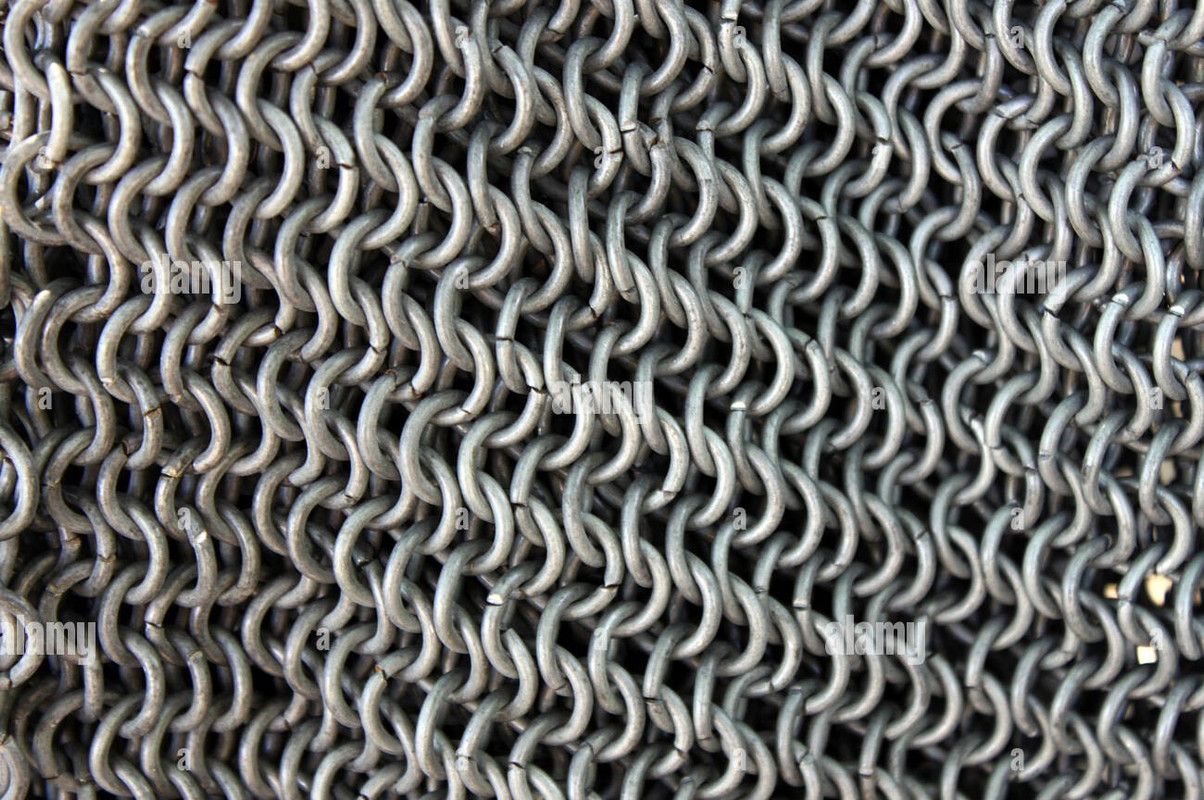 It is made of interlinking metal rings. You can see the contrast in this image of "Blackfish," from Game of Thrones... 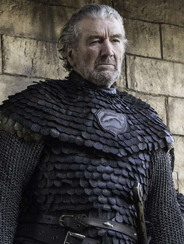 His torso is covered by a scale mail cuirass and he is wearing a chain mail shirt, under that, to protect his arms. What Simon and Kirby tried to do was indicate the rings of chain mail, the way Hal Foster did, in Prince Valiant..... 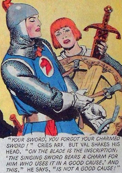 Note Foster's stippling technique tends to indicate more of the rows and columns that the ring form. If you look at the picture above, the rings have a sort of snaking pattern, with the inner rings in shadows and the connecting rings in light. In the filming of Monty Python and the Holy Grail, their chain mail was actually knitted material, simulating the rings of armor. In the Lord of the Rings, they used rubber rings, painted metallic grey, silver and gold. Foster was better able to capture the patterns of mail, than Simon & Kirby and Kirby solo. Many modern artists followed Kirby's trend of indicating parts of the ring loop, rather than the linking portions. That turned more and more into scales, over time, until Kevin Maguire made it completely scale, in Captain America, Sentinel of Liberty. Wally Wood had the technique down, in his work.....  Of course, Wood was doing his own inking, while Kirby was usually inked by someone else. Perez followed Kirby's lead and was better than most, though he also tended to put more detail in it. He could get overly scaly, too. |
|
|
|
Post by mikelmidnight on May 27, 2023 15:08:58 GMT -5
I can understand people disliking that outfit--emphasis on outfit, rather than superhero costume / uniform. He looks like a knock-off safari hunter with poor taste in color selection (red jacket and boots?). My only problem with the outfit is that he looks like he ought to be a member of the THUNDER Squad. |
|
|
|
Post by Duragizer on Jun 2, 2023 9:19:38 GMT -5
I can't hate this costume.  He generates his own bi lighting, too. Nice. |
|