|
|
Post by hondobrode on Mar 1, 2018 9:59:03 GMT -5
|
|
|
|
Post by Deleted on Mar 2, 2018 3:41:32 GMT -5
Iron Man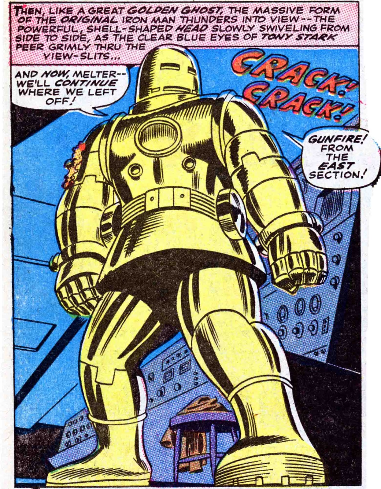
|
|
|
|
Post by tarkintino on Mar 2, 2018 17:42:22 GMT -5
Blackmark (Bantam Books, 1971) by Gil Kane 
|
|
|
|
Post by brianf on Mar 2, 2018 21:54:09 GMT -5
|
|
|
|
Post by kirby101 on Mar 2, 2018 22:14:29 GMT -5
Some are a repeat brianf, but it's Barry Smith, always worth a look.
|
|
|
|
Post by hondobrode on Mar 3, 2018 20:01:45 GMT -5
|
|
|
|
Post by tarkintino on Mar 4, 2018 16:48:57 GMT -5
Superboy starring The Legion of Super-Heroes #202 (June, 1974) by Dave Cockrum with Mike Grell inks. 
|
|
|
|
Post by hondobrode on Mar 4, 2018 23:42:31 GMT -5
|
|
|
|
Post by hondobrode on Mar 5, 2018 0:16:46 GMT -5
|
|
|
|
Post by chadwilliam on Mar 5, 2018 0:59:37 GMT -5
 This might be the first issue of Batman in which the splash page isn't actually, well a splash page. It doesn't recreate the cover or tease the story inside - it just gets right into the action. Even as a kid when I sought out as many old Batman comics as I could find, this one stood out. The greenish hue for the policeman, his wide-eyed startled appearance, that 90 degree angle turn the bricks make as they rise out of the trash as if with a will of their own, the officer slumping forward, even the classy header with the Batman logo to the left and the title to the right - this is how you start a story. More powerful than a full page recreation of the cover (and Batman 202 has a fantastic cover) and more effective than picking a scene from inside the story and just redoing it here, this doesn't even need Batman to make you realize he'll be around shortly in one hell of an adventure. |
|
|
|
Post by MDG on Mar 5, 2018 9:51:12 GMT -5
^^^^ Spotted Sid Greene inks right away, but forgot that Chic Stone drew a few stories. DC seemed to be experimenting a little with how things were colored around this time.
|
|
|
|
Post by Prince Hal on Mar 5, 2018 11:16:58 GMT -5
Love that page, too, chadwilliam . And glad to hear another vote for that version of the Batman logo, with Batman sweeping his cape over his face in a Dracula-esque manner. That logo lent itself to some striking coloring choices you jsut couldn't get with the other logos, IYAM. To wit: 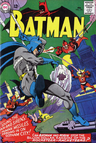 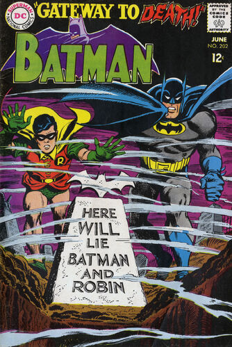 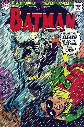 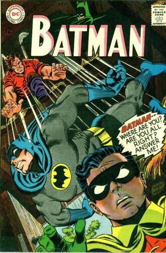 BTW, it started with #170 (six issues into the New Look era), and lasted till #212 on Batman comics, with a couple of notable exceptions.... 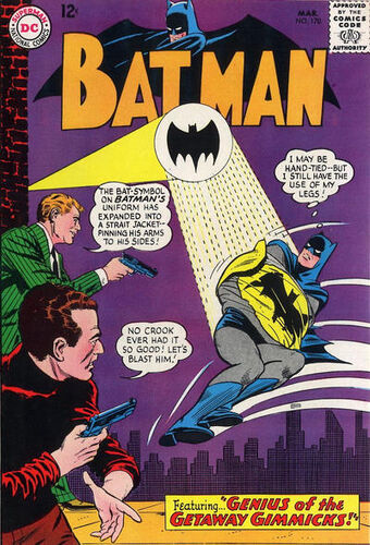 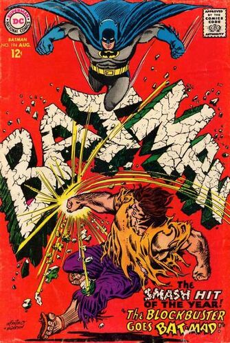 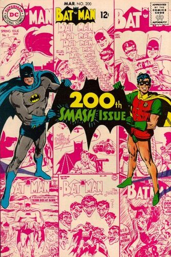 It was added to the traditional Detective logo in July '66, obviously in the wake of the success of the TV show. It only lasted there a year. 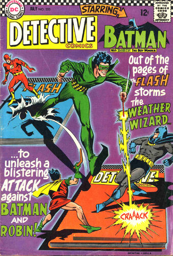 Then, for a handful of issues (214-219), the original logo was re-used. Never could figure out a reason why. Oddly, the original logo was retained for the annuals (through #218). 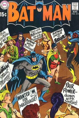 A third logo began with #220, but only lasted till #230 when Robin's name was added. Then that one was replaced as of #241. (It was only printed at an angle for the first two issues.) 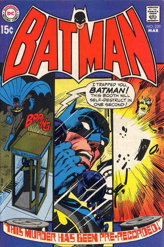 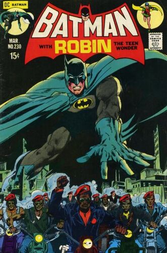 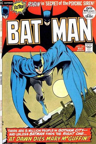 |
|
|
|
Post by tarkintino on Mar 5, 2018 14:24:59 GMT -5
Crisis on Infinite Earths #8 (November, 1985) by George Perez with Dick Giordano. 
|
|
|
|
Post by Prince Hal on Mar 5, 2018 14:29:14 GMT -5
^^ I wonder if they were thinking of this oft-posted cover when they designed this page, particularly the use of the logos...   |
|
|
|
Post by Deleted on Mar 5, 2018 15:40:09 GMT -5
Star Spangled Kid and Stripsy 
|
|