|
|
Post by Prince Hal on Dec 16, 2017 12:46:53 GMT -5
9. Monsieur MallahSure, DC has lots of gorillas. They even have other gorillas who use machine guns. But Monsieur Mallah is the only one who wears a beret and (sometimes) talks in a French accent. Plus, one of his key costume accessories is a brain in a jar. Okay, technically Brain is a separate character, but in terms of design elements, he's basically the equivalent of Captain America's shield.   YES! Beat me to him, but mine was the 1960s version, so I still may put him on the varsity. |
|
|
|
Post by Prince Hal on Dec 16, 2017 12:47:58 GMT -5
@mrp, do I detect the sweet aroma of a Will Eisner villainess in our future???
|
|
|
|
Post by Deleted on Dec 16, 2017 12:51:23 GMT -5
@mrp, do I detect the sweet aroma of a Will Eisner villainess in our future??? you just might, but no spoilers or guarantees  -M |
|
|
|
Post by hondobrode on Dec 16, 2017 13:57:06 GMT -5
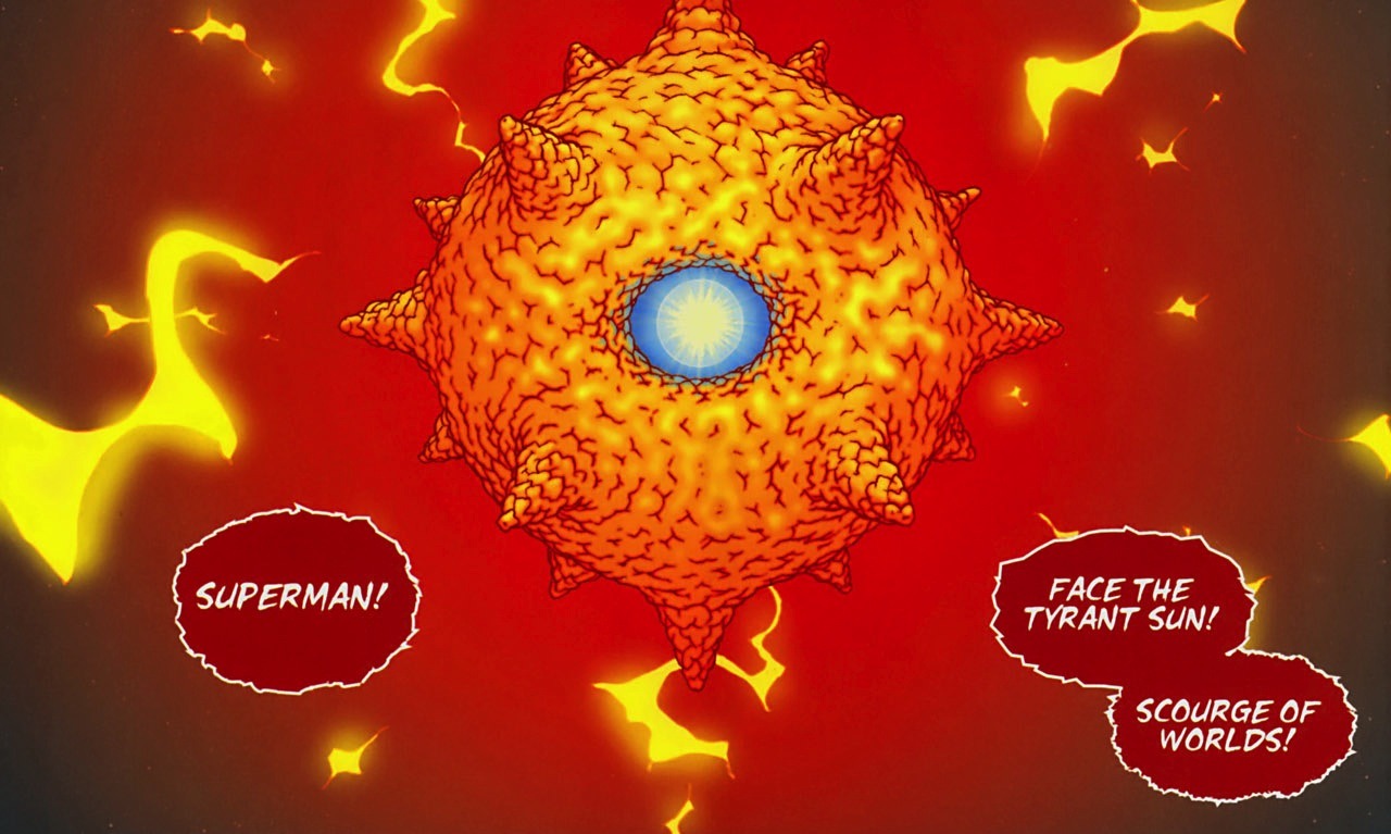
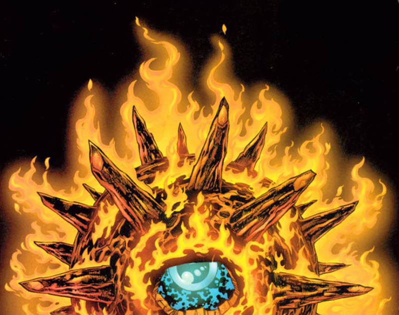
 Behold Solaris the tyrant sun ! What a look ! A spiky evil sun and he's powerful as all get out. and that eye ! How creepy is that ?  |
|
|
|
Post by coke & comics on Dec 16, 2017 13:58:05 GMT -5
9. Two-Face by Bill Finger and Bob KaneI mentioned with my 11th entry my love of all the half-and-half villains, enough to devote two spaces on my list to such. This is the iconic one in my mind. Not being too much of a design guy, I like it when the design and character are so inseparable. I recognize pretty much any variation on the look as appropriate, any bi-colored suit. And of course, what's a good design without a great accessory? And what better accessory has any villain ever been given than that two-headed coin. Nobody flips a coin with such menace. Accessories factored heavily into my thinking on several entries, including yesterday's and tomorrow's. I love the Batman rogues gallery and considered basically the entire gallery for this list, but ultimately settled on just including 3, which I'll dedicate the next two days to.  
|
|
|
|
Post by Deleted on Dec 16, 2017 15:15:09 GMT -5
#9, Joker

It was beautiful drawn by Marshall Rogers and I know that Joker was designed by Jerry Robinson and I felt that Rogers interpretation of the multi-colored outfit that he puts together is nothing short of genius and his face is downright evil and maniacal and I rather see his art than any other Batman Comic Book ever written by the Joker.
Nobody does it better than Marshall Rogers. |
|
|
|
Post by Icctrombone on Dec 16, 2017 15:39:45 GMT -5
10. The Eliminator
Yeah, I know. The Eliminator  ? He’s a one off villain used in Fantastic Four # 184 to kill the FF and remove all trace That Agatha Harkness ever lived in human society. I love the color scheme of red and yellow. He has a suit of armor that includes flame throwers and a hammer type device instead of a right hand. The head piece consists of an open helmet type of cowl which highlights a craggly wrinkly head and a slit to look out of. This is one scary looking dude. I haven’t always loved George Perez designs but this one was great.   {More craggly goodness}  
|
|
|
|
Post by james on Dec 16, 2017 16:37:33 GMT -5
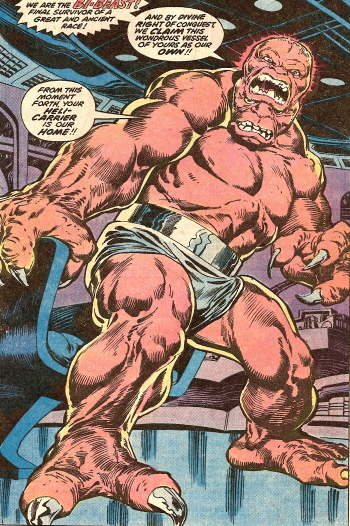
 My number 9. Bi-Beast. One head on top of another. 'Nough Said! picture to come. |
|
|
|
Post by Slam_Bradley on Dec 16, 2017 16:49:36 GMT -5
Coming in at number 09 on our countdown, a menace to an entire valley and particularly to our three intrepid heroes who also have pretensions to culinary greatness.
Stupid Stupid Rat Creatures With Bartleby as the exception these rat creatures menace the Valley where the Bones find themselves. They have the perfect combination of menacing and funny looking to fit perfectly into the Bone Mythos. Stupid stupid rat creatures.   |
|
|
|
Post by Jeddak on Dec 16, 2017 17:18:19 GMT -5
My #9 - Silver Banshee

In the colorful world of super-doers, characters depicted in black-and-white are rare. In Banshee's case, the black-and-silver look not only helps her stand out, it makes her seem less real, less a part of the world around her, giving her an eerie feel. The ragged bits on her arms and legs add to the ethereal look. And of course, there's the skull. Skulls for faces have been around in comics forever, good guys and bad, from Fantomah to that guy Johann Schmidt. But her skull-like look is sleek, slightly stylized, making her look that much less human.  Eye-catching, creepy, and memorable. Not a huge fan of the character, who I understand has gone through some real changes since her introduction. But I've liked the look since I first saw her. |
|
|
|
Post by Roquefort Raider on Dec 16, 2017 17:27:34 GMT -5
I laughed so hard I cried when first reading that page to my kids. Thanks for the great memories, Slam! |
|
|
|
Post by Farrar on Dec 16, 2017 17:40:04 GMT -5
#9 It's been said that cats have 9 lives, and my #9 is, er,  Catwoman, green costume (first seen in Batman #197) Catwoman, green costume (first seen in Batman #197)This is my favorite Catwoman costume by far. Have to admit I've never been a fan of most of her ensembles, but I remember loving this Infantino-Esposito cover and this new green costume way back when. I assume her costume was changed in late 1967 from the previous rather fussy get-ups to this sleek jumpsuit so as to evoke the popular TV version. The TV version was dark-colored, but obviously in the comic, since Batgirl's costume was black, for contrast here DC changed Selina's costume color to a vibrant gorgeous green, instead of the usual purple/eggplanty colors she'd worn previously. The speckled texture is meant to mimic the sparkly lurex of the TV catsuit, though in print the effect comes off as scaly (reminds me of Robin's or Namor's briefs). No matter, I love this emerald green color and I think it beautifully complements the comic book Catwoman's black hair. The green also strikes me as something of a callback to Selina's first appearance in back in Batman #1, where from I can tell--based on internet images, as I certainly don't own a copy of Batman #1--she wore a dark green civilian dress. She didn't sport this sparkly green costume for long, though; back then it only appeared in another issue or so. The eye-catching cover by Infantino and Esposito  Story's art by Frank Springer and Sid Greene 
|
|
|
|
Post by DubipR on Dec 16, 2017 18:21:15 GMT -5
My #9 - Silver Banshee

In the colorful world of super-doers, characters depicted in black-and-white are rare. In Banshee's case, the black-and-silver look not only helps her stand out, it makes her seem less real, less a part of the world around her, giving her an eerie feel. The ragged bits on her arms and legs add to the ethereal look. And of course, there's the skull. Skulls for faces have been around in comics forever, good guys and bad, from Fantomah through that guy Johann Schmidt to the Punisher. But her skull-like look is sleek, slightly stylized, making her look that much less human.  Eye-catching, creepy, and memorable. Not a huge fan of the character, who I understand has gone through some real changes since her introduction. But I've liked the look since I first saw her. Great choice! She might show up my list down the line.... or maybe?  |
|
|
|
Post by badwolf on Dec 16, 2017 18:21:22 GMT -5
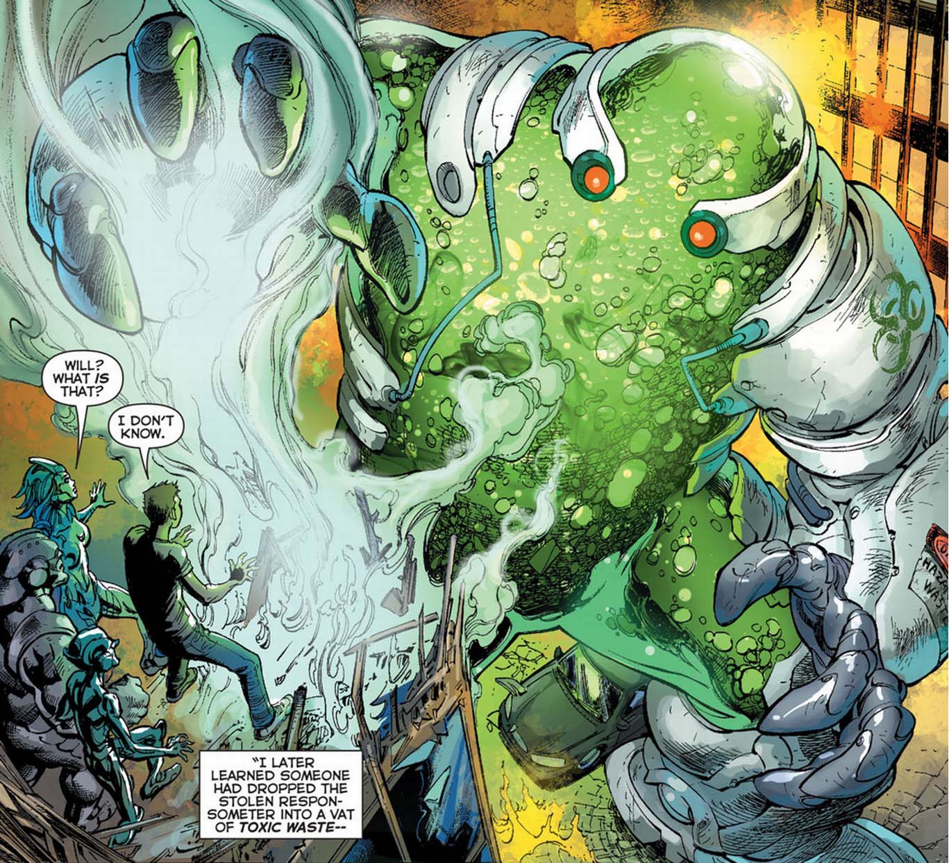
Chemo I first saw this thing as a cameo in Crisis on Infinite Earths, where it was primarily responsible for the death of Aquagirl. A towering, humanoid container of toxic waste? Pretty scary. I saw it again a little later in the form of Superman in Action Comics. But I really like this redesign (which just squeaks in under the 10-year "classic" rule). It has the effect of making it look almost cute, which at the same time makes it seem more sinister.
|
|
|
|
Post by foxley on Dec 16, 2017 19:23:02 GMT -5
9. White Rabbit Yes, I know this looks like a costume assembled by a lunatic. That's because it is supposed to be a costume assembled by a lunatic. But it perfectly fits the character, and manages to hit just the right mix of quirky and sexy for me. It's a fun costume for a fun villain (and there are far too few fun villains in today's comics).
|
|