Confessor
CCF Mod Squad
Not Bucky O'Hare!
Posts: 10,221 
|
Post by Confessor on Mar 23, 2021 10:20:46 GMT -5
I agree that the art wasn’t a good as last issue. I thought the plot was a mess, frankly. Like you implied, the raiders were pretty much an afterthought. Also, I didn’t even realize the spiner died! I was wondering about the pay issue, too. A couple of issues ago it was stated they could only pay them in food, or something like that, yet here it’s implied that they got money. Funny, I, too, was thinking of Han Solo using the lightsaber in The Empire Strikes Back during the scene here. And that Star Wars Weekly cover is...interesting. Ha! Yeah, "interesting" is right.  Yeah, the demise of Hedji is really poorly handled and poorly told with the art. In a re-cap sequence in the next issue his death is shown in a much better way, but it also feels as if they have to show it in order to clarify what happened to him. |
|
|
|
Post by dbutler69 on Mar 24, 2021 12:22:01 GMT -5
Star Wars #11Cover dated: May 1978 Issue title: Star Search!Script: Archie Goodwin Artwork: Carmine Infantino (breakdowns)/Terry Austin (finished art and inks) Colours: Janice Cohen Letters: Joe Rosen Cover art: Gil Kane (pencils)/Tony DeZuniga (inks) Overall rating: 4 out of 10 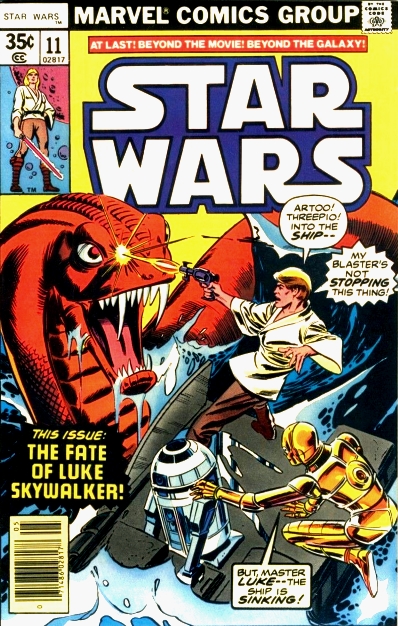 Plot summary Plot summary: After leaving Aduba-3, Han Solo and Chewbacca are once more captured in their ship, the Millennium Falcon, by Crimson Jack and his band of space-pirates. By chance, Princess Leia has also been captured by Crimson Jack, during her journey to the Drexel system to rescue Luke Skywalker. Jack is planning to ransom Leia to the Empire, but Han and the princess conspire to convince him of the existence of a horde of Rebel treasure in the Drexel system. Although he is suspicious of Solo, Jack is taken in by the ruse and agrees to head for the system. Meanwhile, on the ocean planet of Drexel, Luke and his droids R2-D2 and C-3PO are fighting for their lives against a huge sea-dragon, while balanced precariously on the floating remains of their wrecked star-cruiser. Escaping from the beast in one of the sinking spaceship's escape pods, Luke spies a second sea-dragon with a rider and realises that the huge creatures are being controlled by a race of people. Comments: So, this is the first issue of Marvel's Star Wars comic by the new creative team of Archie Goodwin and Carmine Infantino. For those who might be unaware, by this point in his career Infantino was already regarded as a comics industry legend for his highly influential work on The Flash, Batman and, appropriately enough, the sci-fi superhero series Adam Strange. However, Infantino's art style really isn't all that good a fit for the Star Wars Universe, in my view. Even as a kid, I really didn't much like his artwork on the series – mostly because of its hard angular tenancies, but also because his renditions of Star Wars tech never quite looked right. Take his depiction of the Millennium Falcon in this issue, for instance... 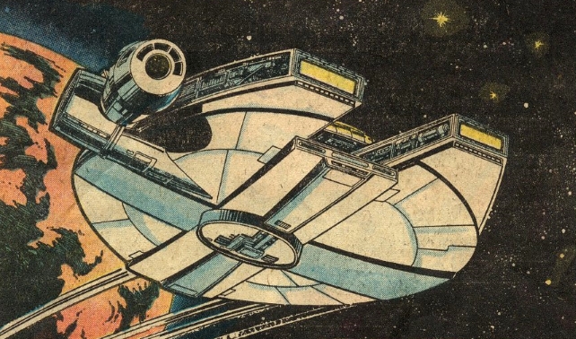 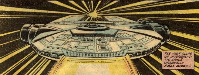 On the one hand, it's easily recognisable as being the same spaceship from the movie. But the more you look at it, the more you spot problems with the detail (and perspective, in that first example) and you start to realise that, actually, it's a pretty inaccurate rendering of the craft. The same goes for Infantino's Star Destroyers as well. Oh, and while we're on the subject, the starships that Luke and Leia each left Yavin 4 in look entirely different under Infantino's pencil to how they did when Howard Chaykin and Tom Palmer drew them. Another problem I have with Infantino's art is that sometimes he puts his characters in slightly ungainly poses, which tend to take you out of the story when you encounter them. However, let me just say that although Infantino's artwork looks very un- Star Wars-y and is also kinda ugly looking, I've learned to really love it in spite of its faults or idiosyncrasies. I'm sure that there's a whole lot of nostalgia involved in my adult appreciation of artwork that I so disliked as a child, but for me (and many others of my generation, I'm sure), Infantino's artwork was Star Wars between the years 1978 and 1980. What's more, I've also come to realise that his instincts for storytelling with sequential art were absolutely flawless. Throughout his run on the comic, it's always crystal clear exactly what is going on from one panel to the next. Also, let me just add that I appreciate Infantino showing us Hedji the spiner dying during a flashback in this issue (not seeing this scene in Star Wars #10, was one of my big criticisms of that issue). Terry Austin's contributions to the finished art and inking here are pretty good for the most part, although some of the cast's faces look a little weird or overly harsh at times. Austin also does a good job of toning down some of Infantino's more sharp-cornered tendencies, whereas Bob Wiacek (who would ink a number of future issues) seemed to emphasise it. As for Archie Goodwin's plot and scripting, the characterisations of the core cast seem reasonably good and, as we will see as the series progresses, his stories are usually pretty good. His prose style is decidedly less romantic or poetic than Roy Thomas's too, which may or may not be a good thing, depending on your own personal tastes. Speaking in Back Issue magazine #9, Thomas would comment on Goodwin's writing for Star Wars by saying, "I think Archie Goodwin had a much better feel for it than I did. He was more enthusiastic about it." Regardless of how enthusiastic he was, Goodwin wasn't actually expecting to write the comic for very long when he first came on board, as he explained in a 1982 interview for Amazing Heroes magazine: "I was Editor-in-chief at the time, Roy was giving up the book and I knew we had to find somebody. What I thought was, 'Well, I'll write a few issues 'til we can settle on some other team.' I got Carmine [Infantino] to draw it and I got Terry Austin to ink it, and we just sort of kept doing it." In fact, Goodwin and Infantino would be the main creative team on the book for the next three years. In addition to writing the Marvel Star Wars comic and the strip appearing in Pizzazz magazine, Goodwin would also go on to pen some excellent adventures for the Star Wars newspaper strip between 1980 and 1984. Unfortunately, Goodwin's writing in issue #11 doesn't really showcase him at his best. For one thing, with the exception of a brief few pages showing Luke battling a sea-dragon, there's a paucity of action in this issue, with the majority of the story being taken up by Han and Leia conniving to get Crimson Jack to take them to the Drexel system. Also, Crimson Jack seems like a pretty two-dimensional character and so does his first mate Jolli, despite a nice little bit of character development in which we learn that she's a committed man hater. Still, Goodwin certainly writes Jack as a genuinely nasty threat (not easy, given that he's wearing what look like a pair of Speedos!). For example, the scene where Jack instructs his men to set their blasters for "slow burn", in order to slowly incinerate Han and Chewbacca where they stand, reveals him to be an utterly cruel individual. We also get to see the first proper kiss between Han and Leia in this issue, even if it is just a trick to make Jack think that they are romantically involved (this kiss predates the one on board the Millennium Falcon in The Empire Strikes Back by almost three years). However, Leia is still clearly thinking about Luke Skywalker in a quasi-romantic fashion, which is a little uncomfortable, given what we now know about them being siblings. There's also a slight continuity gaff here when Leia refuses to inform Jack of the location of the Rebel base and later states that the Rebel Alliance had "no way to be certain whether or not Darth Vader had succeeded in reporting our [Rebel base] position to Empire forces." It's totally illogical that the Rebels would imagine that they were safe on the fourth moon of Yavin as long as Darth Vader hadn't re-established contact with the Imperial forces when, clearly the Empire already knew where the Rebel base was because they sent the Death Star to blow it up in the Star Wars movie! Overall, this isn't an overwhelmingly auspicious start for the Goodwin/Infantino team. As previously noted, Infantino's artwork isn't really a very good fit for Star Wars and the change from Chaykin and Palmer's art is really quite jarring. Also, this issue is a bit dull compared to the Aduba-3 storyline, and certainly compared to the movie adaptation that preceded that. To be fair though, this comic does spend most of its time setting up stuff that will come to fruition in later issues. Nonetheless, this is definitely the dullest issue of Star Wars so far. As a (possibly) interesting aside, according to Patrick Daniel O'Neill in Starlog #120, by the time that issue #11 of Marvel's Star Wars hit the stands, the U.S. comic was actually reprinting content that had already appeared in the UK's Star Wars Weekly. This is because, being a weekly publication, the British Star Wars comic was using up roughly two American issues of story every month. This problem was remedied by Star Wars Weekly reprinting material from the Pizzazz magazine strips and, as we shall see later, featuring original content not available to U.S. readers. Continuity issues: - Leia refuses to reveal the location of the Rebel base to Crimson Jack for fear that he will sell the information to the Empire, but, since the Death Star tried to destroy the Rebel base in the Star Wars film, the Imperials obviously already know where it is.
Favourite panel: 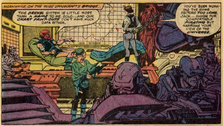 Favourite quote Favourite quote: "Put some feeling into it, your royalness...our lives are at stake." – Han Solo attempts to coerce Princess Leia into giving him a passionate kiss. I thought the story was decent enough, and I agree with you 100% on Carmine Infantino's artwork. I've never liked it, especially as a kid. I agree that it's too angular. Having now seen some of his 60's work (most of my experience with him growing up was his 70's and, to an extent, 80's work) I do think his 60's work is better, less stylized. His art definitely doesn't work here and might be one reason I was never a regular buyer of this series. Odd that Luke is featured on the cover yet hardly appears in the comics. Maybe the editor felt he'd been too neglected lately. |
|
Confessor
CCF Mod Squad
Not Bucky O'Hare!
Posts: 10,221 
|
Post by Confessor on Mar 24, 2021 12:43:19 GMT -5
I thought the story was decent enough, and I agree with you 100% on Carmine Infantino's artwork. I've never liked it, especially as a kid. I agree that it's too angular. Having now seen some of his 60's work (most of my experience with him growing up was his 70's and, to an extent, 80's work) I do think his 60's work is better, less stylized. His art definitely doesn't work here and might be one reason I was never a regular buyer of this series. Yeah, my view on Carmine Infantino's SW artwork is well known to regulars here in the forum. He was waaaay past his best as an artist by this point (as you say, his Silver Age work is head and shoulders above his later stuff) and his overly angular style was ugly as all hell and really didn't suit the feel or "vibe" of George Lucas's universe. It's pretty safe to say that opinion was shared by a lot of Star Wars comic fans in the late 70s and in the years since, from what I've seen online over the years or judging by some of the letters printed in the comic on both sides of the Atlantic. Lucas also wasn't a fan, or so he told artist Al Williamson. That said, although his art annoyed me as a kid, it didn't annoy me enough to stop buying the comic. As a result, I actually have a bit of a love/hate relationship with it nowadays. On the one hand, his artistic idiosyncrasies still bug the hell out of me, but on the other, his artwork is absolutely synonymous in my mind with the pre-Empire Strikes Back Marvel comics. As such, I actually get a nice nostalgic feeling from it nowadays. Plus, whatever criticisms I may have about the look of his art, Infantino's skills as a draughtsman and sequential storyteller were undiminished: his art always conveyed the action in a crystal clear way -- you never had to look twice at an Infantino panel to figure out exactly what was going on. Odd that Luke is featured on the cover yet hardly appears in the comics. Maybe the editor felt he'd been too neglected lately.Yeah, I'd say that's probably a safe bet. EDIT: Ha! I just re-read my review of this issue and I've basically said the exact same thing about Infantion's art. Well, at least I'm consistant. |
|
|
|
Post by dbutler69 on Mar 25, 2021 18:19:06 GMT -5
Star Wars #12Cover dated: June 1978 Issue title: Doomworld!Script: Archie Goodwin Artwork: Carmine Infantino (pencils)/Terry Austin (inks) Colours: Janice Cohen Letters: John Costanza Cover art: Carmine Infantino (pencils)/Terry Austin (inks) Overall rating: 6 out of 10 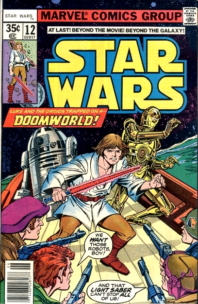 Plot summary Plot summary: Stranded on the water world of Drexel in an escape pod from their crashed spacecraft, Luke Skywalker and his droids R2-D2 and C-3PO are caught in the middle of a battle between the sea-dragon riding Dragon Lords and men in hydra-skimmer craft. Each side wants possession of Luke's wrecked spaceship, as anything mechanical is extremely valuable on the water planet. The battle ends with the Dragon-Lords retreating and Luke and his droids being captured by the hydra-skimmer pilots, who take the trio back to their base and their leader, Governor Quarg. The Governor wants to strip the droids for spare parts, but Luke tries to convince him that R2 and 3PO are more useful to him intact. Meanwhile, Han Solo is leading Crimson Jack and his gang of space-pirates to the Drexel system under the pretense that there is a horde of Rebel treasure there. The pirates become suspicious of Solo's claim, however, when their ship-board sensors reveal that the planet is covered entirely in water. Comments: So, here we have the second Archie Goodwin and Carmine Infantino issue of Star Wars, and I must say that there's a noticeable improvement in the artwork. I attribute this to Infantino doing full pencils on this issue, rather than breakdowns, as he did in issue #11. There's a clarity of line, a heightened level of detail and a confidence to the artwork that is quite satisfying to see. The sea-dragons also look less cartoony in this issue too. Of course, the art still has the usual Infantino idiosyncrasies and overly-angular tendencies, which bug me throughout his run, but leaving aside my personal prejudices for a moment, this is prime 1970s Infantino artwork and, arguably, as good as he gets on the series. In particular, there's a lovely full-page splash of Governor Quarg's floating base (see my favourite panel below). While we're on the subject of the artwork, it's interesting that Infantino draws Luke with longer hair than previous artists did; he sports an almost Conan the Barbarian-style mane in these issues. I'm guessing that the reason for this choice of hairstyle is down to the "Barbarian fantasy in space" aesthetic that early Star Wars promotional material seemed to favour (like the original cinematic poster, for example). Anyway, I don't necessarily dislike Luke's 'do in these issues, it's just an observation. Archie Goodwin's story really starts to pick up pace with this episode and I found myself racing through this issue quite quickly as a result. I like the idea that metal and technology is a hugely valuable commodity for the ocean-bound population of Drexel. Governor Quarg is also a pretty good character and villain, but I'll talk more about him in my next review. Goodwin also gives us some interesting detail about how Crimson Jack runs his operation: turns out that he has financial backers and shareholders, which is how a lowly space-pirate like him can afford to maintain and run a huge Imperial Star Destroyer. We also get to see more of Jack's first mate Jolli and her man hating ways. At one point, all hell breaks loose on the observation deck, when Jolli talks to some of Jack's male crew members about kissing and one or two brave souls attempt to give her a practical demonstration. Yeah, that doesn't go down well, to say the least! To be honest, I'm not sure how I feel about this whole "Jolli the man hater" sub-plot. On the one hand, we will learn in later issues that her attitude towards males is perhaps somewhat justified, given events in her past, but on the other, this seems to be a very two-dimensional version of misandry. Also, the way that Princess Leia antagonises Jolli by talking about what a good kisser Han Solo is – with the princess clearly manipulating Jolli's own attraction to the Corellian smuggler – makes for some unintentionally humourous scenes. Overall though, this is a much better issue than #11, with some very nice looking Infantino art, sympathetically inked by Terry Austin. Unfortunately, I'll never be convinced that Infantino is a particularly good fit for capturing the "feel" of the Star Wars Universe though and this issue, like most of his run, suffers because of that. However, the plot is starting to gather pace and there's a much higher action and intrigue quota in this instalment compared to last issue. So, I'm going to give this a fairly mediocre rating, but still higher than issue #11. Continuity issues: - The blade of Luke's lightsaber is pink instead of blue/white in this issue and on the front cover.
Favourite panel: 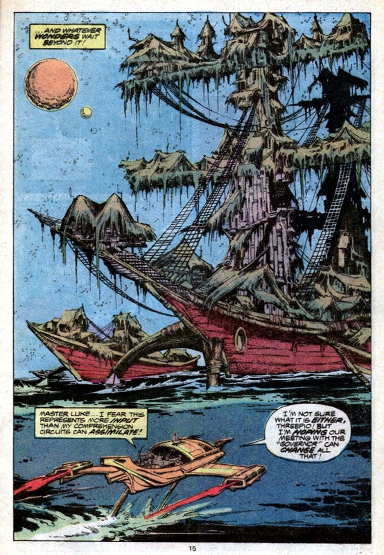 Favourite quote Favourite quote: "A l-lightsaber! The bare-faced little pup is a Jedi!" – One of Governor Quarg's men realises that he may have bitten off more than they can chew by attacking Luke Skywalker. The Jollie the man-hater bit isn't working for me so far. It seems a bit overdone and ham-fisted. I thought the plot with Luke was fairly exciting and fast paced, and yes, the art did seem better than in the last issue. As far as continuity errors, it states here that Chewie is 100 years old, when he's in fact 200 years old. I think that some early versions of the novel mistakenly had him listed as 100 years old, so perhaps that's where this comes from? |
|
|
|
Post by tarkintino on Mar 25, 2021 19:57:17 GMT -5
As far as continuity errors, it states here that Chewie is 100 years old, when he's in fact 200 years old. I think that some early versions of the novel mistakenly had him listed as 100 years old, so perhaps that's where this comes from? as a property was all over the place at the time this issue was published, and contrary to some of Lucas' later-day statements, there was no solid consistency in all of the ancillary market material, such as the character and event history published in the Star Wars Official Poster Monthly, novels such as Splinter of the Mind's Eye, etc. So the comic claiming Chewbacca was 100 instead of 200 just had to be accepted, since the comics and other media were rarely on the same page. |
|
|
|
Post by dbutler69 on Mar 26, 2021 11:23:41 GMT -5
As far as continuity errors, it states here that Chewie is 100 years old, when he's in fact 200 years old. I think that some early versions of the novel mistakenly had him listed as 100 years old, so perhaps that's where this comes from? as a property was all over the place at the time this issue was published, and contrary to some of Lucas' later-day statements, there was no solid consistency in all of the ancillary market material, such as the character and event history published in the Star Wars Official Poster Monthly, novels such as Splinter of the Mind's Eye, etc. So the comic claiming Chewbacca was 100 instead of 200 just had to be accepted, since the comics and other media were rarely on the same page. Th July, 1978 issue of Bantha Tracks (which I think was published by Lucasfilm) did state that "According to George Lucas and Gary Kurtz, Chewbacca is two hundred years old", but that "some editions of the novel edition of Star Wars contain a misprint that states Chewie's age as one hundred, but that is incorrect." |
|
|
|
Post by dbutler69 on Mar 26, 2021 11:33:38 GMT -5
Star Wars #13Cover dated: July 1978 Issue title: Day of the Dragon Lords!Script: Archie Goodwin Artwork: Carmine Infantino (breakdowns)/Terry Austin (finished art & inks)/Bob Wiacek (finished art & inks - uncredited) Colours: Janice Cohen Letters: Rick Parker Cover art: John Byrne (pencils)/Terry Austin (inks) Overall rating: 4½ out of 10 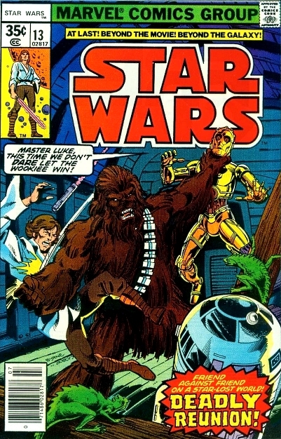 Archie Goodwin's writing is pretty good overall and he throws in a nice reference to the Star Wars movie, when R2 and 3PO are both rewarded for their work on Governor Quarg's hydra-skimmer by being given a lubrication bath (just like in Luke's uncle's garage). There's also a good piece of writing when Goodwin has Han and Chewbacca discussing a rescue of Princess Leia, only to find that the princess has already escaped from Jolli and even procured blasters for the trio. This is the Princess Leia that we saw in the Star Wars movie – a resourceful, feisty Rebel leader, not some weak damsel in distress. Han's reaction to Leia's resourcefulness is very in character too and this brief scene is an excellent example of how much better Goodwin's grasp of George Lucas's characters was than Roy Thomas's. There's also a neat moment in the story when Governor Quarg's master machinesmith attempts to kill Luke, in order to prevent the young Rebel from stealing his job. That's a nice touch on Goodwin's part because it demonstrates that we have a living, breathing society here in the space-wrecker's floating city and that even the bad guys have families to feed. Of course, Quarg's capitol punishment for the master machinesmith also serves to illustrate to the reader what a cruel and despotic ruler he is. While we're on the subject of Governor Quarg, I find him to be one of the more memorable villains from Marvel's Star Wars series. He's evil and brutal, but also somehow relatable, insofar as he's a naturally unkind and brutish man, pushed to dictator-like actions, as a result of exceptionally hard circumstances. I also like Quarg's costume: it suggests that he's ex-military, but, while he's clearly a war leader, no former military service is ever mentioned in the story. Page 10 of this instalment of the Doomworld story arc features an editorial mistake in which there's a blank speech balloon for Governor Quarg (at least, it's blank in the original comic). I was wondering if any of those who are following my reviews with reprints would take a look and see if any dialogue has been retroactively added for Quarg in this panel... 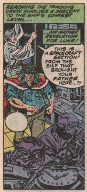 I liked the scene with Princess Leia freeing herself and getting the guns as well. As you said, Archie Goodwin seems to have a better feel for these characters than Rascally Roy did. And also, my Star Wars Omnibus from Dark Horse has the exact same blank speech balloon as your comic. |
|
Confessor
CCF Mod Squad
Not Bucky O'Hare!
Posts: 10,221 
|
Post by Confessor on Mar 27, 2021 0:24:26 GMT -5
The Jollie the man-hater bit isn't working for me so far. It seems a bit overdone and ham-fisted. Yeah, I kinda feel the same way. It does make her character a bit more interesting, I suppose, but "overdone" is the word. As far as continuity errors, it states here that Chewie is 100 years old, when he's in fact 200 years old. I think that some early versions of the novel mistakenly had him listed as 100 years old, so perhaps that's where this comes from? Ooh, good catch! I missed that. When I get some free time I'll have a look at the novel and see what it says. I'll have to add this to my review. |
|
Confessor
CCF Mod Squad
Not Bucky O'Hare!
Posts: 10,221 
|
Post by Confessor on Mar 27, 2021 0:33:22 GMT -5
I liked the scene with Princess Leia freeing herself and getting the guns as well. As you said, Archie Goodwin seems to have a better feel for these characters than Rascally Roy did. Yeah, I mean...I like Roy's writing on the series, and I think his original characters like Amaiza, Serji-X, Don-Wan Kihotay, and of course Jaxxon are very memorable. But I feel as if Goodwin gives us more character moments that feel truer to the cinematic versions of these characters than Roy did. And also, my Star Wars Omnibus from Dark Horse has the exact same blank speech balloon as your comic. Yeah, it's weird isn't it? Oh well... Really enjoying your comments, dbutler69. |
|
|
|
Post by dbutler69 on Mar 27, 2021 7:48:57 GMT -5
Star Wars #14Cover dated: August 1978 Issue title: The Sound of Armageddon!Script: Archie Goodwin Artwork: Carmine Infantino (pencils)/Terry Austin (inks) Colours: Janice Cohen Letters: Denise Wohl Cover art: Carmine Infantino (pencils)/Terry Austin (inks) Overall rating: 4½ out of 10 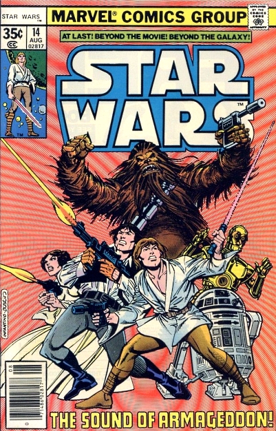 Plot summary Plot summary: Luke Skywalker, C-3PO, R2-D2 and Chewbacca are all imprisoned on Governor Quarg's city-ship on the water world of Drexel. Believing Han Solo to be dead and wrongly assuming that Luke is to blame, Chewbacca attempts to rip the youngster to pieces in their prison cell, while outside a huge battle rages between Quarg's space-wreckers and their enemies, the Dragon Lords. As the conflict intensifies, Quarg's men use their sonic-jammer to ensnare the space-pirate Crimson Jack's Star Destroyer, which is in orbit above the planet. Meanwhile, it turns out that Han in not dead, having been rescued by the Dragon Lords and taken to their secret undersea cave. The leader of the Dragon Lords tells Han that the space-wrecker's sonic-jammer is slowly killing the huge sea-dragons that his people co-exist with, prompting Han to agree to help the Dragon Lords, if they will help him recover the Millennium Falcon from Quarg's men in return. Back on the city-ship, Governor Quarg has found Princess Leia hiding in the Falcon and after a chase through the floating settlement, Luke – who has by now subdued Chewbacca and been freed from his cell – rescues Leia by knocking Quarg into the ocean, killing him. The Falcon then destroys the space-wrecker's jamming equipment. Comments: Issue #14 of Marvel's Star Wars is quite a convoluted episode, with lots of plot development and action crammed into it. Archie Goodwin does a good job of juggling the various plot threads, as the action cuts away from one scene to another with gripping rapidity. As a result, this issue is certainly a quick one to read. However, I also think that the ending seemed a bit rushed, with Governor Quarg's demise and the whole space-wreckers vs. the Dragon Lords plot thread wrapped up in short order on the last page and a half. Still, there's more of the good characterisation of Princess Leia that we saw last issue and having the small lizards that infest the space-wrecker's city-ship turn out to be the sea-dragon's young offspring, who form a spy network for the Dragon Lords, is inventive. I also like the way that Goodwin writes Quarg here: full of hubris and stubborn-minded greed, which blinds him in the heat of battle. On the downside, the fact that Luke an co. just happen to be on Drexel at the precise moment that the fight to end all fights between the space-wreckers and the Dragon Lords kicks off seems a bit contrived. Also, the fight between Chewbacca and Luke Skywalker in the prison cell is a bit corny. In such a confined space, an enraged Wookiee would've made short work of Luke. To then have Chewbacca ultimately defeated by C-3PO getting down on all fours to trip him up, as R2-D2 sprays fire extinguishing foam into his face until the Wookiee passes out, seems, at best, unlikely, and at worst, ludicrously silly. It's interesting that we see a return of Chewbacca the ferocious and ill-tempered brawler in this issue though. We've not really seen this side of Chewie's character since the Roy Thomas-penned issue #7. Something else that I disliked in this issue was Luke punching Han in the face and then threatening him at blaster point. That seemed really out of character for Luke and doesn't really jibe with the relationship that we saw develop between the two men in the Star Wars movie. Besides, Luke later manages to explain his plan of using the Millennium Falcon to destroy Quarg's sonic-jammer to Han in just two panels. Couldn't he have simply explained to Solo what he intended to do instead of socking him in the jaw?! On the art front, Carmine Infantino and Terry Austin's work is of much the same standard as last issue. There's some inventive framing and staging on Infantino's part though. In particular, I've always loved this three-panel sequence... 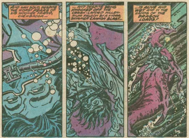 Infantino's ability to keep up with Goodwin's rapid scene changes, without things ever once becoming confusing for the reader, is excellent. I've said it before and I'll say it again, whatever Infantino's short-comings as a Star Wars artist are, his storytelling with sequential art is always flawless. Also, I love the Infantino/Austin front cover: it's really eye-popping and must've leapt out at kids from the spinner racks. Ultimately, Star Wars #14 is a much more interesting read than last issue, but a handful of silly scenes or out of character moments spoil things somewhat. Continuity issues: None Favourite panel: 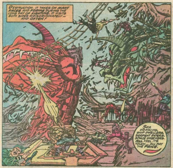 Favourite quote Favourite quote: "Make the trip alone, pudgy! I'm tired of being everybody's pawn!" – Princess Leia Organa gets feisty with Governor Quarg. I agree with all of your comments. first, I thought Chewie's berserker rage was a bit too out of character, without any real explanation for it in the first place. Then, the way that Luke and the droids rendered him unconscious was embarrassing. More like burlesque comedy. I had also disliked Luke punching Han. Surely he would have tried to explain his plan first, rather than just punching him? That's just the comic book mentality of inserting conflict and violence, even where it doesn't make sense, just for the sake of having conflict and violence. I, too, liked how Leia got away from Quarg, showing her strength and self reliance again. I liked when Luke said "Han! Y-you're alive!" and Han responded "What else? Self-preservation is my specialty!" I could imagine Harrison Ford speaking that line. Finally, I agree with you on Carmine Infantino's strengths and weaknesses. No issue with his sequential storytelling, but the illustrations grate on me somewhat. |
|
|
|
Post by dbutler69 on Mar 27, 2021 8:05:43 GMT -5
I liked the scene with Princess Leia freeing herself and getting the guns as well. As you said, Archie Goodwin seems to have a better feel for these characters than Rascally Roy did. Yeah, I mean...I like Roy's writing on the series, and I think his original characters like Amaiza, Serji-X, Don-Wan Kihotay, and of course Jaxxon are very memorable. But I feel as if Goodwin gives us more character moments that feel truer to the cinematic versions of these characters than Roy did. I agree about Roy Thomas. He's an excellent writer, and I did enjoy his western riffs in this series. |
|
|
|
Post by Duragizer on Mar 27, 2021 15:44:58 GMT -5
I'll be the dissenting voice and say I like Infantino's off-model take on Star Wars. Chalk it to a distaste for homogeneity.
|
|
|
|
Post by brutalis on Mar 27, 2021 16:01:59 GMT -5
I'll be the dissenting voice and say I like Infantino's off-model take on Star Wars. Chalk it to a distaste for homogeneity. You are not alone. There are others of us who have voiced our enjoyment of Infantino, especially when we were buying it new off the racks. Yes, it does look quite different from the SW we know now. But at the time with ONLY one movie providing a glimpse of a vast universe, Infantino was giving us science-fantasy settings which few were capable of delivering at the time. Today Infantino would be a bad artistic choice given how much details are available at an artist's fingertips. Back then, all you had was whatever Fox/Lucas was willing to provide or what you might "remember" from seeing the movie. An artist had to interpret what the writer asks for as well as having it "feel" like Star Wars while filling in the blanks. Infantino did that where most others likely would not or could not. Licensed properties were NOT what many were interested in working upon in ye olden days. They did not pay as well and the headaches of dealing with the licensee were just horrible at times. What you could do. What you couldn't do. Change this or change that. Make it look different. Don't copy from photo's. No likeness could resemble the actors. Who needs or wants those type of headaches? Infantino rose to the occasion in my opinion giving us fun, exciting and interesting art keeping the interest of readers waiting AND wondering if there was going to be more Star Wars movies. |
|
|
|
Post by tarkintino on Mar 27, 2021 20:58:09 GMT -5
I'll be the dissenting voice and say I like Infantino's off-model take on Star Wars. Chalk it to a distaste for homogeneity. You are not alone. There are others of us who have voiced our enjoyment of Infantino, especially when we were buying it new off the racks. Yes, it does look quite different from the SW we know now. But at the time with ONLY one movie providing a glimpse of a vast universe, Infantino was giving us science-fantasy settings which few were capable of delivering at the time. Today Infantino would be a bad artistic choice given how much details are available at an artist's fingertips. Back then, all you had was whatever Fox/Lucas was willing to provide or what you might "remember" from seeing the movie. An artist had to interpret what the writer asks for as well as having it "feel" like Star Wars while filling in the blanks. Infantino did that where most others likely would not or could not. Licensed properties were NOT what many were interested in working upon in ye olden days. They did not pay as well and the headaches of dealing with the licensee were just horrible at times. What you could do. What you couldn't do. Change this or change that. Make it look different. Don't copy from photo's. No likeness could resemble the actors. Who needs or wants those type of headaches? Infantino rose to the occasion in my opinion giving us fun, exciting and interesting art keeping the interest of readers waiting AND wondering if there was going to be more Star Wars movies. I agree with much of your post, and I will also point out a few of Infantino's strengths where film details were concerned (originally posted some time ago): from costume details most artists would never pay attention to, to making the lightsaber blade look as though it was really radiating energy, to the wealth of scale-enhancing, so-called "greebles" he always applied to vehicles to match that of the filming miniatures (as seen on the Star Destroyer), Infantino did not simply take on Star Wars like some fill-in artist. He made it his own and captured so much of the unique visual language of the film in a way that was nearly unheard of with film or TV adaptations up to this point in comic book history (with notable exceptions being Perez on Marvel's Logan's Run or Giolitti on Gold Key's Beneath the Planet of the Apes).
Aside from creative license with the Millennium Falcon's gun turrets (middle row), the essence of the weapon and how its used was faithful to the film.
Every artist takes artistic license--to varying degrees--with licensed properties, even Al Williamson, who drew the Falcon's forward landing gear in this manner...
....based of the very inaccurate Kenner diecast toy from 1979, which is odd, since he certainly had many photo sources of the model, and the MPC Falcon model kit (with accurate landing gear) had been available for years up to the period where the panel was produced.
Then, there was the adaptation of the original film...
A: I see a wedge shape piled with greebles (perhaps a good start?), but its not even close to being screen-accurate, not on the main body, or the missing bridge section.
B: Aside from the incorrect Falcon cockpit window & control panels, since when did the cockpit become open concept with the ship's hold? One has to wonder if Chaykin pay any mind to the photos or see any footage to notice a very clear separation between the cockpit and hold?
C: Where to begin? Nevermind Luke's helmet being completely wrong, but how did Chaykin, et al., see any images (still or actual film) of the training remote (inset, left) only to transform that into the equivalent of an underwater mine (inset, right)?
D: The TIE Fighter? Take your pick with the small "wing"/panels, the misshapen cockpit...
So, it appears the Marvel Star Wars adaptation had many an inaccuracy during its run, certainly not limited to, or dominated by one artist.
Infantino's long history with science fiction comics gave him an advantage going into a series that (by its nature) required characters and worlds of the romantic, exotic nature introduced in that first film. He populated his Star Wars world with the kind of characters and energy that lived up to Star Wars being called (at the time) a "science-fantasy" film.
|
|
Confessor
CCF Mod Squad
Not Bucky O'Hare!
Posts: 10,221 
|
Post by Confessor on Mar 27, 2021 23:57:24 GMT -5
I'll be the dissenting voice and say I like Infantino's off-model take on Star Wars. Chalk it to a distaste for homogeneity. You are not alone. There are others of us who have voiced our enjoyment of Infantino, especially when we were buying it new off the racks. Yes, it does look quite different from the SW we know now. But at the time with ONLY one movie providing a glimpse of a vast universe, Infantino was giving us science-fantasy settings which few were capable of delivering at the time. Today Infantino would be a bad artistic choice given how much details are available at an artist's fingertips. Back then, all you had was whatever Fox/Lucas was willing to provide or what you might "remember" from seeing the movie. An artist had to interpret what the writer asks for as well as having it "feel" like Star Wars while filling in the blanks. Infantino did that where most others likely would not or could not. Licensed properties were NOT what many were interested in working upon in ye olden days. They did not pay as well and the headaches of dealing with the licensee were just horrible at times. What you could do. What you couldn't do. Change this or change that. Make it look different. Don't copy from photo's. No likeness could resemble the actors. Who needs or wants those type of headaches? Infantino rose to the occasion in my opinion giving us fun, exciting and interesting art keeping the interest of readers waiting AND wondering if there was going to be more Star Wars movies. Just a couple of points of clarification. Firstly, in 1978, Star Wars was not some bum, licensed title that nobody wanted to be stuck on; the film and franchise were a bona fide pop culture phenomenon by then and the comic was selling extremely well. It had, according to Roy Thomas, even saved Marvel from bankruptcy. I'm not sure about the page rate, but I can't imagine that Carmine Infantino was getting a crappy rate on such a successful property, surely? And secondly, although the artists weren't allowed to depict the actor's likenesses, they were expected to depict everything else in as "movie-accurate" a way as they could (though that didn't always happen in the very early days). That's basically what Marvel having the licence for the property meant: they could copy the props and costumes, and use the characters to tell new stories. When it comes down to liking Infantino's art on SW or not, a lot of it is personal taste, of course. And, yes, there's always going to be varying amounts of artistic licence when drawing a comic, particularly in the minutia of the background technology. But the thing is, we know that Infantino had a lot of reference photographs and concept artwork from Lucasfilm at his disposal when he came onto the comic, and was being supplied with more throughout '78 and '79. Howard Chaykin, on the other hand (who, by his own admission, was also dialling it in because he had no idea how big Star Wars was gonna be when he drew his adaptation of the first movie), had very little in the way of reference material, since the film was unfinished and a lot of the special effects shots were still incomplete when he began working on the comic. That's why details like the Imperial interrogator droid, the cloaked informant at Mos Eisley, the interior layout of the Millennium Falcon, and, famously, Jabba the Hutt in a deleted scene look so different in the film adaptation to how they do on the screen. So, to compare Chaykin's artistic inaccuracies from before the movie was even finished to later inaccuracies when the film was out and Infantino was in possession of plenty of reference photos isn't really a fair comparison. And the thing is, even though Infantino was being provided with reference photographs and concept art by Lucasfilm throughout '78 and '79 – as evidenced by things like the TIE Bomber appearing in issue #15 from June 1978, two years before it appeared on screen in The Empire Strikes Back – it didn't improve his accuracy when depicting the various pieces of Star Wars tech at all. In my review of issue #20, I noted that he delivered a, frankly awful, depiction of a Rebel X-Wing Fighter in late 1978, which had the wrong number of engines, the engines positioned incorrectly, no droid socket, incorrectly shaped "S-foils", and no visible cockpit canopy. I mean, yeah, I know that all artists employ some degree of artistic licence, but this X-Wing... 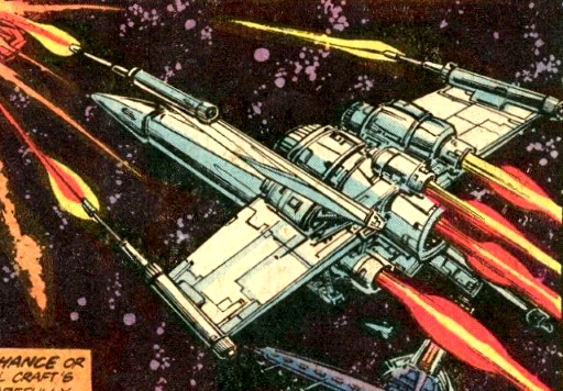 Is not in the same ballpark, with regards to inaccurate depictions of space ships, as this rendering of the Falcon... 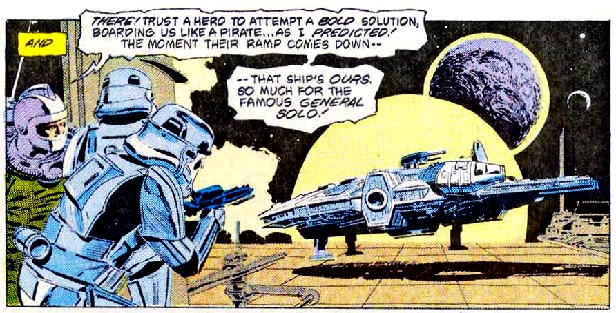 Even if we put aside Infantino's access to reference photos, the popularity of the first SW film was at its absolute zenith in mid-to-late 1978, when Infantino drew that X-Wing. The X-Wing space ship was depicted on lots of merchandise, like lunch boxes, t-shirts, posters, gum cards, and pinball and video game machines etc. The fact that Infantino – the man charged with drawing the official Star Wars comic – could render such an inaccurate drawing of an X-Wing Fighter leads me to the conclusion that he wasn't really trying to draw accurate versions of the Star Wars ships and preferred to put his own spin on them instead. Now, that's absolutely fair enough and was just the way that Infantino rolled, I guess, but it wasn't to my liking, personally. It's also telling, I think, that as Infantino's time on Star Wars came to a close, the comic's new editor Louise Jones would issue an edict that artists were to make the comic look more like the film from now on. On a purely subjective note, I find Infantino's overly-angular art and weird, ungainly character poses to be quite ugly, but your mileage obviously varies...and that's absolutely fair enough! It's really a matter of personal taste. But putting aside our personal preferences for certain artistic styles, I think it's safe to say, based on the evidence we have, that Infantino did not bring his A-game to Star Wars. |
|