|
|
Post by impulse on Apr 10, 2020 13:40:44 GMT -5
Also, yeah, Wolverine was my favorite character for decades, and I thought he looked absolutely hideous on his first appearance cover. Frankly, I always thought that whole cover was awful, and the issue was only desirable because of the knowledge it was his first appearance.
Same with Uncanny 266. Gambit looks hideous on that cover. I really don't know what anyone involved was thinking, from the pencils to the inks to the colors to the costumes to the layout, any of it.
|
|
|
|
Post by tarkintino on Apr 10, 2020 16:48:53 GMT -5
Same with Uncanny 266. Gambit looks hideous on that cover. I really don't know what anyone involved was thinking, from the pencils to the inks to the colors to the costumes to the layout, any of it.  Well, yeah. Its a terrible cover with arms and hands appearing out proportion to the bodies, etc. As a selling point, unless one was already a serious fan of this title, I could not imagine this would grab the attention of anyone...other than to say, "That's awful" or something along that line. |
|
|
|
Post by beyonder1984 on Apr 15, 2020 8:49:53 GMT -5
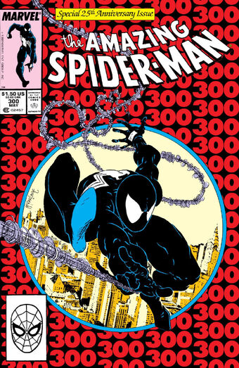
Todd has heard criticism since the day he broke in DC. He laughed all the way to the bank. History was on his side. He had a true artist's mentality to break the rules and ignore the house style. Kids loved the new style while the old timers crapped on it and so did his fellow artists, inkers, and editors. They literally thought he was drawing things "incorrectly" due his impossible anatomical poses and enlarged body parts. For some reason, Todd got singled out- (it's not like comics were bastions of realism) maybe due to his overconfidence or perhaps due to people being envious- but Todd was revolutionary. I understand some older fans quit when Todd was #1 with Spidey and then Spawn. It is completely fine to have different tastes. But this a hugely key payoff issue regarding Spidey's black costume, to say the least. The cover stood out at newsstands. This was when #300 was a huge milestone event at Marvel and but many #300 anniversaries had underwhelming covers or stories- like Fantastic Four and Avengers, which had much better #200s. Captain America 300 and Incredible Hulk 300 were great. Bear in mind this is only my finicky opinion But I don't like this cover, or McFarlane Spidey.
I don't care if it's valuable...I resold every copy I owned or acquired to guys who swoon over Todd McFarlane.
I can't really appreciate a book if I don't like the artwork...
|
|
|
|
Post by Deleted on Apr 15, 2020 11:21:28 GMT -5
Todd has heard criticism since the day he broke in DC. He laughed all the way to the bank. History was on his side.
That's fine. But his style did nothing for me. Same for Rob Liefeld. These 2 might have been a big part of the 90s but they were my least favourite part of it.
|
|
|
|
Post by impulse on Apr 15, 2020 13:02:00 GMT -5
I understand not caring for their styles, but man, there is a vast chasm in technical skill between McFarlane and Leifield.
|
|
|
|
Post by rberman on Apr 15, 2020 13:14:15 GMT -5
I understand not caring for their styles, but man, there is a vast chasm in technical skill between McFarlane and Leifield. Right. I don't mind Spider-Man having weird disjointed arachnid-like anatomy as a matter of choice. Bill Sienkiewicz did plenty of "People don't really look like that" art too, yet was also capable of photorealism when the occasion called for it. Thus these two images of Illyana, each appropriate to their setting:   With Liefeld, the big muscles themselves were a stylistic choice. But not knowing how the human body is constructed was simply ignorance, not a conscious decision. |
|
|
|
Post by String on Apr 16, 2020 17:24:56 GMT -5
I like the figure fine. But I hate the 300 background. Its hideous! They used this same design for several anniversary issues around this time, like Web #50, and it's just terrible. When this came out, I didn't buy it. But I did buy 301, which has the same exact figure, but in the classic costume with a blank white background. It looks infinitely better than this mess on 300.  Yes, I agree, looks a lot better than the 300 cover. Overall, I like McFarlane's art especially his Spider-Man. From his acrobatics to the spaghetti webbing, it's about as classic depiction of the character as Ditko or Romita. I have more of a problem with his Venom though:  Maybe it's all the teeth but I've never warmed up to Venom even with McFarlane handling the art. The character idea is sound but he's another example of fan popularity boosting the appearances of said character whether it's deserving or not. McFarlane broke all sorts of rules even when it came to his writing/plotting. I remember reading in some of his interviews about his method of plotting when he first began on the new solo Spider-Man title. He had no script, no plot outline, no nothing, just an idea of what he wanted in that issue. He drew out rough sketches, laid them out and arranged them into something resembling coherent pages and went from there. He laughed about how his writing technique would probably draw the ire of other seasoned vets but he didn't care. |
|
|
|
Post by chadwilliam on Apr 18, 2020 13:31:08 GMT -5
Even though nothing by Curt Swan deserves to be on a 'Worst of' anything list, it bothers me that if you're looking to do something epic or memorable for an anniversary issue it makes much more sense to go with something like this: Superman #199  or this: Superman #201  than this: Superman #200  I suppose the reasoning may have been that since Superman vs. The Flash is going to sell anyway and that cover for #201 is catchy enough to jump out at readers, there's no need to use them for an anniversary issue which might need nothing more than 'Hey kids, the 200th issue of Superman!' to sell, but even that logic falters when you note that there's nothing on the cover to indicate that it is an anniversary issue other than the customary No. 200 in the right hand corner. Incidentally, the story itself was deemed special by Weisinger because it coincided with Canada's 100th birthday (this imaginary tale concludes with Superman deciding to make Canada his home rather than the US) which doesn't seem that significant to me even as a Canadian. |
|
|
|
Post by tarkintino on Apr 19, 2020 12:10:10 GMT -5
Todd has heard criticism since the day he broke in DC. He laughed all the way to the bank. History was on his side.
That's fine. But his style did nothing for me. Same for Rob Liefeld. These 2 might have been a big part of the 90s but they were my least favourite part of it.
Agreed. They are certainly among the larger poster children for the 1990s being considered a horrible decade for comics. |
|