|
|
Post by berkley on Jun 6, 2019 4:32:20 GMT -5
This is a question I've asked before, but how does everyone think Byrne's artwork in Alpha Flight compare to his X-Men run from just a few years earlier? I loved his 70s stuff, not only X-Men but things like Iron Fist and Marvel team-Up but unlike a lot of fans, I don't much like what I've seen of his 80s work, even his FF, which so many people I usually agree with rate highly.
|
|
|
|
Post by Icctrombone on Jun 6, 2019 5:20:47 GMT -5
It felt like he needed a strong inker. It looked very thin and cartoony without the added weight that Austin or Sinnott provided.
|
|
|
|
Post by Roquefort Raider on Jun 6, 2019 5:57:15 GMT -5
This is a question I've asked before, but how does everyone think Byrne's artwork in Alpha Flight compare to his X-Men run from just a few years earlier? I loved his 70s stuff, not only X-Men but things like Iron Fist and Marvel team-Up but unlike a lot of fans, I don't much like what I've seen of his 80s work, even his FF, which so many people I usually agree with rate highly. In Fantastic Four, he seemed to consciously channel Kirby rather than keeping with his earlier approach from the 70s (when drawing technology, for example). I still liked it, and especially approved of his depiction of Reed and Johnny as less muscular than before, but it took a little getting used to. In Alpha Flight he was closer to his old X-Men style, but with a much looser approach. Looking at the pages, it’s easy to spot the time-saving maneuvers. That gave AF a sort of lighter feel than FF, but I didn’t really mind. Bringing in an inker in the second year was a good idea; it made the art crisper. Dang! Now you people make me want to dig into the old long boxes!!! |
|
|
|
Post by Icctrombone on Jun 6, 2019 7:09:48 GMT -5
And yet when Byrne switched books and did his Hulk run, the art looked a lot better. It felt like it had more detail.
|
|
|
|
Post by badwolf on Jun 6, 2019 8:21:16 GMT -5
This is a question I've asked before, but how does everyone think Byrne's artwork in Alpha Flight compare to his X-Men run from just a few years earlier? I loved his 70s stuff, not only X-Men but things like Iron Fist and Marvel team-Up but unlike a lot of fans, I don't much like what I've seen of his 80s work, even his FF, which so many people I usually agree with rate highly. I think the first halves (roughly, not sure where exactly the transition occurs) of both AF and FF, when he was inking himself, look the best. I understand why he brought in other inkers eventually, as his workload was enormous at the time, but I always felt that they were too "light" with his work. It may be that Byrne's own line work was lightening up at that point, but whatever the reason, it doesn't look quite as good. |
|
|
|
Post by Deleted on Jun 6, 2019 8:25:19 GMT -5
I'm going to nitpick right out of the gate and ask why they used the cover art from AF #1 for the cover of this book. All the other characters are a distraction, and without the word balloon, there's no context.
This would have been much better... Sure I'm not telling you anything you don't know, but that cover was chosen by the Marketing department.
guaranteed.
yes, logic dictates that anyone buying the "Alpha Flight Omnibus" is familiar with the team and knows what they are getting.
but Marvel is counting on your Aunt or Gramma, or Brother, seeing the cover and thinking: hey, that's Spider-Man! (and Captain America!. . or the Fantastic Four!). . and picking up the book as an expensive gift (Xmas, Birthday, or otherwise).
that's the only reason they chose that particular cover.
(tho I do find it super odd that no Wolverine, or Human Torch - two very identifiable characters aren't on the cover. . but I guess Byrne just wasn't in the mood to draw them in the original, and they weren't about to reach out to him to ask for new art for the Omnibus)  |
|
|
|
Post by Deleted on Jun 6, 2019 8:36:52 GMT -5
All of you guys sure pays awful attention to the details of art more than I do. I don't pay much attention to that and having said that ... I look at the collective efforts of them whether the penciller, the inkers, and the colorists all working together in harmony and that's where I see that. You all seems to pinpoint the actual names and that's one area that I'm EXTREMELY WEAK on and I don't pay much attention to. I like to keep things simple overall ART and STORY ... with more emphasis on the storyline than art.
|
|
|
|
Post by Deleted on Jun 6, 2019 10:06:22 GMT -5
I received the omnibus as a birthday gift and recently finished it earlier this year. I loved the stories with Aurora and her personality disorder. Such a harsh upbringing contrasted with that of her brother, Northstar. Sasquatch was funny. Snowbird, beautiful and mysterious. Shaman was cool and Vindicator--what a cool costume! Didn't care for Puck or Marina. When I read this series, it was almost like not reading a Marvel book, but maybe something from an independent publisher. I liked all the little nods to Canada throughout. Enjoyed the introduction of Talisman and the conflict with her dad. Great crossover with the X-Men too. Loved the Paul Smith art.
|
|
|
|
Post by badwolf on Jun 6, 2019 10:35:59 GMT -5
I received the omnibus as a birthday gift and recently finished it earlier this year. I loved the stories with Aurora and her personality disorder. Such a harsh upbringing contrasted with that of her brother, Northstar. Sasquatch was funny. Snowbird, beautiful and mysterious. Shaman was cool and Vindicator--what a cool costume! Didn't care for Puck or Marina. When I read this series, it was almost like not reading a Marvel book, but maybe something from an independent publisher. I liked all the little nods to Canada throughout. Enjoyed the introduction of Talisman and the conflict with her dad. Great crossover with the X-Men too. Loved the Paul Smith art. I liked Marrina but was ambivalent about Puck. Snowbird was always my favorite. |
|
|
|
Post by badwolf on Jun 6, 2019 10:37:18 GMT -5
Sure I'm not telling you anything you don't know, but that cover was chosen by the Marketing department.
guaranteed.
yes, logic dictates that anyone buying the "Alpha Flight Omnibus" is familiar with the team and knows what they are getting.
but Marvel is counting on your Aunt or Gramma, or Brother, seeing the cover and thinking: hey, that's Spider-Man! (and Captain America!. . or the Fantastic Four!). . and picking up the book as an expensive gift (Xmas, Birthday, or otherwise).
that's the only reason they chose that particular cover.
Yeah you're probably right. I am just super-critical of the omnis, as I think they should be definitive volumes...and of course they're expensive! |
|
|
|
Post by beccabear67 on Jun 6, 2019 11:09:26 GMT -5
Pierre says, non, we will have this one back, we're still paying for the Montreal Forum too. Are you possibly thinking rather of the infamous cost-over-runs of Montreal's Olympic Stadium? Oops... you're right... I must have pucks on the brain. Je suis stupide! The Forum was built back in the 1920s or something.  |
|
|
|
Post by Cei-U! on Jun 6, 2019 11:43:51 GMT -5
Great conversation so far and it's only one issue in. Gonna keep my eyes on this thread.
Alpha Flight is by far my favorite solo work from John Byrne and it always makes me sad when I see him disparage his work here in interviews. The Canadian setting gave him some elbow room, away from the rest of the Manhattan-centric Marvel herosphere, and the freedom to build his own little world of heroes, villains, supporting players, and cosmic entities and to take chances with them (deaths, new costumes, new power sets, implied homosexuality). When he did dip his toe in the continuity pool, he did so intelligently and appropriately (Sub-Mariner and Invisible Woman, Super-Skrull, Diablo, and, inevitably, Wolverine). I like the way he structured the first twelve issues, running sub-plots through a series of done-in-ones or two-parters that paid off in a double-sized battle royale with casualties on both sides. I am in the camp that prefers other inkers to Byrne himself, either someone like Terry Austin willing to add detail and texture or a Sinnott, Rubinstein, Palmer, or Hunt who'll give his pencils needed weight and/or polish. Either way, I love his design sense! The Great Beasts are scary as hell! My favorite characters during the Byrne run were Heather, Sasquatch, Shaman,, and Box. I liked Marrina better than Puck (Mantlo's later "origin" for the character vitiated everything I did like bout him), and didn't mind their presence on the team at all.
becca: I seem to remember a long-ago interview where Byrne explicitly said Snowbird was inspired by the song and named her civilian identity, Anne McKenzie, after Anne Murray.
Cei-U!
I summon one of the highlights of the early '80s!
|
|
|
|
Post by Icctrombone on Jun 6, 2019 11:54:25 GMT -5
All of you guys sure pays awful attention to the details of art more than I do. I don't pay much attention to that and having said that ... I look at the collective efforts of them whether the penciller, the inkers, and the colorists all working together in harmony and that's where I see that. You all seems to pinpoint the actual names and that's one area that I'm EXTREMELY WEAK on and I don't pay much attention to. I like to keep things simple overall ART and STORY ... with more emphasis on the storyline than art. The is the best place to learn about the names you don’t know. The right inker and colorist is a big deal to the final product. |
|
|
|
Post by badwolf on Jun 6, 2019 11:56:41 GMT -5
I was not a fan of Joe Sinnott's inks over Byrne. I feel like he eliminated a lot of the Byrniness (is that a word?) from the art.
Rubinstein and Palmer however are two of my favorite inkers--on anyone.
|
|
|
|
Post by badwolf on Jun 6, 2019 12:32:08 GMT -5
X-Men #120 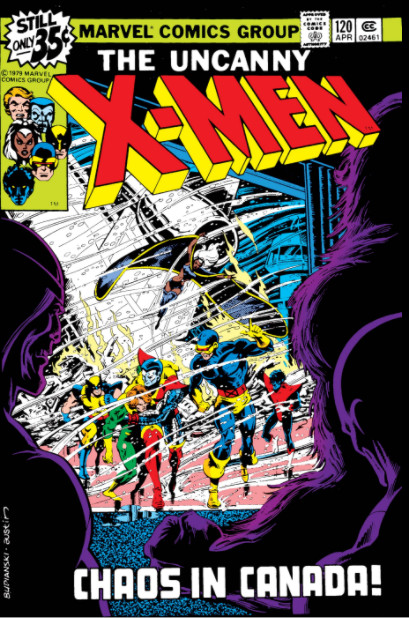 "Wanted: Wolverine! Dead or Alive!" By Claremont, Byrne and Austin Jimmy Hudson (and the Prime Minister) haven't given up on capturing Wolverine, but this time they are bringing reinforcements! We are introduced to the rest of Alpha Flight in their civilian guises. 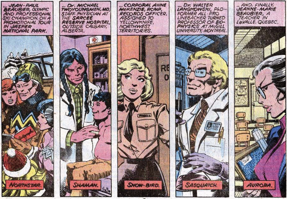 The X-Men have just finished up a mission in Japan and bidding farewell to former member Sunfire. Wolverine wanders off on his own (typical) and presents Sunfire's cousin Mariko Yashida with a lovely chrysanthemum. She thanks him and he tells her to call him Logan. Flying back to North America, their plane is brought down by a magical storm and wrecked by a very strong, orange furry person. (In this issue the rest of Alpha Flight are only partially seen.) The X-Men get out safely, split up and attempt to lose their attackers in a mall. Nightcrawler is blinded and then knocked out by a pair in matching costumes; the woman expresses regret that they had to harm one of their own kind, another mutant. Banshee takes Storm clothes shopping in a (failed) attempt to make her inconspicuous. Hudson, now calling himself Vindicator, finds them. Banshee recognizes him and attacks, but his sonic scream incapacitates him. While Hudson tries to help him, Storm vows payback and unleashes on Hudson, wrecking the clothing store in the process. Hudson flees, expressing doubt about his role as a "super-hero" and regretting the damage they've done. Wolverine is wandering the city when he is ambushed by the furry orange guy again, who knocks him out by pummeling him against the walls. Storm, Banshee, Cyclops and Colossus reconvene and determine to get their missing teammates back, whatever the cost. ** I've read this issue before in Classic X-Men but I had forgotten that here is where we first hear Wolverine's real name. I always remember it as having been in #139, which is when Nightcrawler finds out. Remember when Wolverine wasn't invincible?? |
|