|
|
Post by Cei-U! on Jan 8, 2018 8:29:24 GMT -5
This is the space to post about those super-villain designs that didn't quite make your Top Twelve. Since I'm not tracking these citations, there's no restrictions on the number of images you can include. I'll post my own choices later.
Cei-U!
Have at it!
|
|
|
|
Post by brutalis on Jan 8, 2018 8:39:43 GMT -5
Oh the lists to come from everyone!
Of course MOST of the biggies I started off with and quickly chose to put aside for lesser known evil doers. It goes without saying Doom, Loki, Reverse Flash, Captain Cold, Joker, Luthor and others would make the cut on most folks lists. I wanted to spotlight the unique and daring criminal element. And yes, most are Marvel as DC villains outside of Batman and Flash seemed to be quite lacking visually.
Those who came close:
Sandman
Abomination
SwordsmanBatroc
Rhino
Tarantula
The Leader
The Sphinx
Dr. Sun (takes floating brain one further)
Diamondhead
Blizzard
Ego the Living Planet
High Evolutionary
Diablo
Kraven the Hunter
Super Adaptoid
Doctor Bedlam
Kanto the Assassin
Klarion the witch boy
Abracadabra
Arnim Zola (a head in the middle of the body? What not to love?)
|
|
|
|
Post by Deleted on Jan 8, 2018 8:55:28 GMT -5
Quicksilver - Jack Kirby He was my original #11, and I've changed my mind when I thought of White Queen done by Keith Pollard and Slam Bradley made a good comment about my selection during this annual thing that Cei-U does every year. It's the dual green and white made this costume design unique and that's why I liked this design by Kirby. Bulldozer - Sal Buscema I've totally forgot about him ... until someone here mentioned his name and because of that design that done by Sal it's an incredible design and loved the silver metallic trim to make it more dynamic. Everything about it is first class and I've was wrestling to put him at #12 in place of Viper II but Steranko is a master of details and Viper II has green lips and that's clinch her at #12. The metallic helmet, gloves and boots and belt showed character and that's made it a very cool design at first.
|
|
|
|
Post by DubipR on Jan 8, 2018 9:19:11 GMT -5
The next 12 that missed the cut....
13- Asp
14- Diamondback
15- Black Mamba
16- Mankiller
17- Crimson Cowl
18- Baron Zemo
19- Gypsy Moth/Skein
20- Winnowwill (Elfquest)
21- Silver Banshee
22- Maxima
23- Cheetah
24- Rhino
|
|
|
|
Post by Prince Hal on Jan 8, 2018 10:07:49 GMT -5
In no particular order: Two-Face (Love the green cast to his ruined side. And just gruesome enough so that it isn't overkill, like so mnay recent versions. Thanks, Dick Sprang.) 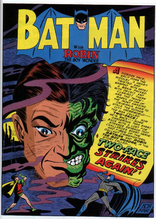 Dragon-Man Dragon-Man (The boxers with the hole for his tail kill me.)  M'sieu Mallah M'sieu Mallah (Just a damn gorilla with Sgt. Rock's ammo and tommy gun. No cutesy beret or clothing.)  Flattop Flattop (So creepy... The fish-lips, the pig-nose, the flat head, the mono-brow, the reptilain eyes, and those pimples, or coldsores, or whatever the hell they were that were always around his pouty little mouth.  Gorilla Boss of Gotham City Gorilla Boss of Gotham City (aka George "Boss" Dyke! Biggest, ugliest, angriest DC ape!)   Clayface Clayface (the goopiest one... so simple, so gross)  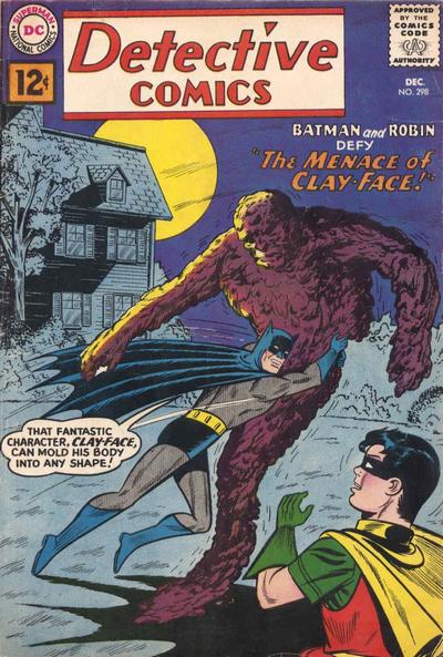 Validus Validus (The design was superb, capturing him as both a threat and a hapless creature)  Tharok Tharok (Divided beings always a little scary... look at that view of Tharok from the left... and his dead, sharklike, Kusheneresque eyes)   Vandal Savage Vandal Savage (The original. A misshapen Cossack of Crime)  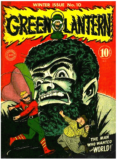 |
|
|
|
Post by Icctrombone on Jan 8, 2018 10:39:05 GMT -5
I don't know if this character on the extreme left even has a name but he has a great look.  |
|
|
|
Post by Deleted on Jan 8, 2018 13:37:00 GMT -5
Comic book villain designs that missed my top looks for whatever reason... Monsieur Mallah and the Brain Ultron Nightmare Eternity Living Tribunal Thorn (Bone) Catwoman (Darwyn Cooke design) Korvac The Badoon Skrulls Dominators Kulan Gath Hela Arnim Zola Reasons for not including them varied form not being able to decide which version I liked best or liking a minor tweak from a later appearance more than the original design to not quite feeling they qualified as villains to having other choices that did what I liked about the design better to not liking the color palette even if I liked the black & white design (and I went back and forth on this because I wasn't sure how much of the color decision making was done by the artist designer and how much by the colorist doing the yeoman like work of getting the pages done on deadline with or without input from the other creators or editors on the book. Two of my favorite villain looks originated outside of comics (both from the Dragonlance Saga) but made it into comics, but a) the design was not originated in comics and b) the execution in comics didn't match that in the original iteration: Verminaard by Larry Elmore... 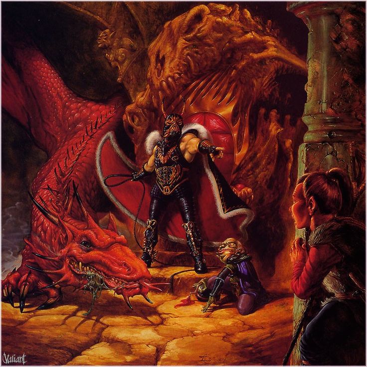 and here again looming behind the protagonists of the Saga...  but not as impressive in comics...  and Lord Soth the Death Knight (the one on the right in Clyde Caldwell's painting 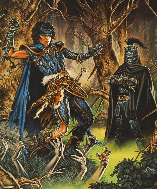 and here by Keith Parkinson leading a horde of undead into battle...  and as seen in comics...  both had the classic elements that showed up in other designs I chose-Karza in particular, and in Vader-the armor, the mask providing anonymity and menace, etc. and if I was doing villain design in any visual medium, they both would make the list. -M |
|
|
|
Post by berkley on Jan 8, 2018 13:40:21 GMT -5
The nearest of my near-misses were Darkseid and Mangog, both of which would probably be on my list if I re-did it right now.
Darkseid I left out in large part because I assumed ghe'd be appearing on lots of other lists so I figured I'd save a spot for a character that might not otherwise get any attention.
With Mangog, I think I was overly influenced by the thought that his later appearances after that first 4-issue epic in Thor #154-157 or thereabouts, were not very effective. But he's so very impressive in that one story that it should have outweighed the failure of other artists to capture the power of Kirby's design.
|
|
|
|
Post by Prince Hal on Jan 8, 2018 14:19:48 GMT -5
The nearest of my near-misses were Darkseid and Mangog, both of which would probably be on my list if I re-did it right now. Darkseid I left out in large part because I assumed ghe'd be appearing on lots of other lists so I figured I'd save a spot for a character that might not otherwise get any attention. With Mangog, I think I was overly influenced by the thought that his later appearances after that first 4-issue epic in Thor #154-157 or thereabouts, were not very effective. But he's so very impressive in that one story that it should have outweighed the failure of other artists to capture the power of Kirby's design. And I wish I'd mentioned in my post about Mangog that his craggy phiz clearly was an influence on Darkseid's own rocky escarpment of a face. |
|
|
|
Post by Jesse on Jan 8, 2018 17:16:14 GMT -5
Worthy Mentions (in no particular order) - Xemnu the Titan
- Sabretooth
- Dark Phoenix
- Mystique
- Wildebeest (New Teen Titans volume 2)
- Hela (Jack Kirby)
- Kraven the Hunter
- Task Master
- Annihilus
- Doctor Eclipse (90s Valiant)
- The Blotch (Zot!)
- One of the handful of cool looking Zot! villains designed by Scott McCloud.

- Doctor Bong
- His helmet is a giant bell and his name is Doctor Bong. 'Nuff Said!

|
|
|
|
Post by Jeddak on Jan 8, 2018 17:51:54 GMT -5
My also-rans, in no order -
Riddler
Scarecrow (DC)
Red Skull
Mr. Mind
9-Jack-9
The Mist
Gladiator
Kraven the Hunter
Terra-Man (no, really)
Darkseid
Sandman (striped shirt)
Ares (DC)
Kang
Dragon Lady
Poison Ivy
Enchantress
Hela
Emerald Empress
Madame Hydra
Umar
|
|
|
|
Post by Deleted on Jan 8, 2018 18:15:02 GMT -5
there were 3 for me who JUST missed making my top 10. . I mean, they were actually part of my 10, and got bumped as I finalized the list: Tarantula: simple design, with a beautiful color scheme of red/black. I've loved this design since the first time I saw it on a comic cover.  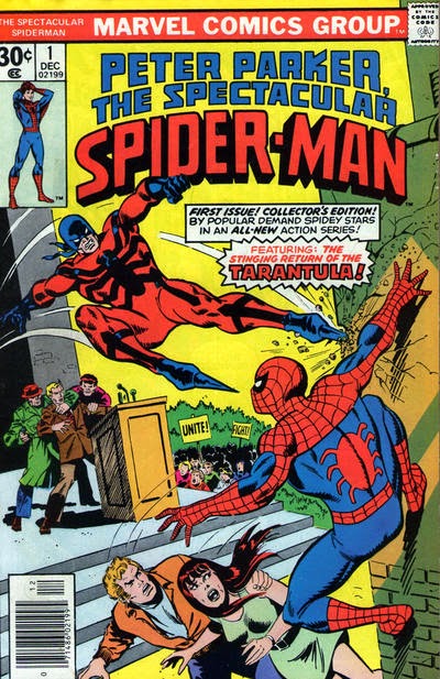 Dark Phoenix Dark Phoenix: again, simple design, with beautiful color scheme. .that red/yellow combo works so well, and I always liked this one more than the Green/Gold version.   and Killer Moth: for the most part, a lame villain (tho they beefed him up in later years, so he wasn't just a criminal version of batman). the leggings were horrendous (but in a good way), but the design of the helmet and the colors that just went so well together.  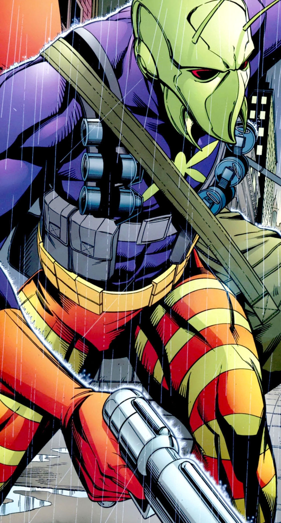 |
|
|
|
Post by Reptisaurus! on Jan 8, 2018 19:02:20 GMT -5
Oooh, good one! Klarion probably should have made my list - I know I thought of him at some point. |
|
zilch
Full Member
Posts: 244 
|
Post by zilch on Jan 8, 2018 20:29:15 GMT -5
Sandman (in particular his costume, long abandoned)
Original Vulture
... and just about everybody else's picks!
|
|
Confessor
CCF Mod Squad
Not Bucky O'Hare!
Posts: 10,199 
|
Post by Confessor on Jan 8, 2018 20:40:01 GMT -5
Among those vying for a place in my Top 12 this year, but ultimately falling short, were...
The Scorpion
Green Goblin
Red Skull
Baron Orman Tagge (from Marvel's Star Wars comics)
Mrs. Pruneface
Paste-Pot Pete
|
|