|
|
Post by dbutler69 on May 24, 2020 12:16:17 GMT -5
I read Fantastic Four #107 and Captain America #284. FF#107 was pretty good. The FF are all acting like jerks (more than usual, I mean) and there's obviously mysterious reason behind it which I'm kinda curious about. Plus what's up with the Janus gy who takes off to the Negative Zone. Ben gets the ability to change back and forth between the Thing and his human form, and has some fun with the people on the subway. I really don't understand why the run away from him like he's the Creature from the Black Lagoon or something, though. Ben is well known and respected at this point, and this behavior by the people on the subway seems very inconsistent with what we've seen before.  Captain America #284 was a nice character building issue. We get to see plenty of Cap's supporting cast. 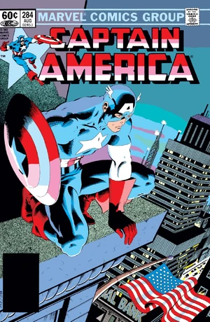 |
|
|
|
Post by earl on May 24, 2020 18:27:22 GMT -5
Oeming is a pretty good writer and storyteller, I think that his art style probably won't be for everyone. He does some cool stuff with darks and shadow.
I eventually need to catch up and read the last 15-20 issues of Powers I never read. (Is it done? Not sure...)
|
|
|
|
Post by dbutler69 on May 25, 2020 9:44:49 GMT -5
I read Best of DC Blue Ribbon Digest#21, starring the Justice Society! I love this comic, from the George Perez cover to the Secret Origin of the JSA story, to the All-Star Comics #37 reprint with the JSA vs. Per Degaton's time travelling hi-jinks, to the Starman/Black Canary vs. Sportsmaster/Huntress story.  |
|
|
|
Post by wildfire2099 on May 25, 2020 15:04:18 GMT -5
Finished up the Atom Showcase volume today... for all the stories all seem to get the same quickly, man, is it some good art... especially in black and white!
I definitely didn't appreciate Gil Kane enough with the things of his I have from Marvel.
|
|
|
|
Post by beccabear67 on May 25, 2020 17:57:14 GMT -5
I read Best of DC Blue Ribbon Digest#21, starring the Justice Society! I love this comic, from the George Perez cover to the Secret Origin of the JSA story, to the All-Star Comics #37 reprint with the JSA vs. Per Degaton's time travelling hi-jinks, to the Starman/Black Canary vs. Sportsmaster/Huntress story. I was buying a lot of those when they came out, and despite the sort of lousy print and size quality aspect they were usually well worth the money like this one. Also the Doom Patrol one with new Perez cover around the time of New Teen Titans #13-15 with the Doom Patrol featured, and a collection of top DC war comics stories! Definitely a better format than the paperback I think, and they usually resized the original lettering for readability. |
|
|
|
Post by Batflunkie on May 25, 2020 20:29:20 GMT -5
Invaders #1 & #2 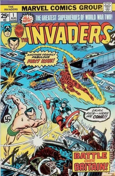  Interesting set up with Gods being manipulated by the bad guys and a mysterious girl being the key to everything. Big reveal and aftermath felt totally phoned in |
|
|
|
Post by Slam_Bradley on May 26, 2020 16:16:36 GMT -5
 I finally got around to reading The Family Man by Jerome Charyn and Joe Staton. This originally came out as three 96-page digests through DC's Paradox Press in 1995. The version I read was a hardcover that was Kickstarter'd about a year or so ago and came out through It's Alive Press and IDW. Charyn is a novelist probably best known for his Isaac Sidel series of novels. Staton, of course is a long-time comic book artist. This is a hard book to categorize. At it's heart it's kind of a crime/noir thing but it clearly takes place in a dystopian near future. Alonzo, the Family Man, is a long-time mob enforcer. His younger brother, Charles, is the "monsignor" of the police department who essentially controls the city though his control of the mayor, and the police and his own death squad-like gang. Alonzo is still dedicated to protecting Don Fuioso, the last living mafia Don from the police, the FBI (who are frequently mentioned as a boogie man but don't show up) and the general population. The Don is pretty much a doddering old fool. Charles' girlfriend is helping Alonzo, who may or may not be being targeted by Charles' minions though Charles still is trying to save him, except when he's not. The book is honestly a mess made somewhat readable by Staton's art, which is always good though maybe not the best suited to this type of story. Some comics deserve to be forgotten. This is probably one that did. It's not bad enough to be interesting. But it's certainly not good. |
|
|
|
Post by dbutler69 on May 31, 2020 9:46:41 GMT -5
Having read a couple of Doc Savage novels now, including Man of Bronze, I decided to check out Marvel's 1972 Doc Savage series. The first two issues adapt Man of Bronze. I guess when you convert a novel into a two issue comic story, you're going to have to make plenty of changes. I'm generally OK with that, though the first issue takes place in the 1970's instead of the 1930's, but they apparently though better of it and had the rest of the series take place in the 1930's, which I think is a good move. It's a good enough adventure tale, and I like how they captured the ribbing between Monk and Ham (a bit of a Ben Grimm/Johnny Storm vibe there) but I do have to say, I think Doc looks kinda ridiculous. That little very with the upturned collar and no shirt, the ridiculous looking hair, and the odd coloring. I know he's the "man of bronze" but I'm thinking that just means a well-tanned Caucasian, not that orangeish skin. Still, it's enjoyable enough so far and I'll keep on reading. 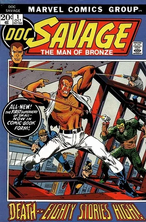 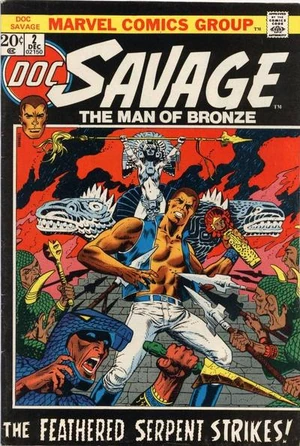 |
|
|
|
Post by EdoBosnar on May 31, 2020 10:56:17 GMT -5
Having read a couple of Doc Savage novels now, including Man of Bronze, I decided to check out Marvel's 1972 Doc Savage series. (...) The color series is just o.k.; the stories in the b&w magazine, which was published a little later, are far better. |
|
|
|
Post by dbutler69 on May 31, 2020 12:06:03 GMT -5
Having read a couple of Doc Savage novels now, including Man of Bronze, I decided to check out Marvel's 1972 Doc Savage series. (...) The color series is just o.k.; the stories in the b&w magazine, which was published a little later, are far better. Interesting. I may have to look for that. |
|
|
|
Post by brutalis on May 31, 2020 12:44:30 GMT -5
Having read a couple of Doc Savage novels now, including Man of Bronze, I decided to check out Marvel's 1972 Doc Savage series. (...) The color series is just o.k.; the stories in the b&w magazine, which was published a little later, are far better. Total agreement! Magazine series hit all the proper notes so it felt like real Doc adventures. Well worth the nickels (many) spent for reading & enjoying. |
|
|
|
Post by Batflunkie on May 31, 2020 19:10:07 GMT -5
Howard The Duck #1-#2 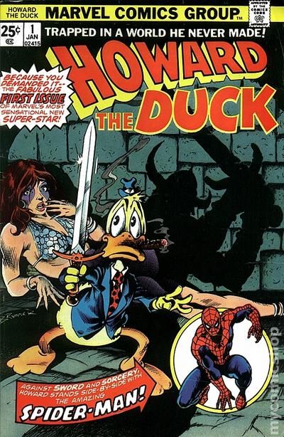  Got an itch to re-read my HTD Omnibus after watching a video by Strange Brain Parts/Overlord Comics about Howard. Can't ever say enough good things about that series |
|
|
|
Post by Cei-U! on Jun 1, 2020 10:03:07 GMT -5
Having read a couple of Doc Savage novels now, including Man of Bronze, I decided to check out Marvel's 1972 Doc Savage series. The first two issues adapt Man of Bronze. I guess when you convert a novel into a two issue comic story, you're going to have to make plenty of changes. I'm generally OK with that, though the first issue takes place in the 1970's instead of the 1930's, but they apparently though better of it and had the rest of the series take place in the 1930's, which I think is a good move. It's a good enough adventure tale, and I like how they captured the ribbing between Monk and Ham (a bit of a Ben Grimm/Johnny Storm vibe there) but I do have to say, I think Doc looks kinda ridiculous. That little very with the upturned collar and no shirt, the ridiculous looking hair, and the odd coloring. I know he's the "man of bronze" but I'm thinking that just means a well-tanned Caucasian, not that orangeish skin. Still, it's enjoyable enough so far and I'll keep on reading. That look for the character was, of course, taken from the cover paintings James Bama did for the paperbacks. It's a look that, in my opinion, doesn't work in pen-and-ink. Back in college, I designed a cover for a Doc Savage fanzine depicting him as described in the pulps: dressed in a tailored suit and with short-cropped hair with a normal hairline instead of that Vision/Super-Skrull look. The 'zine's editor insisted I change it to the Bama look. I refused, he "fired" me (I was doing the cover for free as a favor), and we never spoke again. I completely forgot about that until I started to write this post.
Cei-U! I summon the artistic integrity!
|
|
|
|
Post by brutalis on Jun 1, 2020 10:15:17 GMT -5
Having read a couple of Doc Savage novels now, including Man of Bronze, I decided to check out Marvel's 1972 Doc Savage series. The first two issues adapt Man of Bronze. I guess when you convert a novel into a two issue comic story, you're going to have to make plenty of changes. I'm generally OK with that, though the first issue takes place in the 1970's instead of the 1930's, but they apparently though better of it and had the rest of the series take place in the 1930's, which I think is a good move. It's a good enough adventure tale, and I like how they captured the ribbing between Monk and Ham (a bit of a Ben Grimm/Johnny Storm vibe there) but I do have to say, I think Doc looks kinda ridiculous. That little very with the upturned collar and no shirt, the ridiculous looking hair, and the odd coloring. I know he's the "man of bronze" but I'm thinking that just means a well-tanned Caucasian, not that orangeish skin. Still, it's enjoyable enough so far and I'll keep on reading. That look for the character was, of course, taken from the cover paintings James Bama did for the paperbacks. It's a look that, in my opinion, doesn't work in pen-and-ink. Back in college, I designed a cover for a Doc Savage fanzine depicting him as described in the pulps: dressed in a tailored suit and with short-cropped hair with a normal hairline instead of that Vision/Super-Skrull look. The 'zine's editor insisted I change it to the Bama look. I refused, he "fired" me (I was doing the cover for free as a favor), and we never spoke again. I completely forgot about that until I started to write this post.
Cei-U! I summon the artistic integrity!
One of those cases where an updated/stylized look takes over and becomes the "standard recognition" for a character. The Lone Ranger took the same turn with Clayton Moore's blue suited and domino masked rendition becoming the go to look for merchandising and instant recognition. While the widows peaked skull cap hair cut does provide a certain style for Doc, I prefer the more natural wavy haired look which suits his 30's Pulp origin. The Skull Cap would fit into the 60/70's and possibly 80's cultures much better. In today's culture Doc would probably be totally unrecognizable or considered as old and out of touch with his cultured sensibilities and style and etiquette. |
|
|
|
Post by dbutler69 on Jun 1, 2020 14:36:25 GMT -5
Having read a couple of Doc Savage novels now, including Man of Bronze, I decided to check out Marvel's 1972 Doc Savage series. The first two issues adapt Man of Bronze. I guess when you convert a novel into a two issue comic story, you're going to have to make plenty of changes. I'm generally OK with that, though the first issue takes place in the 1970's instead of the 1930's, but they apparently though better of it and had the rest of the series take place in the 1930's, which I think is a good move. It's a good enough adventure tale, and I like how they captured the ribbing between Monk and Ham (a bit of a Ben Grimm/Johnny Storm vibe there) but I do have to say, I think Doc looks kinda ridiculous. That little very with the upturned collar and no shirt, the ridiculous looking hair, and the odd coloring. I know he's the "man of bronze" but I'm thinking that just means a well-tanned Caucasian, not that orangeish skin. Still, it's enjoyable enough so far and I'll keep on reading. That look for the character was, of course, taken from the cover paintings James Bama did for the paperbacks. It's a look that, in my opinion, doesn't work in pen-and-ink. Back in college, I designed a cover for a Doc Savage fanzine depicting him as described in the pulps: dressed in a tailored suit and with short-cropped hair with a normal hairline instead of that Vision/Super-Skrull look. The 'zine's editor insisted I change it to the Bama look. I refused, he "fired" me (I was doing the cover for free as a favor), and we never spoke again. I completely forgot about that until I started to write this post.
Cei-U! I summon the artistic integrity!
Sorry to bring back bad memories, but I much prefer your version over your editor's or apparently the one from the Bama covers (which I've never seen - I'll have to check them out). I had a vision in my head based on the pulps, and the guy in this comic wasn't close to it. |
|