|
|
Post by Deleted on Nov 2, 2015 18:14:25 GMT -5
I WILL BE THE JUDGE OF EVERYTHING. Like Namor and Aquaman wearing thongs. Stop fainting. I'm laughing. Because that is so gross. HAHAHAHAHA. |
|
|
|
Post by Arthur Gordon Scratch on Nov 2, 2015 18:21:53 GMT -5
From scans I saw of his Batman and Robin stuff, it was WAY better than his X-Men stuff, imo. I would say because some of the criminals were super wacky looking, but the mutants in X-Men were kind of weird, too. I think he was just better on it for whatever reason. Dunno. He's stuff on New X-Men had hte disavantage of being heavily tainted by wildstrom inkers if I remember correctly. He really isn't the kind of artist you want inked by anyone but himself. |
|
|
|
Post by Deleted on Nov 2, 2015 18:27:39 GMT -5
Jim Lee's first work on Alpha Flight was pretty decent, tbh. I take no issue with his art on AF.
|
|
|
|
Post by hondobrode on Nov 2, 2015 19:53:02 GMT -5
Just my opinion, but I'm more about extolling the good than pointing out "the worst."
Sure there are hacks, and sometimes something like the Spidey image that kicked off this thread, looks... different, but we don't know the whole story as to why.
The editor might have wanted it.
Or the writer for a stylized weird perspective or emphasis
Maybe the pencils were fine but late and an inker had to fight a really tight deadline to get it out the door.
The penciler might be trying a new style and is transitioning. I'd hate to think of not having Bill Sienkiewicz's later more famous stylized look than to continue with the Neal Adams style he started with.
|
|
|
|
Post by Icctrombone on Nov 2, 2015 20:51:43 GMT -5
Okay, I'll play. How about this panel from Dark Reign #1  Yeah, that's Namor the Submariner. Sorry Jez, no thong. |
|
|
|
Post by Deleted on Nov 2, 2015 20:58:23 GMT -5
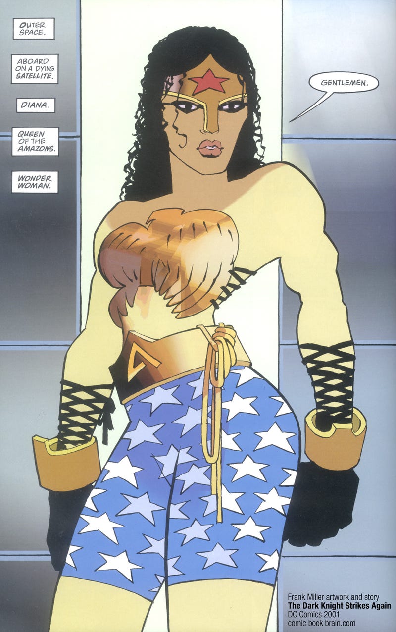
Okay, I'll play. How about this panel from Dark Reign #1  Yeah, that's Namor the Submariner. Emma's probably thinking of a 4-lettered F word and it ain't Fish. I don't know what Miller was smoking when he grabbed his pencil.  |
|
|
|
Post by Deleted on Nov 2, 2015 21:04:30 GMT -5
Omfg, that WW is soooo bad.
Lord.
|
|
|
|
Post by Icctrombone on Nov 2, 2015 21:54:26 GMT -5
But that discussion is the only interesting thing about this thread. Otherwise, it's just an exercise in cheap mockery. Cei-U! I summon the meat in the sammich! So tell me what the difference is between this thread and the 'worst cover ever' thread. Are covers so much more subject to criticism and laughter than panels? Even when those panels actually take up twice the size of any cover? When did criticizing one panel become an attack on the artist and his skills/knowledge? Not to fan the flames and destroy the peace accord but, I draw a huge difference between a bad panel and a bad cover. A bad cover is much more harmful to sales than a bad panel. Comic companies take great care to insure that a cover stands out in a crowded Comic shop to draw the eye and entice a person to buy it. There are dozens of panels in each comic book and there are bound to be some clunkers in the mix. |
|
|
|
Post by Slam_Bradley on Nov 2, 2015 22:05:13 GMT -5
So tell me what the difference is between this thread and the 'worst cover ever' thread. Are covers so much more subject to criticism and laughter than panels? Even when those panels actually take up twice the size of any cover? When did criticizing one panel become an attack on the artist and his skills/knowledge? Not to fan the flames and destroy the peace accord but, I draw a huge difference between a bad panel and a bad cover. A bad cover is much more harmful to sales than a bad panel. Comic companies take great care to insure that a cover stands out in a crowded Comic shop to draw the eye and entice a person to buy it. There are dozens of panels in each comic book and there are bound to be some clunkers in the mix. I have to agree with this. In theory the cover is the gateway to the book and is there to sell it to the audience. Now that may not have been true for the last 20 or so years, but it was definitely the case for most of the history of comics. A bad panel can easily be an anomaly in an otherwise good book. |
|
|
|
Post by Deleted on Nov 2, 2015 22:23:26 GMT -5
From scans I saw of his Batman and Robin stuff, it was WAY better than his X-Men stuff, imo. I would say because some of the criminals were super wacky looking, but the mutants in X-Men were kind of weird, too. I think he was just better on it for whatever reason. Dunno. I completely agree that his x-men run is not his best work. His characters were odd looking face wise face wise especially. Really hated the way he drew Cyclops and Emma Frost. And by god those chins! Much better work than the artist that was rotating with him. Igor Kordey...now that was some nauseating art. Never much cared for his All-Star Superman either. His Batman and Robin though I really liked. |
|
|
|
Post by Deleted on Nov 2, 2015 22:45:10 GMT -5
Omfg, that WW is soooo bad. Lord. You got my endorsement - it's hideous beyond description! |
|
|
|
Post by Icctrombone on Nov 2, 2015 22:53:27 GMT -5
From scans I saw of his Batman and Robin stuff, it was WAY better than his X-Men stuff, imo. I would say because some of the criminals were super wacky looking, but the mutants in X-Men were kind of weird, too. I think he was just better on it for whatever reason. Dunno. I completely agree that his x-men run is not his best work. His characters were odd looking face wise face wise especially. Really hated the way he drew Cyclops and Emma Frost. And by god those chins! Much better work than the artist that was rotating with him. Igor Kordey...now that was some nauseating art. Never much cared for his All-Star Superman either. His Batman and Robin though I really liked. The artwork by Quitely was refreshing to me. It is odd, but in an interesting change from the hum drum X-men pages that I read from the 80's on. |
|
|
|
Post by Deleted on Nov 2, 2015 22:54:10 GMT -5
|
|
|
|
Post by Icctrombone on Nov 2, 2015 22:55:58 GMT -5
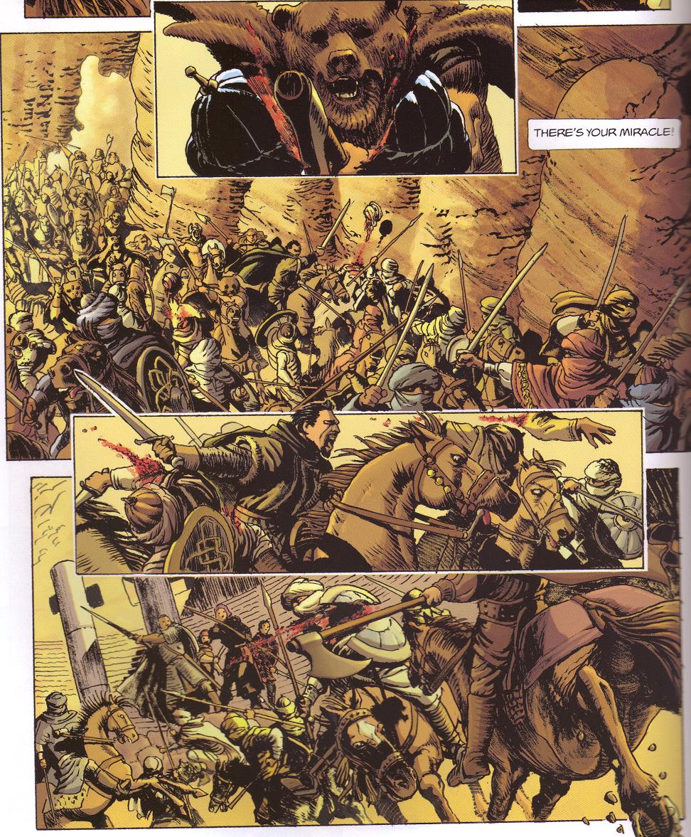
Yeah, one of Kordeys panels. I heard that he was super fast in turning the pages in. It was a jarring down grade from the Quitely pages. |
|
|
|
Post by Deleted on Nov 3, 2015 0:35:12 GMT -5
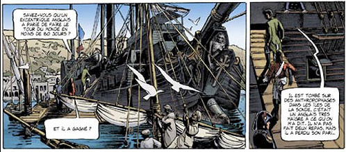
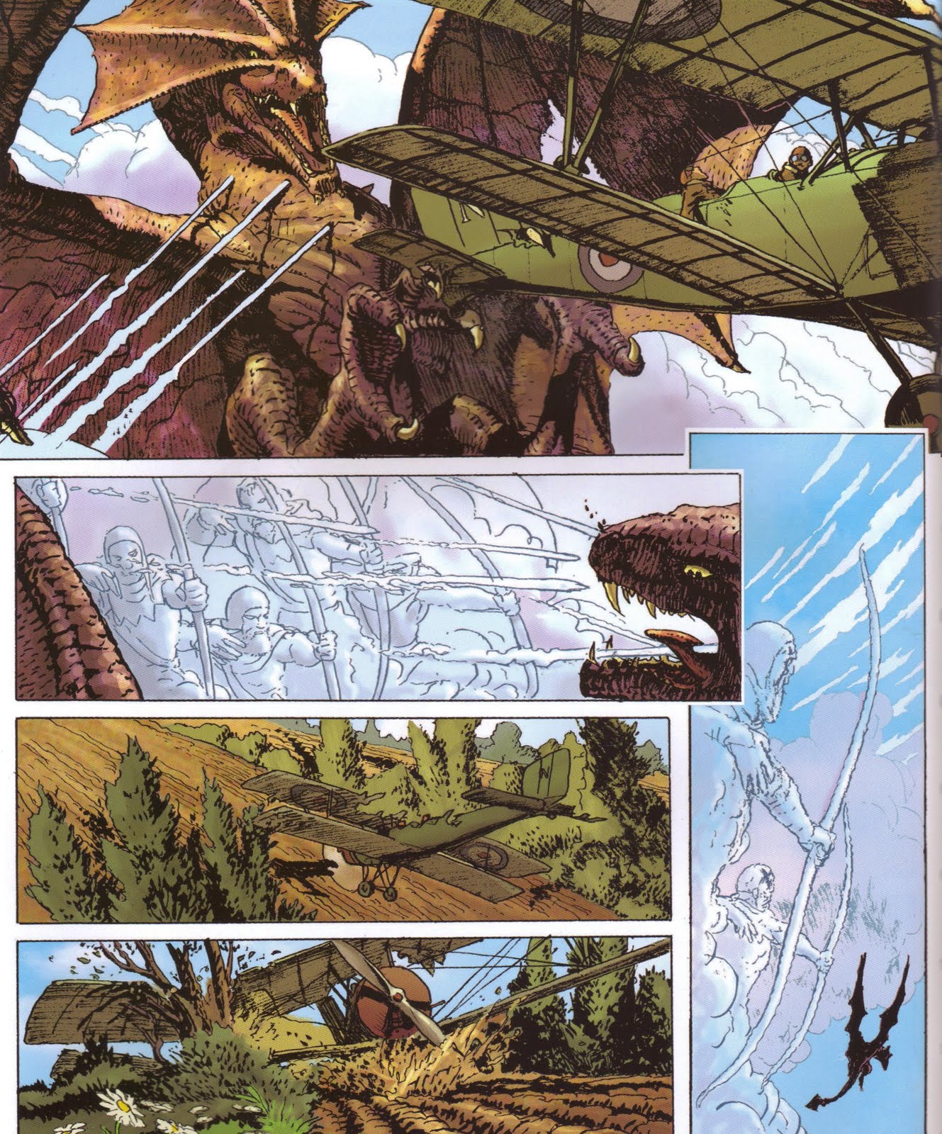
From scans I saw of his Batman and Robin stuff, it was WAY better than his X-Men stuff, imo. I would say because some of the criminals were super wacky looking, but the mutants in X-Men were kind of weird, too. I think he was just better on it for whatever reason. Dunno. I completely agree that his x-men run is not his best work. His characters were odd looking face wise face wise especially. Really hated the way he drew Cyclops and Emma Frost. And by god those chins! Much better work than the artist that was rotating with him. Igor Kordey...now that was some nauseating art. Never much cared for his All-Star Superman either. His Batman and Robin though I really liked. Blame Grant Morrison for Igor Kordey's work on New X-Men, Grant was turning in scripts 2-3 days before it had to be at the printer and Kordey was forced to pencil and ink 22 pages in those 2-3 days to make deadlines. Check out Kordey's work on other stuff, especially his European work like Secret History being publshed in the US by Archaia to see what he is capable with when he has aprofessional writer who meets deadlines on a project and can actually spend time pencilling and inking...     -M |
|