|
|
Swipes
Mar 20, 2015 16:12:18 GMT -5
Post by Ish Kabbible on Mar 20, 2015 16:12:18 GMT -5
I can't respect someone who bragged about swiping. And Buscema always griped how he hated Super-Heroes and the comic book business in general. He always came off as a cantankerous, crotchety man. No one is without fault. And I'm sure Buscema, like most artists had his own swipe file of cars,weaponry,planes,animals etc. Or what I consider reference models |
|
|
|
Swipes
Mar 20, 2015 16:29:31 GMT -5
Post by Deleted on Mar 20, 2015 16:29:31 GMT -5
Actually, I think he would have. The pride he took in his personal, non-mainstream work suggests that if he could've afforded to take less work and devote more time to each page, he wouldn't have had to resort to the shortcuts he turned to. Cei-U! I summon the might-have-beens! Sorry bro, I have to disagree. Once you start taking shortcuts, there's no going back. Plus, Kirby didn't take these shortcuts and he was pressured into doing more books than anyone. Artists then and now are in it for the paycheck. They aren't trying to create the Mona Lisa. How do you know Kirby didn't take those shortcuts? |
|
|
|
Swipes
Mar 20, 2015 16:58:08 GMT -5
via mobile
Post by Icctrombone on Mar 20, 2015 16:58:08 GMT -5
I can't respect someone who bragged about swiping. And Buscema always griped how he hated Super-Heroes and the comic book business in general. He always came off as a cantankerous, crotchety man. No one is without fault. And I'm sure Buscema, like most artists had his own swipe file of cars,weaponry,planes,animals etc. Or what I consider reference models Yeah, he didn't like superheroes That's why Always thought it was nothing more than a job for these legends. Wood had his demons to be sure. So why talk about swipes if everyone does it ? |
|
|
|
Post by berkley on Mar 20, 2015 17:24:26 GMT -5
To many of the older guys it was just that, but not all of them - otherwise Kirby would have been happy to stay at Marvel instead of attempting to find elsewhere the artistic freedom he needed to develop his own ideas.
And in the 70s, artists like Bernie Wrightson, Barry Windsor-Smith, Mike Kaluta, and others obviously saw their art as more than just a job because they insisted on taking the time they felt they needed to produce their work instead of churning out pages as quickly as possible.
And I think that even some artists who somehow learned or trained themselves to manage a steady number of pages per month saw it as more than just a job - you can see it in the work. A guy like Gene Colan didn't need to come up with those wildly innovative panel arrangements in Doctor Strange. His editors would have been happier if he'd produced something less imaginative. But he did it anyway, because he felt some artistic impulse beyond just putting out the assigned number of pages and picking up his cheque.
Even Buscema, for all his repeatedly avowed dislike for superheroes couldn't have produced the outstanding work he sometimes did if that had been the whole story.
|
|
|
|
Swipes
Mar 20, 2015 18:14:39 GMT -5
Post by Deleted on Mar 20, 2015 18:14:39 GMT -5
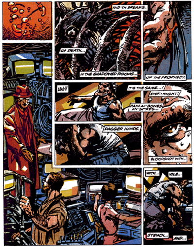
I'm not a fan of the kind of "innovative" panel arrangements found in super hero comics. I wonder if they are something the artist wanted to do or something the editor expected of them? Because they are almost exclusive to superhero comics. I feel like the panel layout of Weapon X was it's biggest flaw. I'm a much bigger fan of plain old left to right, top to bottom.  |
|
|
|
Post by Phil Maurice on Mar 20, 2015 18:17:06 GMT -5
Even Buscema, for all his repeatedly avowed dislike for superheroes couldn't have produced the outstanding work he sometimes did if that had been the whole story. I agree with your entire post, berk. But Icctrombone has a valid point as well. "If everyone swipes, why talk about it?" The discussion presumes that "swiping" is a pejorative. But what if it is an intrinsic part of the production process? Because what we're talking about IS a job, a job with assignments that don't always inspire burning passion and which includes long hours and hard deadlines. My company exhorts us to "work smarter, not harder." Shortcuts, when we can find them and when they increase profits and enhance timely delivery, are encouraged. Why should that be any different in the work-for-hire comics environment? It's possible that we have unrealistic expectations of comics artist who toiled under this system. Over a forty or fifty year career, who among us brings their "A" game every hour of every day? Certainly not me. Now, often I exceed what is expected of me by my employer, but just as often I merely meet or fall slightly short of expectations. Not every project summons the muses for me. I would imagine the same is true in any business in which one carves out a living over decades. |
|
|
|
Swipes
Mar 20, 2015 18:18:18 GMT -5
Post by Deleted on Mar 20, 2015 18:18:18 GMT -5
"Everyone" doesn't swipe though. It's probably VERY common in monthly comics though.
|
|
|
|
Swipes
Mar 20, 2015 18:19:47 GMT -5
Post by the4thpip on Mar 20, 2015 18:19:47 GMT -5
Even Buscema, for all his repeatedly avowed dislike for superheroes couldn't have produced the outstanding work he sometimes did if that had been the whole story. I agree with your entire post, berk. But Icctrombone has a valid point as well. "If everyone swipes, why talk about it?" The discussion presumes that "swiping" is a pejorative. But what if it is an intrinsic part of the production process? Because what we're talking about IS a job, a job with assignments that don't always inspire burning passion and which includes long hours and hard deadlines. My company exhorts us to "work smarter, not harder." Shortcuts, when we can find them and when they increase profits and enhance timely delivery, are encouraged. Why should that be any different in the work-for-hire comics environment? It's possible that we have unrealistic expectations of comics artist who toiled under this system. Over a forty or fifty year career, who among us brings their "A" game every hour of every day? Certainly not me. Now, often I exceed what is expected of me by my employer, but just as often I merely meet or fall slightly short of expectations. Not every project summons the muses for me. I would imagine the same is true in any business in which one carves out a living over decades. I do believe there is a difference between using reference (photographic or otherwise) while creating a great visual narrative, and lazily re-arranging scanned images from magazines and things found on google image search to a cluttered mess. |
|
|
|
Swipes
Mar 20, 2015 18:21:56 GMT -5
Post by the4thpip on Mar 20, 2015 18:21:56 GMT -5
"Everyone" doesn't swipe though. It's probably VERY common in monthly comics though. Yeah... I am friendly with Dale Eaglesham and he gets very upset when he gets accused of using "shortcuts" as he does everything the hard way. I think he was pretty surprised at all the lightboxing going on a CrossGen (not just by Land) when he shared an office with them for a few months. |
|
|
|
Post by Reptisaurus! on Mar 20, 2015 19:16:31 GMT -5
I'm not a fan of the kind of "innovative" panel arrangements found in super hero comics. I wonder if they are something the artist wanted to do or something the editor expected of them? Because they are almost exclusive to superhero comics. Ahhhhh! Not even close to true. I am a HUGE design guy and you are going to give me ulcers. Chris Ware does a lot of Krigstien-ish panel arrangements - when he's not completely redefining the form with Building Stories, which in it's finished form is basically three dimensional comics. Emily Carrol doesn't even use panels. Paper Rad generally doesn't use panel, and Michael Deforge and Brian Chippendale can take 'em or leave 'em.
Then there's stuff like Elvis Road (4o page comic, all one panel across multiple pages) or Mengyu Chen's stuff (comics + origami + pop up books.)
And keep in mind American comics are decades beyond Japan and Europe, and they've both gone waaaay further into experimentation with form and structure.
And there are plenty of independent cartoonists who use the traditional panel structure as well... But percentage-wise, there are far more experimental independent cartoonists than Gene Colans or Williams IIIs or Bill Siencz....etc', because duh, of course there are. The separation between comics and "high" art are really a fairly permeable membrane right now, so you're going to see a lot of people with unusual ideas about form and structure doing comics.
|
|
|
|
Swipes
Mar 20, 2015 20:16:57 GMT -5
Post by thwhtguardian on Mar 20, 2015 20:16:57 GMT -5
I'm not a fan of the kind of "innovative" panel arrangements found in super hero comics. I wonder if they are something the artist wanted to do or something the editor expected of them? Because they are almost exclusive to superhero comics. Ahhhhh! Not even close to true. I am a HUGE design guy and you are going to give me ulcers. Chris Ware does a lot of Krigstien-ish panel arrangements - when he's not completely redefining the form with Building Stories, which in it's finished form is basically three dimensional comics. Emily Carrol doesn't even use panels. Paper Rad generally doesn't use panel, and Michael Deforge and Brian Chippendale can take 'em or leave 'em.
Then there's stuff like Elvis Road (4o page comic, all one panel across multiple pages) or Mengyu Chen's stuff (comics + origami + pop up books.)
And keep in mind American comics are decades beyond Japan and Europe, and they've both gone waaaay further into experimentation with form and structure.
And there are plenty of independent cartoonists who use the traditional panel structure as well... But percentage-wise, there are far more experimental independent cartoonists than Gene Colans or Williams IIIs or Bill Siencz....etc', because duh, of course there are. The separation between comics and "high" art are really a fairly permeable membrane right now, so you're going to see a lot of people with unusual ideas about form and structure doing comics.
100% this, in fact I'd go the other direction and say that non-traditional or experimental panel lay outs are far more common in independent books than most of your traditional super hero comics as guys like Gene Colon or J.H. Williams III are more the exceptions to the rule than they are the norm. |
|
|
|
Swipes
Mar 20, 2015 21:27:06 GMT -5
Post by Deleted on Mar 20, 2015 21:27:06 GMT -5
I'm not a fan of the kind of "innovative" panel arrangements found in super hero comics. I wonder if they are something the artist wanted to do or something the editor expected of them? Because they are almost exclusive to superhero comics. Ahhhhh! Not even close to true. I am a HUGE design guy and you are going to give me ulcers. Chris Ware does a lot of Krigstien-ish panel arrangements - when he's not completely redefining the form with Building Stories, which in it's finished form is basically three dimensional comics. Emily Carrol doesn't even use panels. Paper Rad generally doesn't use panel, and Michael Deforge and Brian Chippendale can take 'em or leave 'em.
Then there's stuff like Elvis Road (4o page comic, all one panel across multiple pages) or Mengyu Chen's stuff (comics + origami + pop up books.)
And keep in mind American comics are decades beyond Japan and Europe, and they've both gone waaaay further into experimentation with form and structure.
And there are plenty of independent cartoonists who use the traditional panel structure as well... But percentage-wise, there are far more experimental independent cartoonists than Gene Colans or Williams IIIs or Bill Siencz....etc', because duh, of course there are. The separation between comics and "high" art are really a fairly permeable membrane right now, so you're going to see a lot of people with unusual ideas about form and structure doing comics.
I don't think poor panel arrangement is what makes a comic high art. Actual fine artists make comics too. Pretty traditional panel layout. This is just absolutely unnecessary. If it weren't BWS I'd actually think it was a weakness on behalf of the artist being unable to fit the sequential story he wants to tell in easy to use panels  And although BWS is not one of the trendy hot Image artists of the day, this came out around that time, and if you remember having to turn a comic sideways to see the panel correctly, you remember what the trends were back then. I opened up the Danger Girl trade and didn't get past the first page before the jarring panel layout made me put it back on the shelf. It took quite a while to force myself to suffer through that. The Maxx is another one where I think the comic was amazing but ultimately flawed by ridiculous panel layouts. Comics that critics would say approach high art tend to not have Liefeld panels  |
|
|
|
Swipes
Mar 20, 2015 22:00:55 GMT -5
Post by thwhtguardian on Mar 20, 2015 22:00:55 GMT -5
Ahhhhh! Not even close to true. I am a HUGE design guy and you are going to give me ulcers. Chris Ware does a lot of Krigstien-ish panel arrangements - when he's not completely redefining the form with Building Stories, which in it's finished form is basically three dimensional comics. Emily Carrol doesn't even use panels. Paper Rad generally doesn't use panel, and Michael Deforge and Brian Chippendale can take 'em or leave 'em.
Then there's stuff like Elvis Road (4o page comic, all one panel across multiple pages) or Mengyu Chen's stuff (comics + origami + pop up books.)
And keep in mind American comics are decades beyond Japan and Europe, and they've both gone waaaay further into experimentation with form and structure.
And there are plenty of independent cartoonists who use the traditional panel structure as well... But percentage-wise, there are far more experimental independent cartoonists than Gene Colans or Williams IIIs or Bill Siencz....etc', because duh, of course there are. The separation between comics and "high" art are really a fairly permeable membrane right now, so you're going to see a lot of people with unusual ideas about form and structure doing comics.
I don't think poor panel arrangement is what makes a comic high art. Actual fine artists make comics too. Pretty traditional panel layout. This is just absolutely unnecessary. If it weren't BWS I'd actually think it was a weakness on behalf of the artist being unable to fit the sequential story he wants to tell in easy to use panels  And although BWS is not one of the trendy hot Image artists of the day, this came out around that time, and if you remember having to turn a comic sideways to see the panel correctly, you remember what the trends were back then. I opened up the Danger Girl trade and didn't get past the first page before the jarring panel layout made me put it back on the shelf. It took quite a while to force myself to suffer through that. The Maxx is another one where I think the comic was amazing but ultimately flawed by ridiculous panel layouts. Comics that critics would say approach high art tend to not have Liefeld panels  I think there is a huge difference between experimental or non-traditional lay outs and poor layouts. For instance Steve Bisset's choice here in Swamp Thing is spectacular:  It captures the tone of the prose in a way that could not be done with a traditional grid and it is not hard to follow. |
|
|
|
Swipes
Mar 20, 2015 23:12:09 GMT -5
Post by Deleted on Mar 20, 2015 23:12:09 GMT -5
That page works much better, I'll give you that. I don't have a problem with it if it's well executed. I just think, for the most part, it isn't well executed when it's attempted. And although I can tough it out in an otherwise great comic, it has on multiple occasions made a great comic an "otherwise great" comic for me.
|
|
|
|
Swipes
Mar 21, 2015 7:05:10 GMT -5
Post by Paradox on Mar 21, 2015 7:05:10 GMT -5
That BWS page is just awful. It's a friggin' spiral going the wrong way. That's not a comic trend or style, just a really really bad choice.
|
|