|
|
Post by Phil Maurice on Aug 19, 2019 17:43:59 GMT -5
I can't believe no one has seen fit to show "puffer" Sub-Mariner yet. Gee, what a swell power!  He could also isolate the "puffer" effect to a specific body part, his skull for instance:  He could maintain the effect for an entire story, if needed. |
|
|
|
Post by rberman on Aug 19, 2019 17:46:01 GMT -5
I can't believe no one has seen fit to show "puffer" Sub-Mariner yet. Gee, what a swell power! He could also isolate the "puffer" effect to a specific body part, his skull for instance: He could maintain the effect for an entire story, if needed. If they made this the actual head of Namor in a film, I'm so there! |
|
|
|
Post by Icctrombone on Aug 19, 2019 18:24:48 GMT -5
Isn't that the head of a Dick Tracy villain ?
|
|
|
|
Post by Prince Hal on Aug 19, 2019 18:28:13 GMT -5
One of his most evil... Flattop. Partially based on Pretty Boy Floyd. His name probably alluded to the nickname for aircraft carriers.  |
|
|
|
Post by The Captain on Aug 19, 2019 18:29:05 GMT -5
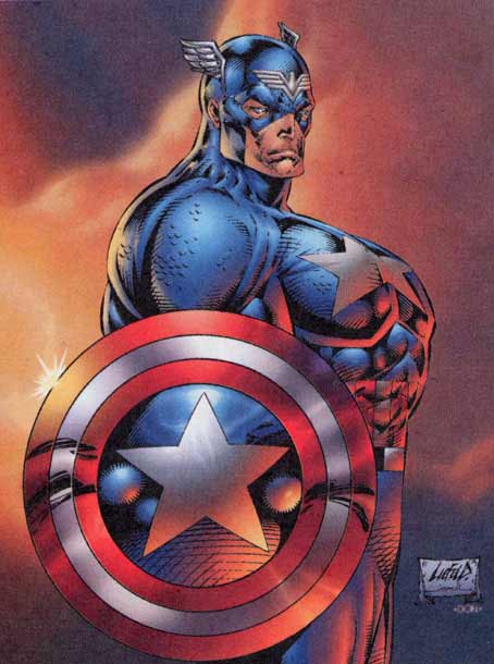
yep. . so handy Cap borrowed it once And this is why we need a "down vote" function. You are a bad, bad man, @bert , and you should feel bad for posting this. |
|
|
|
Post by Farrar on Aug 19, 2019 18:43:51 GMT -5
He could also isolate the "puffer" effect to a specific body part, his skull for instance: He could maintain the effect for an entire story, if needed. And for those who may be wondering, that's from Marvel Mystery Comics #77, the cover of which boasted this stunning image of Subby   |
|
|
|
Post by Deleted on Aug 19, 2019 18:51:43 GMT -5
He could also isolate the "puffer" effect to a specific body part, his skull for instance: He could maintain the effect for an entire story, if needed. And for those who may be wondering, that's from Marvel Mystery Comics #77, the cover of which boasted this stunning image of Subby Marvel Tales #77 is a great book ... I have a dear friend that has a copy of it. |
|
|
|
Post by Deleted on Aug 19, 2019 22:07:28 GMT -5
yep. . so handy Cap borrowed it once And this is why we need a "down vote" function. You are a bad, bad man, @bert , and you should feel bad for posting this. I'll admit that I DO feel "bad". . for not using THIS one  |
|
|
|
Post by profholt82 on Aug 19, 2019 22:30:54 GMT -5
*shuddering* Rob Liefeld is one of the worst things to happen to comics. What was great about Image taking off back then was that it stopped him from roiding up all of my favorite Marvel characters. In my humble opinion of course. All apologies to Liefeld apologists. |
|
|
|
Post by profholt82 on Aug 19, 2019 22:46:10 GMT -5
No, not Reed Richards!  And he appears to have Joker's face in that drawing too. Holy moly. It was a dark time for the empire. I mean, that whole style was hugely popular back then, so who am I to judge. They sold a ton of books. And I have no problem with the new characters that came out like that, but I remember seeing a lot of classic characters who I loved back then become American Gladiators, and it was weird. |
|
|
|
Post by Cei-U! on Aug 19, 2019 23:31:24 GMT -5
Ye gods, that is some ugly-ass art. Makes me glad I largely steered away from comics during that period.
Cei-U!
I summon the eyedrops!
|
|
|
|
Post by EdoBosnar on Aug 20, 2019 3:46:10 GMT -5
Oh, man. I used to have a tpb (Citizen Kang) that collected a few annuals from the early 1990s, one of which included a story with art by Trimpe drawing in the Liefeldesque style. I'm getting unpleasant flashbacks now...
|
|
|
|
Post by rberman on Aug 20, 2019 7:34:11 GMT -5
*shuddering* Rob Liefeld is one of the worst things to happen to comics. What was great about Image taking off back then was that it stopped him from roiding up all of my favorite Marvel characters. In my humble opinion of course. All apologies to Liefeld apologists. So instead you had Marvel editorial asking artists like Herb Trimpe to draw like Liefeld and 'roid up the characters anyways... 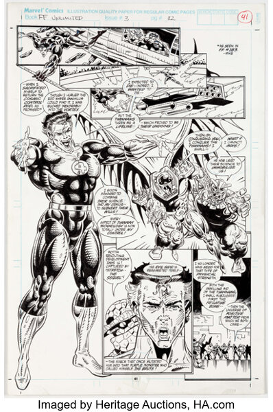 I can never un-see this, can I? |
|
|
|
Post by Dizzy D on Aug 20, 2019 9:06:49 GMT -5
It was Trimpe's own decision to start drawing like Liefeld.
|
|
|
|
Post by MDG on Aug 20, 2019 9:20:27 GMT -5
^^^^ This relates to the current "were the 90s really that bad?" thread. What always struck me about this style of art was: there's always been sub-standard (and downright bad) in comics, but never produced with such painstaking care. That is, you can look at, for example, a late period Mort Meskin story or a bronze age Charlton romance story with not-great art and say, "well they were just bashing it out for the page rate." But this stuff has that fine-line, precise inking that probably wasn't easy or quick to do all in the service of crap drawing.
|
|